• Skip to primary navigation
  • Skip to main content
  • Skip to primary sidebar
  • Get A Quote
  • 610.743.5602
  • Schedule A Meeting
default-logo
Menu
  • About
    • Team
    • Careers
    • Work
  • HubSpot Agency
    • Marketing Hub
      • Setup & Strategy
        • Inbound Success Plan
        • Inbound Marketing Plans
      • Traffic Generation
      • Lead Conversion
      • Lead Nurturing
    • Sales Hub
      • CRM Implementation
      • Sales Enablement
      • Sales & Marketing Alignment
    • Content Hub
  • Digital Marketing
    • Inbound Marketing
      • Inbound Marketing Plans
    • Content Marketing
    • Email Marketing
    • SEO
    • Social Media Marketing
    • PPC Management
  • Digital Analytics
  • Web Design
    • Shopify Web Design
    • CMS Hub
    • Branding/Graphic Design
    • Our Work
    • Hosting & Maintenance
  • Blog
    • Small & Mid-Sized Business Resources
    • Client Referral Program

Digital Branding

Bank Marketing: Creating Your Bank’s Brand

December 27, 2016 by Daniel Laws Leave a Comment

If you are not careful, a bank can easily become a faceless organization—making one virtually indistinguishable from another financial institution. That is why even though a bank is offering a service which is considered a NEED, not a want, a branding message is vital. Banks have print, digital, and branches that need a consistent message and look. This message is something that should carry across mediums, devices, and generations. To improve your bank’s marketing and financial success, utilize these bank branding guidelines.

Bank Marketing tips and Bank Branding Guidelines

Effective Bank Marketing Starts with Your Employees

External branding is visible to each and every customer, or potential customer, who walks into your bank or researches your firm online. However, without internal branding, it is easy to let this message slip away. Your employees must carry the message, value proposition, differentiation and “live” the brand that you have clearly defined. Your slogans and taglines should be more than just statements; they can be shown through actions and customer interactions. Every employee should understand the bank’s branding. These employees will become ambassadors for the firm and may be responsible for carrying the message to both existing and potential customers.

Guidelines for Branding Your Bank

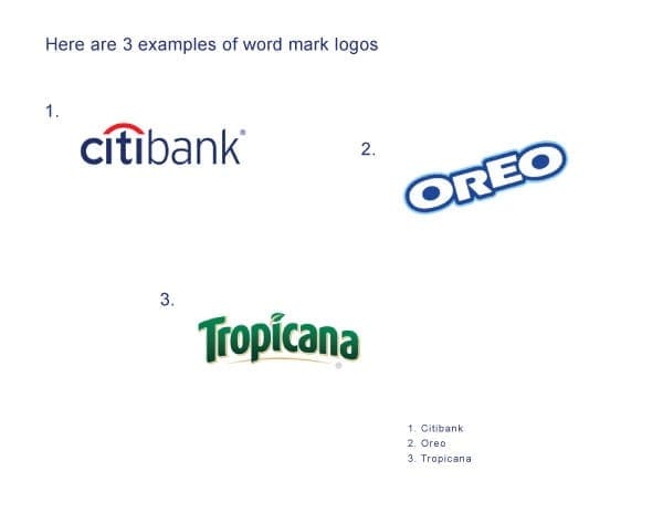
You need to put together a list of guidelines for your brand so that it appears consistent across all mediums. What font or typography will you use? How will the logo be placed? What color(s) will be utilized? Keeping these consistent is vital. Think about how the brand will be delivered, both in person and digitally, to ensure there are no mistakes. The smallest inconsistency can be magnified when published. As far as for use in your physical locations, you may need to hold training sessions with your employees on how to display any brand elements, too. Finally, don’t forget to cover yourself from a legal standpoint. Protect your logo and other branding elements and make sure you are not stepping on other toes.

Creating Your Bank’s Brand

When your bank is branded, it becomes more and more necessary to take advantage of your digital assets. Even if you don’t plan to use them today. Claim social media platforms when they become available. Get listed in the major directories. Additionally, you may wish to research reputation management and how it can benefit your bank. In certain cases, this can be necessary to give your company the right look and feel.

  • What the bank’s unique value proposition?
  • What differentiates them from other banks?
  • What’s the voice, style, and tone of the bank?

The answers to these questions will help you as you work to create your brand and make it “live” in the hearts of your customers.

Humanizing Your Brand

Your brand doesn’t just exist on paper, so it is important to “make it human.” Continuously reinforce the brand with your staff, customers, vendors and outside firms. This extra effort will go a long way in reinforcing what you stand for and creating something that will not only serve you well today but grow with your bank and become the core of what you are and how you serve those around you.

For more information about bank marketing and branding, leave a comment below or contact us today!


Filed Under: Bank Marketing, Digital Branding, Financial Services Tagged With: bank marketing, brand guidelines, branding, financial services, financial services marketing, social media

Why Stock Photography Shouldn’t Represent Your Brand

July 19, 2016 by Mark Mapp Leave a Comment

5 Reasons Not To Use Stock Photography

Throughout my experience as a Web Designer, I have noticed that many businesses struggle when they have to make a decision on whether or not to use stock photography to promote their brand. Although there are several good reasons to utilize stock photography on branded materials (such as limited budget, accessibility, variety, and quality), the negative impact of using them can prove to be much greater. This blog covers the 5 disadvantages or risks of using stock photography when promoting your brand and what alternative solutions are out there to avoid these potential risks.

1. Limited Restrictions

When purchasing non-custom photography, there are always license restrictions to abide by. Always make sure to read and understand all license restrictions associated with your purchase. Some restrictions may include crediting the author while some images may only be licensed for editorial use versus advertising/commercial use. You can view iStock’s License Help or iStock’s Content License Agreement to get an idea of the type of licenses or restrictions associated to stock photography purchases.

Don't use stock photography for branding your company
Screenshot displaying iStock’s additional image license options.

2. Non-Exclusive

You must remember that the same website you purchase your photos from may be the same website your competitors are purchasing from. This factor alone makes stock photography usage non-exclusive to your brand. There is always that risk of competitors finding and using the same imagery you purchased.

3. Lack of Creativity

It is almost impossible for a designer to come up with a unique and custom design concept when limited to using stock photography. Remember that these images weren’t taken with your brand or products in mind. Therefore, you may find yourself paging through hundreds of images to find that one that you feel will best represents your brand. Although image options are limitless with stock photography, unique or original concepts are not.

reasons your business should not use stock photography
Screenshot showing 10 different images depicting the same woman in similar compositions or settings.

4. Predictability

Images submitted to stock photography websites cover a variety concepts. Since these concepts are limited, image options can seem to be very predictable or clichéd. It’s one thing to have a limitless amount of images to choose from. But, if you have 100 images depicting the same idea or concept, where is the variety in that?

iStock Search Categories
Screenshot displaying 6 of iStock’s 32 images categories to choose from.

5. Unnatural Compositions

When browsing through stock photography websites, it’s hard not to notice all the unnatural positions or “forced” compositions in most of the images containing people; especially people in business attire. Everything looks staged. This is the best way to make your website look like spam.

Stock Photography Example

What Are The Alternatives?

1. Custom Photography

It is always best to utilize custom photography to represent your brand or to tell your brand story. Purchasing in-house photography equipment or hiring a professional to do the job will prove to be a better branding method than using stock photography.

2. Vectors/Illustration

Instead of using photos, more and more companies are using vectors or illustrations to promote their brand. Take Google for example.

3. Customize Your Stock

If you are going to use stock photography, find different ways to utilize the photo. Whether it is cropping out a certain portion of the image or combining two different images or concepts. These are just a couple of ways to make stock images as unique and original as possible while diminishing the chance of someone using the same image, idea, or concept.
To learn more about different visual branding methods and which one best suits your company, contact us! We’d be more than happy to chat with you.

Filed Under: Digital Branding, Marketing Strategy, Web Design Tagged With: branding, web design

Branded Assets to Consider When Redesigning a Website

April 25, 2016 by Mark Mapp Leave a Comment

Branded Assets to Consider When Redesigning a Website

When business executives make a decision to redesign, or give their website an updated look, there are other important branded assets or materials that may also need redesign considerations as well. Not taking these other assets or materials into account can cause a disconnect between your brand and potential customers that may want to use your services. Therefore, before beginning your website redesign project there are some important questions that may need some answers.

Is your logo in need of an updated look or redesign?

Now that mobile accounts for over 54% of the devices used to browse the web, it is important that you understand how your logo will be displayed or viewed at these resolutions. Things such as fonts, colors, and taglines can greatly affect how your logo is displayed especially at the smaller sizes required for most mobile or responsive websites. Familiarizing yourself with up-to-date logo design trends will help you decide if it’s time for a logo design overhaul.

What about the rest of your identity package?

Yeah, what about it? Well let’s see…If you did in fact need to update or redesign your logo based on the latest design trends, then your next step in the process would also include updating or revamping your identity package. Identity package materials can range from business cards, letterheads, envelopes, pens, etc. A decision will have to be made on what design elements are going to be carried over from these materials to the new website design to retain consistency, if any at all. However, this is something that should also be addressed.

Is your brand message going to be the same?

Your brand message is definitely one of the most single important aspect of your business. What you are trying to convey to your customers and how you want them to perceive your business is dependent on how effective or strong your brand message is. Brand messages are usually what drives the design process for most businesses, and what they generally rely on to remain brand consistent. If as a business you decide to change your brand message, be prepared to address all other content being used to promote your business.

Are you going to update the design/content on your marketing materials?

Well, if your business decided it is best to change or update its brand message, then it would be a great idea to review your current promo/marketing materials design and content to see if they align with the new brand message. These materials can be anything from a company brochure, catalogs, folders and folder inserts. This may also include social media accounts as well. If the design and content doesn’t align with your new brand message you may have just added another project to your redesign list. Always remember the goal is to create brand consistency.

As you can see there are other branded assets and materials that may need some attention when a business decides to redesign their website. Taking these other assets into consideration will help your business to streamline the redesign process and prevent any issues upstream that may cause a possible disconnect between your brand and potential customers you are trying to engage with. Maintaining a consistent brand is key especially when it comes to establishing healthy, long-term business relationships.

For more information about branded assets to consider when redesigning a website, contact us or leave us a comment below!

Filed Under: Digital Branding, Web Design Tagged With: web design

The 5 Different Logo Types and Your Brand Identity

July 11, 2014 by Mark Mapp 17 Comments

Introduction

In my last blog on the basics of designing a logo, we covered principles to follow when designing one of the most important identity pieces for your business. We learned that a successful logo design should be simple, yet versatile enough to be placed on a variety of different media. Visually, its design should appear to be memorable and timeless, yet stay appropriate to its audience.

When working to develop a logo, one big consideration is the type of design you choose. There are wealth of resources out there that cover various logo styles, but in my experience, there are 5 that are most prevalent and also most important. Let’s get started!

1. Symbol / Icon

The symbol or icon logo benefits from being the least complicated style yet the most flexible of all the other logo types. Symbolic/Iconic logos should be able to stand on their own without the company name association. This type of logo should only be utilized by large or international companies where language could play a huge role in consumers not being able to recognize the brand.

symbolic logos
Example 1: Here are 3 companies that recently dropped the word mark portion of their logo and now utilizes only the symbol/icon component. Out of the top 100 companies worldwide 6% of them uses this type of logo.

According to a study administered by Tastyplacement.com, only 6% of the top 100 companies in the world implements this type of logo. In other words, startups and other new business ventures should likely stay away from relying on a simple image to define their brand. However, I believe that every business should gradually move towards developing a symbolic/iconic logo because to me it represents a level of awareness that comes with overall success.

2. Word Mark

The second type of logo is known as a word mark. Roughly 37% of the top 100 companies worldwide are represented by this type of logo (via Tastyplacement.com). These logos consist of a type font which is styled or manipulated to convey the identity of a business. Even without being styled or manipulated, fonts tend to give off their own impressions. For example:

● Italic – motion, change, timely, continuous

● Bold – strength, power, stability, security

● Script – formal, refined, elegance, prestige

● Hand Written – friendly, playful, happy, childish

Word Mark Logos - Branding
Example 2: This graphic showcases 3 word mark logos which uses typefaces that are uniquely styled. Some word mark logos may even include a simple graphic element in the design.

Word mark logos are ideal for new startup businesses because it helps customers familiarize themselves with both the brand name and, ideally, a bit of the brand culture or personality.

3. Letter Mark

Letter mark logos are very similar to word mark logos in that they are created using typefaces; however, there is greater focus on just using first letter, initials, or an abbreviation of a company’s name to convey their brand identity. Unlike word marks that may contain a simple graphic for clarity, letter marks tend to be exclusively typographic.

Letter Mark Logos - Branding
Example 3: Letter mark logos are typically typographic using either the first letter, or an abbreviated version of a company's name. This type of logo is utilized by 37% of the top 100 companies globally.

This type of logo is best suited for companies with longer or hard to pronounce names. Companies with names that sound or appear generic can also benefit from letter mark logos as a means of differentiation. As an example, if a friend of yours told you that he was watching a show on “Home Box Office,” you probably wouldn’t have a clue what he was talking about. You may think he was speaking about some new cable network, but “Home Box Office” is none other than the vastly-popular cable channel HBO.

4. Combination Mark

Combination Mark Logos - Branding
Example 4: Combination mark logos offers the most flexibility because they consist of both a symbol and a word, or letter mark. These elements can be presented together or individually when representing a company. 56% of the top 100 businesses globally uses this type of logo.

Logos that integrates both a symbol/icon with text (word marks) are known as combination mark logos. According to Tastyplacement.com, 56% of the top 100 companies globally uses this type of logo style. A couple of benefits with developing a combination mark logo for your company are:

  • Having both a symbol and a word mark to represent your company gives you an additional level of flexibility on how your brand appears to customers. As your business grows and changes, parts of the mark can be altered, combined, or separated, but always retain a level of consistency. Many businesses today are following this trend.
  • Combination mark logos are also easier to register as a trademark than stand alone symbol/icon type logos. Many symbol/icon logos can appear similar without uniquely styled text (word marks) associated with them.

5. Emblem

Emblem logos can be considered combination marks to a degree. They are similar because they both include a symbol and text; however, unlike combination marks, emblem style logos are more integrated and enclosed to appear as one single graphic.

Emblem Logos - Branding
Example 5: A large portion of the automobile industry is represented by this type of logo. Emblem logos are also very popular in sports and the beer industry.

Because of this, emblem style logos cannot be presented as separate identity pieces like a combination mark logo, which gives them very little flexibility, especially in print applications or when resizing. This type of logo is very popular in the automobile industry as well as in the sporting world. Emblem style logos tend to resemble a badge or an official seal.

For the last example I decided to showcase DaBrian Marketing Group. Our logo would be classified as a combination mark because it consists of a word mark, a symbol, and a tagline. This type of logo is ideal for our company because we are a small and only made up of 9 employees. We are not well known outside of our coverage area therefore the combination mark logo serves us best.

Different Logo Types - Reading, PA

Are you looking to design a new logo or take your current one in a new direction? Join the discussion in the comments!

Filed Under: Digital Branding, Marketing Strategy Tagged With: brand identity, branding, combination marks, design, emblems, icons, letter marks, Logo Design, logo types, logos, symbols, word marks

Designing a Logo? Here Are 5 Basic Design Principles to Follow

June 4, 2014 by Mark Mapp Leave a Comment

Introduction

When starting a business it is very important to establish some sort of identity or visual presence. This is normally accomplished by the development or creation of a logo to represent your business. Your logo should speak to your audience with little or no explanation needed to justify its meaning. With that being said, there are 5 basic design principles that many designers follow that, more often than not, will ultimately determine the success of your new identity piece. In this blog we will go over these basic principles as well as provide some good examples of each.

1. Make it appropriate or relevant to your audience

Understanding your target audience and/or customers is probably the most important step in creating an effective or successful logo design. Not knowing or having this information may cause you to struggle with the development of your logo. It may even create a big disconnect between you and your target audience. By defining who your audience or customers are, you are then able to keep all the elements within the logo design relevant to them. Some examples of logos that clearly define who’s being targeted are the ones currently representing Gerber, Pantene Pro-V, and Rolex.

Relative logo design examples
Example 1: In the example above there are 3 logos shown that clearly define their target audience. As we all know Gerber markets towards new mothers, Pantene Pro-V markets towards women, while Rolex markets towards the rich and famous.

2. Most successful logos are “simple” in design

After you have defined your target audience, you can then move on to developing and designing your logo. This leads to our next principle, which is to keep the design or idea as simple as possible. It is best to apply the saying “less is more” to this principle. This phrase was actually first popularized by German architect Ludwig Mies van der Rohe, and I believe that this saying has more value or meaning in logo design than any other aspect of creative design. A logo that is too elaborately designed or made up of too many elements generally tends to create issues with things such as resizing, adding color, and most importantly readability. As a major rule, it is best to design the logo in black and white or grayscale before implementing colors. A well-designed logo in black and white usually translates well in color. Some logos that work well in black and white, as well as color are IBM, Nike, and Mercedes Benz.

Simple logo design examples
Example 2: It is a common practice to design a logo in black and white before implementing color. It is very possible that your logo may be successful enough where you do not have to add any color to make it relevant. That choice will be left up to you.

3. Your logo should be memorable

For a logo to be memorable, it should be visually pleasing and easy to remember. A good test to see if your logo has that memorable factor is by removing components or elements from the logo to see if it is still recognizable. Throughout history, many companies have eliminated parts or pieces of their identity without losing any relevancy. There are some key aspects to remember that can help make your logo a memorable one. First, stay away from concepts that mimic logos already in existence. Your logo design should be unique, yet relevant to the audience it’s trying to capture. Second, you should choose a font that best represents your business. Choosing a font can be considered the most crucial step in logo design. According to imjustcreative.com, fonts are the life and soul of the logo. Time spent choosing a font should not be underestimated. Make sure that you choose a font that delivers the right message because choosing the wrong font can be disastrous for you and your logo design. Third, stay away from design trends or social trends when designing a logo because as we know, trends do have a tendency to come and go. Follow them too closely and your logo could meet the same fate. In the examples below, I removed key elements or parts of logos to see if they are still recognizable.

Memorable logo design examples
Example 3: Here are 3 logos with key elements or major parts removed. See how quickly and accurately you can identify these brands.

4. Will your logo stand the test of time?

As time passes by, your logo or identity should remain relevant and appropriate to your audience with little or no changes at all. Simply put, the least amount of changes you make to your logo over time the better it is for you and your company. Logos that have that timeless factor or element to them tend to have little or no changes to their design over time, or the changes can be so miniscule that it is almost impossible to tell the difference between the previous and new design. According to brandprofiles.com, your logo should remain relevant 10-20 years down the road. Therefore, redesigning or rebranding your company’s identity or brand isn’t considered a good practice. Simply put, it is all about longevity. Some good examples of this would be the Google, Coca-Cola, and Reebok logos.

Timeless logo design examples
Example 4: In this example you can see that Reebok has changed or made slight alterations to their logo since 1895 (10 to be exact). Until the 2008-present version of the logo, they all closely resemble each other to some degree.

5. It must be versatile and flexible

Another key aspect of a successfully designed logo is its ability to be scaled at different sizes without losing quality or readability. Logos should also display well in one color or against different color backgrounds. They should also have the ability to be implemented across various media and within a variety of contexts. Creating a logo in vector format is the most common and recommended practice by designers as a whole. Vector files can be created in programs such as Adobe Illustrator and Inkscape and will give you the most versatility and flexibility when creating or implementing a logo for different media types.

Versatile/Flexible logo design examples
Example 5: This example shows an identity package with a variety of media. As you can see, the logo is implemented differently depending on the type of media it is on. Here you can see the variation of sizes and color.

Conclusion

Now that we have covered the 5 basic principles of logo design, it may be in your best interest to audit your company’s current logo, or a logo that you have been developing to see if the design reflects any or all of these principles. You may also want to critique some busy or complex logo designs to see what the designer could have done differently to make the logos more relevant or ideal to its audience. When looking at and critiquing these logos, keep in mind that some of them may still be considered good designs though they do not follow the 5 basic logo design principles.

Have a question or a tip I didn’t mention? Please add yours in the comments below!

Filed Under: Digital Branding, Web Design Tagged With: 5 basic principles, Logo Design, web design

Mad Men’s Don Draper on Digital Advertising

May 8, 2013 by Daniel Laws Leave a Comment

As an addict of the AMC series “Mad Men,” I’ve been thinking about what Don Draper would say about my digital agency and today’s advertising industry. If you don’t know, Don Draper is the Creative Director and a founding partner at Sterling Cooper Draper Pryce ad agency in the show. The series is based on a 1960s New York advertising agency that fights for recognition in the industry as well as key players making their mark. Don Draper is a key character within the show that works to tell the story of the agency’s clientele.

I thought it would be interesting to put myself in Don Draper’s shoes to see what he would most likely say about the growing digital landscape as an ad man. Here’s what I came up with:

  • Agencies still need to present great ideas to clients. It could be a unique creative solution or technology, but it always starts with an idea that helps the client solve a problem.

  • It’s about storytelling in all formats: print, media, mobile, digital, PR, branding, and creative, but with more research and analytics geeks to deliver info for informed storytelling and engagement.

  • Storytelling doesn’t just apply to the marketing mix; it also applies to the reporting. Multiple data sources, tag management solutions, and data visualization are all part the story. The more information that you have on the customer or prospective customer’s story that manifests into actionable recommendations or insights, the better.

  • Creative is still important, but not without testing, measurement, and outcomes. Not just ad creative either, but creative in the sense of identifying solutions to client challenges. Think about digital & creative on the path toward creating a successful outcome.

  • Digital creates more opportunities, but someone still has to sell it! From more graphic designers that create banner ads to analysts that implement a tag management solution for attribution analysis. Our client’s don’t always see the value, so we need to sell the story along with the impact it will have on selling more products or services.

  • It’s a tough journey from creative, to messaging, to measuring outcomes. Without the right people and technology, it will be more like a nightmare.

  • It’s an opportunity to improve the marketing mix and turn data into insight. The March 2013 issue of Advertising Age brought this up in an article “Data, Data Everywhere, and not an Insight in Sight.” The bottom-line is that big data still needs to be customer-centric and segmented. You need to have some idea on what you plan to do with the data.

  • You need the right talent and you need to cultivate it. It took time for Peggy to become a Copy Chief! Many ad executives are looking for the next “Big-Data Draper,” but in today’s environment, that’s like looking for a unicorn. I think it’s more realistic to develop a team of creative analytics geeks that work well together than the “Big-Data Draper” approach.

  • Don’t just give customers/clients what they want, but recommend what they need with a story. Marketers have become obsessed with technology, but isn’t the idea to make more money from selling products and services?

  • Digital Advertisers & Analysts need to tell the public a better story on the usage of big data, tracking, and security! We’re collecting data to recommend products/services, we’re tracking to see what works so we can stop sending you bullshit, we’re securing the data based on existing industry standards, and we’re proactively looking for methods to save customers time and money while better servicing your needs.

While today’s digital advertising is growing, so is the need to provide creative digital solutions to clients. In my opinion, it starts with a team of good people with good ideas. Don’t let the technology control the outcome, but think about how to leverage technology or even expand its capabilities to achieve exactly what you want. Remember that what is standard technology today will be mediocre tomorrow, but storytelling and the need for creative solutions will be around for a life time.

Do you have a Draper-ism of your own when it comes to the digital advertising landscape? Let us know in the comments below!

Filed Under: Digital Branding, Marketing Strategy Tagged With: branding, digital advertising, don draper, mad men, storytelling

  • « Go to Previous Page
  • Page 1
  • Page 2

Primary Sidebar

Archives

Categories

Subscribe Now


CONTACT INFORMATION

DaBrian Marketing Group
3535 N. 5th Street HWY
Suite 2, #203
Reading, PA, 19605

  • 610.743.5602
  • Mon - Fri: 9AM - 5PM
Contact Us
Web Support

RESOURCES

  • Case Studies
  • White Papers
  • eBooks
  • Small Business Resources
  • Our Blog

MARKETING

  • Financial Services
  • Health & Wellness
  • Ecommerce & Retail
  • Business 2 Business
  • Business 2 Consumer

VISIT OUR LOCATION

  • Get Map & Directions

CONNECT WITH US

Facebook Instagram Linkedin Rss Twitter Youtube

Copyright © 2025 DaBrian Marketing Group  •  All Rights Reserved  •  Privacy Policy

Scroll Up