• Skip to primary navigation
  • Skip to main content
  • Skip to primary sidebar
  • Get A Quote
  • 610.743.5602
  • Schedule A Meeting
default-logo
Menu
  • About
    • Team
    • Careers
    • Work
  • HubSpot Agency
    • Marketing Hub
      • Setup & Strategy
        • Inbound Success Plan
        • Inbound Marketing Plans
      • Traffic Generation
      • Lead Conversion
      • Lead Nurturing
    • Sales Hub
      • CRM Implementation
      • Sales Enablement
      • Sales & Marketing Alignment
    • Content Hub
  • Digital Marketing
    • Inbound Marketing
      • Inbound Marketing Plans
    • Content Marketing
    • Email Marketing
    • SEO
    • Social Media Marketing
    • PPC Management
  • Digital Analytics
  • Web Design
    • Shopify Web Design
    • CMS Hub
    • Branding/Graphic Design
    • Our Work
    • Hosting & Maintenance
  • Blog
    • Small & Mid-Sized Business Resources
    • Client Referral Program

logo types

Five Logo File Types Every Business Should Keep on File

June 24, 2015 by Mark Mapp Leave a Comment

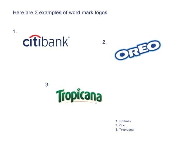
Business owners often advertise their brand in multiple facets and in the media space. This makes it crucial for them to understand the different logo file types and the way they are utilized in the media space they are implemented into. In this blog, I will be covering the five important logo file types all business owners should have at their disposal.

Vector Based File

Vector graphics are considered to be the most flexible image format for saving logo files. Vector based files allow you to easily add spot colors (Pantone colors), gradients, and textures to the artwork. However, what they are mostly known for is having the ability to be reduced or increased in size without losing any quality. Common file extensions associated with vector files are .AI, .SVG, .EPS, and .DRW. If there is one file type I would recommend a business owner use to preserve their logo, vector files would be it.

vector-export

EPS (Encapsulated PostScript) File

​Another versatile and effective file type for preserving logos is an .EPS file. An .EPS file can contain any combination of text, graphics and images and is often used when exchanging logo vector graphics that are only to be read but not edited by the recipient. Files sent to a professional printer, for example, are usually sent in this format. Unlike vector files, .EPS files have very little editability when it comes to changing colors, adding gradients, or simply changing text. However, they are similar to vector files because they are programmed in PostScript (PS), which is the language used to create vector based graphics, allowing them flexibility in the scaling department. An .EPS file is made up of two types of data; there is the preview data that allows the file to be viewed in most page layout programs, and it also contains high resolution data used by high quality printing devices.

eps-export

JPEG (Joint Photographic Experts Group) File

JPEG is a compressed image file format (or lossy compression format). JPEG files allow you to compress an image while trying to preserve as much of its’ quality as possible and are not limited to the amount of color it contains. Although some image quality is lost during compression, JPEG images can still appear to be colorful and high in resolution. I would make a guess and say that over 80% of the images seen on the World Wide Web are JPEG files in nature. If you have to showcase your logo on the web in an advertisement, for example, more than likely this would be your image file of choice. The big negative on JPEG images is that they do not preserve transparency data unlike all the other files mentioned in this blog.

jpeg-export

PNG (Portable Network Graphics) File

​Just like JPEG files, a PNG file is a raster (or bitmap) image file format which supports lossless data compression. It also supports millions of colors similar to it’s counterpart,  however it does not support non-RGB color spaces such as CMYK which doesn’t make it ideal for high quality printing if any printing at all. It’s a  clear advantage over JPEG files is the ability to preserve transparency data which is how logos on most websites are implemented.

png-export

GIF

Last, we have the GIF file. A GIF image by nature is an 8-bit color file, which means they are limited to a palette of 256 colors. Having this limited color palette makes GIF files ideal for small images with solid areas of color. GIF files are also an effective means of saving grayscale images since they are based on an 8-bit color palette. With its limited color palette, GIFS offers the smallest image compression available, but that comes with the sacrifice of poor image quality. GIF image files are currently being replaced by PNG image files around the web and most digital spaces since they offer higher resolution images.

gif export

Conclusion

As a business owner, it is important that you prepare your logo in a variety of image file types. The ones I’ve listed are just a few, but these file types are the ones I feel are the most important. Having these files at your disposal gives you the flexibility to place your logo on any type of print or digital advertising campaigns. Having them readily available can also speed up your creative or design process, as well as, give your designer a peace of mind not having to recreate or redesign any logo assets. If you have any other file type in mind you would like to mention, please leave it in the comments below.

Filed Under: Web Design Tagged With: Logo Design, logo types

The 5 Different Logo Types and Your Brand Identity

July 11, 2014 by Mark Mapp 17 Comments

Introduction

In my last blog on the basics of designing a logo, we covered principles to follow when designing one of the most important identity pieces for your business. We learned that a successful logo design should be simple, yet versatile enough to be placed on a variety of different media. Visually, its design should appear to be memorable and timeless, yet stay appropriate to its audience.

When working to develop a logo, one big consideration is the type of design you choose. There are wealth of resources out there that cover various logo styles, but in my experience, there are 5 that are most prevalent and also most important. Let’s get started!

1. Symbol / Icon

The symbol or icon logo benefits from being the least complicated style yet the most flexible of all the other logo types. Symbolic/Iconic logos should be able to stand on their own without the company name association. This type of logo should only be utilized by large or international companies where language could play a huge role in consumers not being able to recognize the brand.

symbolic logos
Example 1: Here are 3 companies that recently dropped the word mark portion of their logo and now utilizes only the symbol/icon component. Out of the top 100 companies worldwide 6% of them uses this type of logo.

According to a study administered by Tastyplacement.com, only 6% of the top 100 companies in the world implements this type of logo. In other words, startups and other new business ventures should likely stay away from relying on a simple image to define their brand. However, I believe that every business should gradually move towards developing a symbolic/iconic logo because to me it represents a level of awareness that comes with overall success.

2. Word Mark

The second type of logo is known as a word mark. Roughly 37% of the top 100 companies worldwide are represented by this type of logo (via Tastyplacement.com). These logos consist of a type font which is styled or manipulated to convey the identity of a business. Even without being styled or manipulated, fonts tend to give off their own impressions. For example:

● Italic – motion, change, timely, continuous

● Bold – strength, power, stability, security

● Script – formal, refined, elegance, prestige

● Hand Written – friendly, playful, happy, childish

Word Mark Logos - Branding
Example 2: This graphic showcases 3 word mark logos which uses typefaces that are uniquely styled. Some word mark logos may even include a simple graphic element in the design.

Word mark logos are ideal for new startup businesses because it helps customers familiarize themselves with both the brand name and, ideally, a bit of the brand culture or personality.

3. Letter Mark

Letter mark logos are very similar to word mark logos in that they are created using typefaces; however, there is greater focus on just using first letter, initials, or an abbreviation of a company’s name to convey their brand identity. Unlike word marks that may contain a simple graphic for clarity, letter marks tend to be exclusively typographic.

Letter Mark Logos - Branding
Example 3: Letter mark logos are typically typographic using either the first letter, or an abbreviated version of a company's name. This type of logo is utilized by 37% of the top 100 companies globally.

This type of logo is best suited for companies with longer or hard to pronounce names. Companies with names that sound or appear generic can also benefit from letter mark logos as a means of differentiation. As an example, if a friend of yours told you that he was watching a show on “Home Box Office,” you probably wouldn’t have a clue what he was talking about. You may think he was speaking about some new cable network, but “Home Box Office” is none other than the vastly-popular cable channel HBO.

4. Combination Mark

Combination Mark Logos - Branding
Example 4: Combination mark logos offers the most flexibility because they consist of both a symbol and a word, or letter mark. These elements can be presented together or individually when representing a company. 56% of the top 100 businesses globally uses this type of logo.

Logos that integrates both a symbol/icon with text (word marks) are known as combination mark logos. According to Tastyplacement.com, 56% of the top 100 companies globally uses this type of logo style. A couple of benefits with developing a combination mark logo for your company are:

  • Having both a symbol and a word mark to represent your company gives you an additional level of flexibility on how your brand appears to customers. As your business grows and changes, parts of the mark can be altered, combined, or separated, but always retain a level of consistency. Many businesses today are following this trend.
  • Combination mark logos are also easier to register as a trademark than stand alone symbol/icon type logos. Many symbol/icon logos can appear similar without uniquely styled text (word marks) associated with them.

5. Emblem

Emblem logos can be considered combination marks to a degree. They are similar because they both include a symbol and text; however, unlike combination marks, emblem style logos are more integrated and enclosed to appear as one single graphic.

Emblem Logos - Branding
Example 5: A large portion of the automobile industry is represented by this type of logo. Emblem logos are also very popular in sports and the beer industry.

Because of this, emblem style logos cannot be presented as separate identity pieces like a combination mark logo, which gives them very little flexibility, especially in print applications or when resizing. This type of logo is very popular in the automobile industry as well as in the sporting world. Emblem style logos tend to resemble a badge or an official seal.

For the last example I decided to showcase DaBrian Marketing Group. Our logo would be classified as a combination mark because it consists of a word mark, a symbol, and a tagline. This type of logo is ideal for our company because we are a small and only made up of 9 employees. We are not well known outside of our coverage area therefore the combination mark logo serves us best.

Different Logo Types - Reading, PA

Are you looking to design a new logo or take your current one in a new direction? Join the discussion in the comments!

Filed Under: Digital Branding, Marketing Strategy Tagged With: brand identity, branding, combination marks, design, emblems, icons, letter marks, Logo Design, logo types, logos, symbols, word marks

Primary Sidebar

Archives

Categories

Subscribe Now


CONTACT INFORMATION

DaBrian Marketing Group
3535 N. 5th Street HWY
Suite 2, #203
Reading, PA, 19605

  • 610.743.5602
  • Mon - Fri: 9AM - 5PM
Contact Us
Web Support

RESOURCES

  • Case Studies
  • White Papers
  • eBooks
  • Small Business Resources
  • Our Blog

MARKETING

  • Financial Services
  • Health & Wellness
  • Ecommerce & Retail
  • Business 2 Business
  • Business 2 Consumer

VISIT OUR LOCATION

  • Get Map & Directions

CONNECT WITH US

Facebook Instagram Linkedin Rss Twitter Youtube

Copyright © 2025 DaBrian Marketing Group  •  All Rights Reserved  •  Privacy Policy

Scroll Up