• Skip to primary navigation
  • Skip to main content
  • Skip to primary sidebar
  • Get A Quote
  • 610.743.5602
  • Schedule A Meeting
default-logo
Menu
  • About
    • Team
    • Careers
    • Work
  • HubSpot Agency
    • Marketing Hub
      • Setup & Strategy
        • Inbound Success Plan
        • Inbound Marketing Plans
      • Traffic Generation
      • Lead Conversion
      • Lead Nurturing
    • Sales Hub
      • CRM Implementation
      • Sales Enablement
      • Sales & Marketing Alignment
    • Content Hub
  • Digital Marketing
    • Inbound Marketing
      • Inbound Marketing Plans
    • Content Marketing
    • Email Marketing
    • SEO
    • Social Media Marketing
    • PPC Management
  • Digital Analytics
  • Web Design
    • Shopify Web Design
    • CMS Hub
    • Branding/Graphic Design
    • Our Work
    • Hosting & Maintenance
  • Blog
    • Small & Mid-Sized Business Resources
    • Client Referral Program

Mobile Marketing

Top 5 Technical Issues That Impact Your Organic Search

August 26, 2015 by Dabrian Marketing Group 1 Comment

Optimizing your site to perform well in organic search is not a set it and forget it process. There are several factors that go into determining your site’s positioning in the search engines. In fact, backlinko.com reports (and lists them for you) that Google uses over 205 different factors! While many business owners tend to focus on the visible on-page components such as content and keywords (which are very important), there are several technical issues that often go unnoticed because they are not visible to the end users. These issues listed below greatly impact your business’s organic search results and should be a top priority when creating and maintaining your site.

Organic Search
(Image from http://seattleorganicseo.com)

1. Navigation

Before your website appears in a search engine, it must be crawled, and then indexed. During this process, search engines will collect information about your site’s content. Just as users prefer sites that are easy to navigate, so do search engines.

If you wish to perform better in search engines, it would greatly benefit your business to create and maintain a sitemap. A sitemap is a document or a webpage containing all the pages on your site. Search engines evaluate sitemaps to understand the structure of the site. This is regularly done so it is a best practice to make sure this sitemap is being updated when new pages are created.

Your navigation bar is not just for the user either, search engines consider them into their organic search rankings. While (quality) links are always good for your site, not all links are created equal in a search engine’s eyes. Links placed in your navigation bar are deemed more important. Therefore your navigation bar should only contain links that are most valuable to your business. These are the links that generate more traffic and lead to more sales and conversions. Many website owners make the mistake of placing too many links in their navigation. This not only worsens the user experience (which worsens your position in organic search), but it also dilutes the authority/value of your links.

Having descriptive anchor texts, the text that appears highlighted in a hypertext link, is another factor associated with navigation. Having descriptive anchor texts means linking to your pages using content related words and not something generic such as “click here” or “read more.” These generic links tell search engines that the page should be about clicking things, or reading. This appears spammy and can negatively impact your performance in organic search.

2. Site Speed

One of the 200+ factors that Google and other search engines take into account is site speed, or how fast your site finishes loading. Search engines have become focused on providing the best user experience for those searching, so a faster load time to them, means a better experience and will correlate to the improvement of your rankings. Common mistakes that many site owners make that cause slow site speed are things such as large pictures, flash animation, bulky code, and external media. While some of  these things may look nice, it would be wise to reduce or remove them in order to increase site speed. To evaluate your site’s speed, use Google’s pagespeed insight tool.

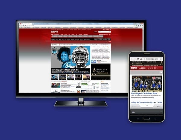
3. Mobile Capability

On April 21st of this year, Google released an algorithm change requiring sites to be mobile friendly if they wished to perform well in organic search on mobile phones. Before the update, a study from Adobe reported that 45% of business did not have a mobile friendly site. To be mobile friendly, search engines such as Google recommend using a responsive design. This means that all your site’s content will remain the same for all users, it will just appear differently depending on the device the user is using. For more information about the update, please read my blog on Google’s Algorithm change posted near the time of the release.

4. Duplicate Content

Most business owners are aware that copying content from other sites is not only unethical, but will result in a ranking penalty from search engines. However, many are not aware of the internal duplicate content happening on their site right now. When a user visits a specific page, a URL is generated based upon the path they take. For example, a user may search Amazon looking for a cellphone, and once there, they decide they want a smartphone so they click on the smartphone section. After going to that section, they click on their desired phone (let’s say an Iphone 6).  Their URL will look something like this: Amazon.com/cellphone/smartphones/Iphones/Iphone6. Now let’s say another user knows exactly what they want. They go to Amazon and enter in the search bar “Iphone 6.” Their URL will be shorter and look something like this: Amazon.com/iphone6. While this is the same page, they have two separate URLs. Search engines will recognize them as two separate separate pages with duplicate content. Google lists solutions and explanations on how to deal with duplicate content.

5. Include a Robot.txt file

A Robot.txt file is used to direct search engines when crawling. It’s usually used to prevent search engines from indexing specific pages and files. So why would you want to prevent search engines from crawling any part of your site? Let’s say for example you are in the process of updating your site. You’ve began adding pages but they aren’t complete yet. If a search engine were to crawl those pages, they would not perform well in organic search due to lack of content. That places you in a uphill battle from the start. A similar issue arises when you are performance testing different layouts for pages. The pages have identical content, but you wish to see which layout users prefer. A Robot.txt file will tell search engines not to crawl these pages yet until you are finished or have picked a layout. Another reason would be to prevent search engines from penalizing you for duplicate content. For example if you have a print version of a page, you can tell search engines not to crawl it.

Learn more about Robot.txt files.

Performing well in organic search is essential for a business that wishes to improve digitally. A study done by BrightEdge shows that the majority of web traffic (51%) comes from organic search. That is a huge opportunity to miss out on. While having great content may be the priority in some business owners mind, none of that means anything if your website has the technical issues listed above.

Contact Us today to make sure your site is technically sound to perform well in organic search!

By: David McDowell

Filed Under: Mobile Marketing, Search Engine Optimization (SEO) Tagged With: Organic Search

7 Deadly Sins of Social Media for Banks

June 8, 2015 by Daniel Laws Leave a Comment

A recent American Banker article discussed opening up the opportunities for employees to engage with customers. I was surprised that this was the position of the article because financial institutions, in general, tend to be very risk adverse. I understand utilizing social media to communicate with customers, but I think there need to be some controls. With that said, I give you my 7 deadly sins of social media for banks.

7 deadly sins of social media

Lusting for “Likes” without the Bank’s Strategy

Before opening communication on social media for bank employees and customers, it’s important to recognize the need for a social media strategy and why social media matters. Profitability is a major concern in this competitive market, and social media can help financial service institutions differentiate themselves and communicate with customers on a level  they’re accustomed to. For a bank to allow employees and customers to interact via social media, there needs to be a clear strategy and metrics to determine whether or not it’s having an impact on deposit accounts, loan applications, improving customer service, and generating revenues.

Failing to Acknowledge Competition (Pride)

With all the potential mergers and acquisitions banks go through, the market has become increasingly competitive. Not looking into the competitive landscape of how to effectively use social media can lead to disaster.  There are a few financial services institutions (Wells Fargo, Bank of America, and US Bank) that banks can take a note from on how to implement social media best practices and still remain compliant. Leverage the learning from local credit unions to connect with the local markets is a good place to start.

Not Preparing for the Rage of Employees & Customers

Not all employees or customers will remain happy with the bank so failing to prepare for the wrath of an unhappy employee or an unsatisfied customer may lead to unwanted national media attention. I would highly recommend that banks develop social media policies and procedures to manage employees social media engagement on behalf of the institution. It is also wise to clearly communicate what customers should expect and not expect via social media from the bank.  A good example of this is Bank of America which offers guidelines and terms of use specifically for their social media community.  These social media guides should help you to limit the risk and plan accordingly for the wrath of unhappy individuals or sensitive information.

Starting with More than Banks can Handle (Gluttony)

With all the social media networks out there, which one makes sense for the business? Opening up every social media platform to employees and customers is simply not a good idea. I would highly recommend that you start with one platform at a time and prioritize which social media platforms make sense based on your strategy. Each social media platform has unique aspects and as an industry that is generally slow to implement change getting a handle on each platform and understanding how customers engage will be critically important, so don’t bite off more than you can chew at one time!

Excessive Promotion of Your Bank and Financial Services

Contrary to popular belief your social media accounts should promote more than your bank, credit union, wealth management, and products or services. I would recommend the social media rule of thirds. ne-third of the social media content should promote the bank, one-third should share industry information and one-third should be based upon interactions and socializing with customers or potential customers. If you’re not following the rule of thirds or something similar you’re simply being greedy and tantalizing your community which will end with customers disengaging.

Being Lazy on the Measurement

The real question is how do you plan to measure the effectiveness that social media is having on growing deposit accounts, loan applications, and improving customer service? For years, I’ve witnessed banks and credit unions being really lazy on measuring the return on investment for their marketing dollars, especially dollars spent on social media marketing!  There is a cost associated with having employees engage in this process and there should be a return on that investment. For full visibility into the return on investment, banks need to implement web analytics solutions and track across mobile banking apps, loan or member application process, and customer support tickets. Without doing so, there will be limited visibility into the overall impact that social media is having on the deposit accounts and lending.

Envy of the Competitor’s Social Community without Context

So the competitor has 1 billion likes and a trillion followers but how many members of their social media community interact with the brand, share information, use the specific social network, and are advocates for the company or product/service offerings?  Don’t be jealous of the number of metrics without understanding the context of how they were acquired or the level of interaction.  You can purchase Twitter followers but are they real followers?  For example, you can have 300 followers for with a 50% interaction rate or you can have 1000 with just a 10% interaction rate.

Conclusion

It’s important to the financial service industry to embrace the idea that social media to communicate with customers, members, or investors but it should be aligned with the strategy and add value to the potential customers as well as the organization.  The social media strategy and value of social media must be clearly established prior to opening social media communications.  The expectations should be clearly defined for customers and employees to put things into perspective and avoid the 7 deadly sins of social media for financial services organizations.

Filed Under: Bank Marketing, Financial Services, Marketing Strategy, Mobile Marketing, Social Media Marketing & Management, Wealth Management Marketing Tagged With: social media

Mark your Calendars: Google’s New Algorithm is Coming

April 8, 2015 by Dabrian Marketing Group Leave a Comment

Google’s “Mobilegeddon” will begin on April 21st. This means that Google is no longer just recommending mobile friendly sites, they are requiring it. A study from Adobe found that 45% of businesses don’t have a mobile-optimized site or a mobile app. This means nearly half the businesses with an online presence will be penalized and see a significant drop in traffic. If your site is not mobile friendly, what are you waiting for?

Listed below are 5 mistakes to avoid while creating your mobile site in order for it to excel.

Not Considering Mobile First Design

According to Seoclarity, mobile search currently makes up about 30% of total traffic, regardless of the industry, and will only continue to grow. When designing your website, consider making your mobile site first. Create a simple, yet effective page with the user’s experience in mind. A study by MediaPost shows that 48% of mobile shoppers said that “ease of use” is their most important quality they look for in a mobile site. So just remember the old acronym K.I.S.S (Keep, it, simple, stupid).

After that, use your mobile site as a core basis of developing your desktop view. There is nothing you can put on a mobile site that can’t be loaded on a desktop. Progressively enhance your page with extra information and a more extensive navigation (as long as it’s relevant).

Not a Responsive Site

So you’re interested in mobile, but the thought of having two separate sites sounds difficult and time consuming. Well the good news is you don’t have to, nor should you. A responsive design, using the same site for both mobile and desktop, is the best option. In fact, Google actually recommends this approach. A responsive site is more efficient for Google to scan and review, making it more likely that your content will show in the search results. It also eliminates the possibility of being penalized for duplicate content as you most likely would for having two separate sites.

Consistent web design is also important because multiple device screening is becoming extremely prevalent. In fact, Google reports that 67% of online shoppers use multiple devices during their process. Users will look at products on mobile and revisit later on a desktop (or vice versa) hoping their history, preferences, and shopping cart is synced. The longer the conversion (sale or lead generation) process takes, the more likely the user will not complete it.

No Mobile Search Strategy

Since you’re using a responsive site, you can use the same search strategy, right? Not necessarily. Typically mobile users have different interest and intent than those on desktops. To develop theses strategies, use Google Webmaster’s tools and apply a mobile filter to your search query information. Compare the similarities and differences among mobile and desktop and begin to develop a list of keywords from that. Then do mobile competitive analysis using tools such as SEMrush, SearchMetrics, Sistrix or SimilarWeb, to develop a masters list. If your competitors do not have mobile sites, this is the perfect opportunity to get a leg up.

Not Assessing Mobile

Just because you have a mobile site does not mean it is mobile friendly. It is in an owners best interest to test the functionality of their site, among different devices and operating systems. Also they should check for any crawling issues or error reports (especially 404’s). Besides the technical aspect, ask yourself, “are SEO best practices still being followed?” Relevant and unique content, tags, titles, meta descriptions, site speed, etc should all be accounted for.

Evaluate the performance of your mobile page. This will show you the intent of these users. Which pages are receiving the most visits, have the longest view duration, and have the highest conversions? Make sure these pages are easy to get to by placing them in the navigation bar. Also asses which pages have a higher bounce rate on mobile. This could be an indicator of an error, or that the page is just not relevant to mobile users.

Still not sure where your stand? Google offers a free tool to test your sites mobile friendliness.

Not considering the impact on local search

According to Think With Google,  94% of Americans with smartphones search for local information on mobile. If that’s not enough to grab your attention, Google also polled mobile users searching for local businesses and discovered that half of them visited the business that day. This means your mobile strategy should be geared locally. To guarantee you are maximizing your reach and visibility, make sure your address, phone number, email, and any other business information is accurate and consistent. This information should not only be a resource, but provide as a simple and efficient channel for the consumer to further connect with your business as well. Consider adding a click-to-call button, syncing your location to Google maps, and making sure all email addresses are linked. This not only generates more traffic, but also will lead to more leads and sales.

Google’s “Mobilegeddon” on April 21st is the biggest update concerning mobile thus far,but it most likely is only the first of many more to come. If you are not mobile friendly by the time it is released, your visibility will certainly decrease and expect a substantial drop in traffic.

Do not wait for your site to be penalized, call DaBrian Marketing (610.743.5602) and create a mobile site now!

By: David McDowell

Filed Under: Mobile Marketing, Search Engine Optimization (SEO), Web Design

Technical Considerations for Going Mobile Design

March 11, 2015 by Dabrian Marketing Group Leave a Comment

What method should you use when starting your mobile design?

There are a lot of variables you need to consider when making your site mobile friendly. To start, there are three different ways you can do it. Only 1 of the 3 ways is considered best practice, and the other 2 are being phased out. Ideally you want to shoot for responsive design which with media queries work. Then no matter the size of your screen, your website’s look and feel will always be as at the width you want it.

Before we get into the 3 most common ways to design for mobile, I should mention the absolute most ideal way to do it. If you are doing a complete re-design then you should design for mobile first. I know it’s a bit different from how we developers have been doing it for decades, But going from the simplicity of mobile to complex is much easier. If you are not doing a re-design and already have a website you want to go to mobile, then you are going to choose between one of the 3 methods below. Keep in mind that there are other ways to go about it, I only mention the most common.

The 3 most common ways are as follows: media queries (referred to as responsive), mobile version of site (you would have 2 sites basically – one for desktop, and one for mobile), and making it fit exact sizes (making it fit 320, 450, 700, 900, 1024. If someone has a screen size of 400, they would see the 450 size. Basically, the design jumps as if you moved the browser).

Helpful Tools For Mobile Design

There are dozens of software packages and sites you can use to help. I am going to keep it simple and only mention 2 specific ones. The first is to help with Internet Explorer since you’ll usually encounter the most issues,  as with previous versions of the browser. The next one can help with every browser, but it only gives you a screenshot of what you select. Still very helpful for checking multiple versions of chrome in one go.

  • Netrenderer
  • Browser shots
  • Responsivepx

The last one allows you to view websites in different sizes without having to resize your browser. You can also browse the site using this, which is helpful for usability. If you use Google Chrome then you can use this next bit. If not then I highly recommend downloading Chrome. It is actually a built in feature that I use all the time.

Chrome phone icon.
Shows the chrome inspect element, and where the phone icon is located.

All you need to do is right click on a site, and select “inspect”. Then another bar will pop out showing you the code of where you right clicked, and below that will be the CSS properties associated with it. It is handy for anyone programming. I have used Chrome for years and never noticed this until recently.

At the top of the inspect window there are buttons to change what you are seeing. Those are cool to use also. You can change the position of the inspect window from there. It can either be bottom, right side or a completely different window. On that top bar between the magnifying glass and the “Elements” tab, there is a phone icon. Click on it. Instantly you can browse in any size and go to specific device sizes. You can also see the recommended screen sizes to hit when going for mobile design.

Mobile Design Cross Browser Issues

Here is where all of the trouble is. You need to pick which devices you want to design for, and for which browser versions. The more versions and devices you support the better. Choose wisely – supporting every browser version under the sun for all devices simply isn’t possible.  A good standard would be the webs top 5 browsers that cover 95% of the user market: Google Chrome, Internet Explorer, Firefox, Safari, and Opera. You can download them and use them for testing, or use the tool above to see screenshots in those browsers. I recommend both so that if you want, you can use the site on that browser instead of only seeing a screenshot.

Browser version wise, it is recommended that you go back at least as far as 3 versions. For Chrome, Firefox, Safari, and Opera those typically can go even farther back, maybe as far as 10 versions or more because they usually show roughly the same. For Internet Explorer, you will need to pick what specific version you want to design for.For each version you go back, it will become harder and harder to design for. So your mileage my vary with Internet Explorer versions.

Programing wise, inside your CSS you can use 3 properties to target those browsers. First is “ -webkit- “ – this targets Chrome and Safari. The next is “ -moz- “ – which targets Firefox. Lastly, there is “ -o- ” – and that targets Opera. To target Internet Explorer, you need to do some research depending on the version you’re designing for –  that pre-fix might be different.

Browser support pre-fix.
Thinking about going mobile and have questions? Ask away in the comments below!

Filed Under: Mobile Marketing

Design Solutions for the Mobile Web

January 28, 2015 by Mark Mapp Leave a Comment

The introduction of mobile devices, such as smart phones and tablets, has given people the ability to browse the web and complete additional task on the go. In January, 2014, mobile devices accounted for 55% of the internet usage in the United States with mobile apps making up 47% of the internet traffic while 8% came from mobile browsers. This was the first time in history mobile app usage eclipsed desktop usage (45%). This continual growth in mobile device usage also created several issues in the web design and web development workspace. Designers and developers now have to compensate for how web pages are being viewed on these devices as well as choose the best solution to implement.

This week, we’re going to walk you through the three most common design solutions for the mobile web.

Mobile Websites

The initial way of handling the mobile web experience was by creating an entirely separate website just for mobile. A good example of this is ESPN’s website. If you type http://espn.go.com/ into your browser window in a desktop setting you will be taken directly to their “desktop” version of their site. However, if you type that same URL into your smart phone or tablet’s browser you will notice that it will redirect you to their mobile version of the site and the URL will reflect m.espn.go.com/wireless/index instead.

This direction was effective, but it still created several issues. Mobile websites often have completely separate content and a bit less functionality in comparison to their desktop counterparts.

See other advantages and disadvantages of mobile websites here.

Websites designed for mobile devices.

Mobile Apps

Another solution for catering to the mobile web is developing a mobile app. This is not to be confused with a mobile website. Unlike mobile websites, mobile apps work independently of a browser and they don’t depend on an internet connection for general usage. Mobile apps are popular for linear processes, or processes that have a starting and an ending point. They also have the ability to utilize mobile device hardware such as credit card readers, cameras, and GPS locators.

A good example of this would be bank apps like Wells Fargo, or Bank of America that would allow you to scan your check with the use of your mobile phone or tablet which would then allow you to make a deposit into your bank account. You can browse and download other mobile apps from the Google Play Store from your mobile devices as well. The main disadvantage of developing a mobile app is that you have to create code for three platforms (namely Apple, Android, and Blackberry). The code is not universal and cannot be implemented across platforms.

See other advantages and disadvantages of mobile apps here.

Responsive Design

Responsive design is currently the best solution for mobile web development (See Google’s Mobile Guide). It is considered the best solution because it is one website, one URL, and one set of HTML code which allows the website’s content to be displayed on wide variety of mobile devices at multiple resolutions. Some good examples of responsive design are the Microsoft, Adobe, and BlueSky Interactive websites.

Responsive design can be a bit more costly to develop than your standard desktop website, but the low maintenance advantage of creating content for only one URL vs. multiple URLs saves time and money in the long run. In addition, having one URL is better suited for SEO related purposes.

Websites utilizing responsive design techniques.

Conclusion

Although all three solutions are proven ways of designing for the mobile web, in 2014 responsive design is the solution of choice. From our experience, responsive design is the simplest solution to the mobile design problem and has been the most effective for our web design projects.

Now that you are familiar with three design solutions, you are now able to make a better decision on which one is best for you and your company.

Which mobile design solution would you choose? Let us know in the comments below!

Filed Under: Marketing Strategy, Mobile Marketing, Web Design Tagged With: mobile app, responsive web design, web design

5 Tips to Jump Start Your Mobile Analytics

July 25, 2014 by Daniel Laws 1 Comment

Danny Laws, our principal owner, senior digital strategist, and chief dreadlocks connoisseur, covers his top tips to adopting mobile analytics*.
 
Learn to get your strategy in gear, your solutions configured, your reporting streamlined, and more!
Transcript

Hi, my name’s Danny Laws. I’m the principal owner of DaBrian Marketing Group. I’m also one of the co-chairs with Philadelphia Digital Analytics Association. I want speak to you today about mobile analytics. One of the things that we’re talking about mobile analytics right now in the space is that mobile search is on the rise, mobile usage is on the rise, whether it be a
tablet or a smartphone, and we want to talk about how to jump start your ability to collect that information and what you should be considering in order to get you moving down the path.

The first thing that we recommend here is connecting mobile analytics with business value. So what we talk about from a business perspective is, are we looking to increase brand awareness from a mobile perspective; are we looking to cut costs; are we looking to become more efficient. By walking down this endeavor of mobile analytics, is it going to help position the company better in the long run? Those are some of the things you need to be considering from a value perspective.

The next thing that we recommend is is aligning the mobile analytics with the overall strategy, so whether it be a lead generation audit, part of an auditing process, part of discovery or education for internal purposes, you want to align that back to the organization’s high-level goals and objectives to make sure that it’s part of the plan, and that it’s going to influence what’s happening within the plan.

So the next component would be implementation or to implement with best practices. There are number of analytical platforms as well as mobile analytics platforms you can leverage in order to capture the data. What I say to that is “Great, but at the same time we need to configure, we need to implement best practices.” We need to implement the appropriate filters, the appropriate segments and slice and dice the data, get the cleanest possible view that we can in order to better analyze that information.

So you want to make sure that you’re implementing with best practices regardless of whether or not it’s Google, Webtrends, SiteCatalyst, you name it. You want to make sure that everything is configured appropriately or to the best of its ability.

The next thing that I would say is to measure what matters to the mobile audience specifically, so that you can better impact what’s happening to those customers and for what they’re seeing, whether be resolution, whether it be device, whether it be operating system, you name it. You want to be measuring what matters to that audience, and when we speak to that we talk about the journey. So as an example, you might want to take into account the device, the behavior, the outcomes, and then analysis of the information that’s happening from your mobile audience and consider what’s happening, and take that into account.

The last component of this is to make decisions that impact customers. Ideally, user behaviors simplify the process, make it easier for them, make it a better process overall to help impact their ability to download information, to view information, to make a purchase, to fill out a form, whatever it might be.

Once you get to this process, it’s important that you continue to target, whether it be from a device perspective, whether it be from a platform perspective, you want to target and test what you can to improve and continue to impact customers in the way that they interact with your mobile site, with your site, whether be from an informational perspective or from an eCommerce perspective, to be able to impact those components.

With that being said, my final recommendation is just to do it. Pull yourself together, allocate some time, get the ball rolling, and seize the moment while search traffic is on the rise and people are continuously getting access to mobile. If you have any questions, any comments, don’t hesitate to comment on our blog, to hit us up on Twitter, or to reach out to us direct. Thank you very much, hope you have a good day. Good hunting.

Filed Under: Digital Analytics, Mobile Marketing Tagged With: Analytics, mobile, mobile analytics, web analytics

  • « Go to Previous Page
  • Page 1
  • Interim pages omitted …
  • Page 3
  • Page 4
  • Page 5
  • Page 6
  • Go to Next Page »

Primary Sidebar

Archives

Categories

Subscribe Now


CONTACT INFORMATION

DaBrian Marketing Group
3535 N. 5th Street HWY
Suite 2, #203
Reading, PA, 19605

  • 610.743.5602
  • Mon - Fri: 9AM - 5PM
Contact Us
Web Support

RESOURCES

  • Case Studies
  • White Papers
  • eBooks
  • Small Business Resources
  • Our Blog

MARKETING

  • Financial Services
  • Health & Wellness
  • Ecommerce & Retail
  • Business 2 Business
  • Business 2 Consumer

VISIT OUR LOCATION

  • Get Map & Directions

CONNECT WITH US

Facebook Instagram Linkedin Rss Twitter Youtube

Copyright © 2025 DaBrian Marketing Group  •  All Rights Reserved  •  Privacy Policy

Scroll Up