Here at DaBrian Marketing, we love to make predictions on hot web design trends you’ll see in the upcoming year. In the past, our own Creative Director, Mark Mapp, has made predictions in both 2015 and 2016. Heading into 2017, it’s time again to see what has survived and died in the past few years of web design.
Web design is always evolving to keep up with the latest technological advancements. What started in 1989 with just text on the screen, has now progressed to complex websites that can auto adjust to any size while also having all sorts of bells and whistles. Today, we are looking towards the future as designers and developers as we begin to create the next great innovation in the web world. Let’s take a look at some of the biggest trends carrying into the new year.
Flat Design
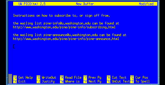
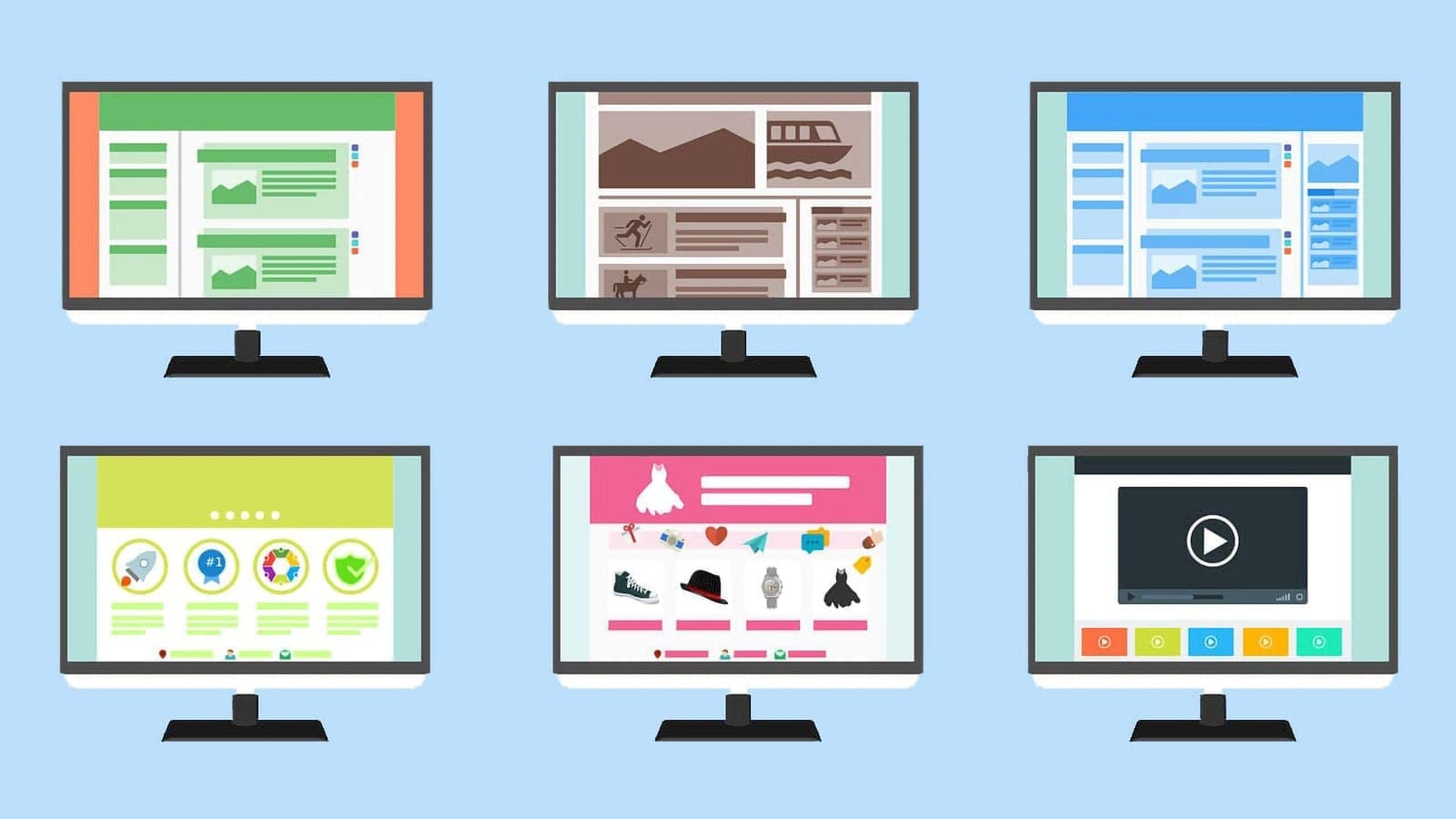
First catching fire in 2010, we haven’t let flat design go since. We ditched the glossy buttons and shadow effects for vector icons and images. In doing so, we went back to our design roots to focus on layout hierarchy and content structure. Some debate has been made that all flat designs look the same, thus killing the creative aspects of web creation. I actually believe that it is simplifying the design-process. In turn this opens up more opportunity to be creative in other areas of web design. Not to mention: looking similar isn’t always a bad thing. As stated by Forbes Steve Widen: “Familiarity creates confidence.” When it comes to websites, familiarity makes users feel that they can trust the site. For examples of the best flat design websites, go to awwwards.com and check out their nominies.
Material Design
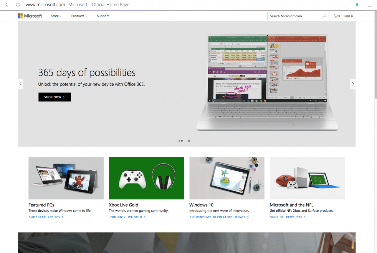
If you haven’t heard of material design yet, then it is about time. Material design is Google’s answer to the next step in the evolution of web design. Like most things that Google does, material design is making waves in the web community and everyone is following in the wake. The goal is to “Create a visual language that synthesizes classic principles of good design with the innovation and possibility of technology and science.” Material design is a spin-off of flat design that focuses on the fundamentals of design while taking it a step further by adding subtle gradients and motion to provide more meaning within designs. The driving force behind this style of design is an emphasis on user actions. This makes the core functionality immediately apparent and provides waypoints for the user.
Mobile Ready Responsive Design
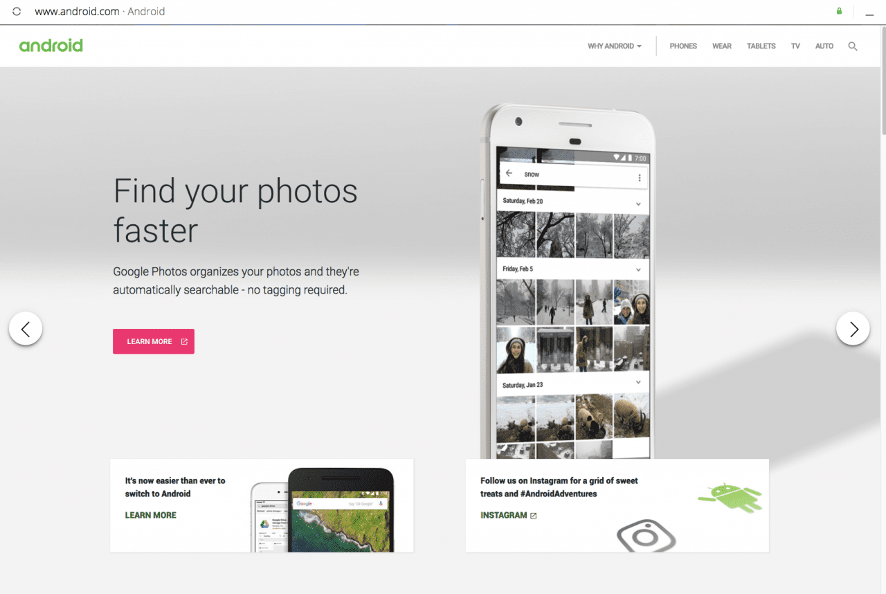
The most important trend that will continue to carry into 2017 is creating mobile-ready responsive designs. As mobile continues to gain importance, you will see websites increasingly dropping the classic, heavy, top navigation in favor of a slimmed down mobile version. Having mobile at the forefront of your design will not only improve your site’s ease of use, but also increase site speed. When you consider that “Mobile devices now account for nearly 2 of every 3 minutes spent online,” it’s no wonder that we are going in the direction that we are.
On the Horizon: Virtual Reality?
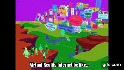
Looking back, you can see that many trends we have today have evolved, and continue to do so, as technology advances and new challenges arise. New ideas arrive out of a changing consumer-based, interactive environment. It seems that we have grasped a solid foundation to hold onto in web design and are now beginning to refine our approaches in building and designing. With exciting new innovations like VR (>Virtual Reality) becoming more common, I am thrilled to see what possibilities this will bring to the web. Who knows? Maybe a virtual space to visit “the internet” is right around the corner.

Responsive design will continue to dominate because it is one of the most effective ways of achieving a good UX.As website providers, we must accept the situation, though, that there’s not a one size fits all situation here. I do believe that offering fewer options, less responsive views, conversions of those websites will go up.
Thanks for the comment! Couldn’t agree more, in most cases to many options can ruin a good thing.
I love the movie just as much as any other 90s kid. But, this is just too funny: http://www.warnerbros.com/archive/spacejam/movie/jam.htm
P.S. if you go to this link (http://www.warnerbros.com/archive/spacejam/movie/cmp/pressbox/credits.html) and look at the bottom of the page for the name, “Darren Olcsvary,” you can download a super-secret soundbyte from 1996. Talk about time capsules.