In my last blog on the basics of designing a logo, we covered principles to follow when designing one of the most important identity pieces for your business. We learned that a successful logo design should be simple, yet versatile enough to be placed on a variety of different media. Visually, its design should appear to be memorable and timeless, yet stay appropriate to its audience.
When working to develop a logo, one big consideration is the type of design you choose. There are wealth of resources out there that cover various logo styles, but in my experience, there are 5 that are most prevalent and also most important. Let’s get started!
1. Symbol / Icon
The symbol or icon logo benefits from being the least complicated style yet the most flexible of all the other logo types. Symbolic/Iconic logos should be able to stand on their own without the company name association. This type of logo should only be utilized by large or international companies where language could play a huge role in consumers not being able to recognize the brand.
Example 1: Here are 3 companies that recently dropped the word mark portion of their logo and now utilizes only the symbol/icon component. Out of the top 100 companies worldwide 6% of them uses this type of logo.
According to a study administered by Tastyplacement.com, only 6% of the top 100 companies in the world implements this type of logo. In other words, startups and other new business ventures should likely stay away from relying on a simple image to define their brand. However, I believe that every business should gradually move towards developing a symbolic/iconic logo because to me it represents a level of awareness that comes with overall success.
2. Word Mark
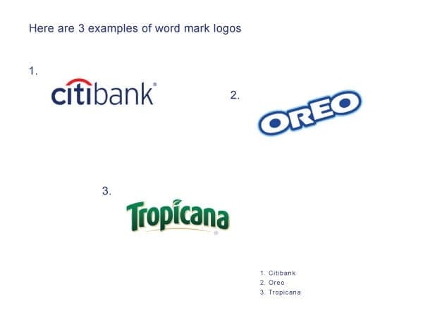
The second type of logo is known as a word mark. Roughly 37% of the top 100 companies worldwide are represented by this type of logo (via Tastyplacement.com). These logos consist of a type font which is styled or manipulated to convey the identity of a business. Even without being styled or manipulated, fonts tend to give off their own impressions. For example:
● Italic – motion, change, timely, continuous
● Bold – strength, power, stability, security
● Script – formal, refined, elegance, prestige
● Hand Written – friendly, playful, happy, childish
Example 2: This graphic showcases 3 word mark logos which uses typefaces that are uniquely styled. Some word mark logos may even include a simple graphic element in the design.
Word mark logos are ideal for new startup businesses because it helps customers familiarize themselves with both the brand name and, ideally, a bit of the brand culture or personality.
3. Letter Mark
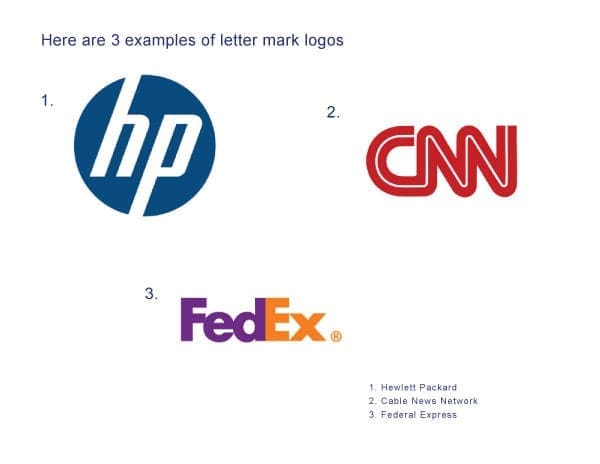
Letter mark logos are very similar to word mark logos in that they are created using typefaces; however, there is greater focus on just using first letter, initials, or an abbreviation of a company’s name to convey their brand identity. Unlike word marks that may contain a simple graphic for clarity, letter marks tend to be exclusively typographic.
Example 3: Letter mark logos are typically typographic using either the first letter, or an abbreviated version of a company's name. This type of logo is utilized by 37% of the top 100 companies globally.
This type of logo is best suited for companies with longer or hard to pronounce names. Companies with names that sound or appear generic can also benefit from letter mark logos as a means of differentiation. As an example, if a friend of yours told you that he was watching a show on “Home Box Office,” you probably wouldn’t have a clue what he was talking about. You may think he was speaking about some new cable network, but “Home Box Office” is none other than the vastly-popular cable channel HBO.
4. Combination Mark
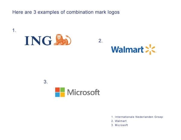
Example 4: Combination mark logos offers the most flexibility because they consist of both a symbol and a word, or letter mark. These elements can be presented together or individually when representing a company. 56% of the top 100 businesses globally uses this type of logo.
Logos that integrates both a symbol/icon with text (word marks) are known as combination mark logos. According to Tastyplacement.com, 56% of the top 100 companies globally uses this type of logo style. A couple of benefits with developing a combination mark logo for your company are:
Having both a symbol and a word mark to represent your company gives you an additional level of flexibility on how your brand appears to customers. As your business grows and changes, parts of the mark can be altered, combined, or separated, but always retain a level of consistency. Many businesses today are following this trend.
Combination mark logos are also easier to register as a trademark than stand alone symbol/icon type logos. Many symbol/icon logos can appear similar without uniquely styled text (word marks) associated with them.
5. Emblem
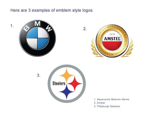
Emblem logos can be considered combination marks to a degree. They are similar because they both include a symbol and text; however, unlike combination marks, emblem style logos are more integrated and enclosed to appear as one single graphic.
Example 5: A large portion of the automobile industry is represented by this type of logo. Emblem logos are also very popular in sports and the beer industry.
Because of this, emblem style logos cannot be presented as separate identity pieces like a combination mark logo, which gives them very little flexibility, especially in print applications or when resizing. This type of logo is very popular in the automobile industry as well as in the sporting world. Emblem style logos tend to resemble a badge or an official seal.
For the last example I decided to showcase DaBrian Marketing Group. Our logo would be classified as a combination mark because it consists of a word mark, a symbol, and a tagline. This type of logo is ideal for our company because we are a small and only made up of 9 employees. We are not well known outside of our coverage area therefore the combination mark logo serves us best.
Are you looking to design a new logo or take your current one in a new direction? Join the discussion in the comments!
When starting a business it is very important to establish some sort of identity or visual presence. This is normally accomplished by the development or creation of a logo to represent your business. Your logo should speak to your audience with little or no explanation needed to justify its meaning. With that being said, there are 5 basic design principles that many designers follow that, more often than not, will ultimately determine the success of your new identity piece. In this blog we will go over these basic principles as well as provide some good examples of each.
1. Make it appropriate or relevant to your audience
Understanding your target audience and/or customers is probably the most important step in creating an effective or successful logo design. Not knowing or having this information may cause you to struggle with the development of your logo. It may even create a big disconnect between you and your target audience. By defining who your audience or customers are, you are then able to keep all the elements within the logo design relevant to them. Some examples of logos that clearly define who’s being targeted are the ones currently representing Gerber, Pantene Pro-V, and Rolex.
Example 1: In the example above there are 3 logos shown that clearly define their target audience. As we all know Gerber markets towards new mothers, Pantene Pro-V markets towards women, while Rolex markets towards the rich and famous.
2. Most successful logos are “simple” in design
After you have defined your target audience, you can then move on to developing and designing your logo. This leads to our next principle, which is to keep the design or idea as simple as possible. It is best to apply the saying “less is more” to this principle. This phrase was actually first popularized by German architect Ludwig Mies van der Rohe, and I believe that this saying has more value or meaning in logo design than any other aspect of creative design. A logo that is too elaborately designed or made up of too many elements generally tends to create issues with things such as resizing, adding color, and most importantly readability. As a major rule, it is best to design the logo in black and white or grayscale before implementing colors. A well-designed logo in black and white usually translates well in color. Some logos that work well in black and white, as well as color are IBM, Nike, and Mercedes Benz.
Example 2: It is a common practice to design a logo in black and white before implementing color. It is very possible that your logo may be successful enough where you do not have to add any color to make it relevant. That choice will be left up to you.
3. Your logo should be memorable
For a logo to be memorable, it should be visually pleasing and easy to remember. A good test to see if your logo has that memorable factor is by removing components or elements from the logo to see if it is still recognizable. Throughout history, many companies have eliminated parts or pieces of their identity without losing any relevancy. There are some key aspects to remember that can help make your logo a memorable one. First, stay away from concepts that mimic logos already in existence. Your logo design should be unique, yet relevant to the audience it’s trying to capture. Second, you should choose a font that best represents your business. Choosing a font can be considered the most crucial step in logo design. According to imjustcreative.com, fonts are the life and soul of the logo. Time spent choosing a font should not be underestimated. Make sure that you choose a font that delivers the right message because choosing the wrong font can be disastrous for you and your logo design. Third, stay away from design trends or social trends when designing a logo because as we know, trends do have a tendency to come and go. Follow them too closely and your logo could meet the same fate. In the examples below, I removed key elements or parts of logos to see if they are still recognizable.
Example 3: Here are 3 logos with key elements or major parts removed. See how quickly and accurately you can identify these brands.
4. Will your logo stand the test of time?
As time passes by, your logo or identity should remain relevant and appropriate to your audience with little or no changes at all. Simply put, the least amount of changes you make to your logo over time the better it is for you and your company. Logos that have that timeless factor or element to them tend to have little or no changes to their design over time, or the changes can be so miniscule that it is almost impossible to tell the difference between the previous and new design. According to brandprofiles.com, your logo should remain relevant 10-20 years down the road. Therefore, redesigning or rebranding your company’s identity or brand isn’t considered a good practice. Simply put, it is all about longevity. Some good examples of this would be the Google, Coca-Cola, and Reebok logos.
Example 4: In this example you can see that Reebok has changed or made slight alterations to their logo since 1895 (10 to be exact). Until the 2008-present version of the logo, they all closely resemble each other to some degree.
5. It must be versatile and flexible
Another key aspect of a successfully designed logo is its ability to be scaled at different sizes without losing quality or readability. Logos should also display well in one color or against different color backgrounds. They should also have the ability to be implemented across various media and within a variety of contexts. Creating a logo in vector format is the most common and recommended practice by designers as a whole. Vector files can be created in programs such as Adobe Illustrator and Inkscape and will give you the most versatility and flexibility when creating or implementing a logo for different media types.
Example 5: This example shows an identity package with a variety of media. As you can see, the logo is implemented differently depending on the type of media it is on. Here you can see the variation of sizes and color.
Conclusion
Now that we have covered the 5 basic principles of logo design, it may be in your best interest to audit your company’s current logo, or a logo that you have been developing to see if the design reflects any or all of these principles. You may also want to critique some busy or complex logo designs to see what the designer could have done differently to make the logos more relevant or ideal to its audience. When looking at and critiquing these logos, keep in mind that some of them may still be considered good designs though they do not follow the 5 basic logo design principles.
Have a question or a tip I didn’t mention? Please add yours in the comments below!
In my last blog we discussed the importance of kerning and tracking in creative design. We explained their meanings and differences; in addition we gave visual examples of each. Besides kerning and tracking there are other key factors to keep in mind when formatting text in creative design. The key factors I decided to focus on in this blog are: widows, orphans, rivers (also known as text rivers), and rags. Although these issues are very common in print design, they can also be as problematic in a digital design space.
Definitions:
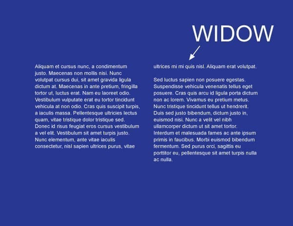
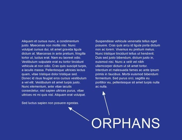
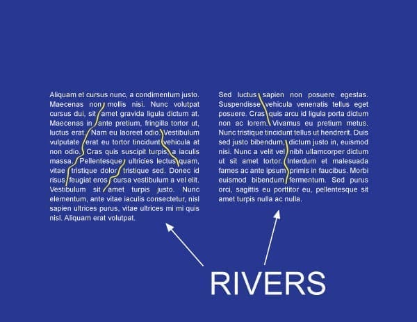
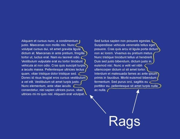
We will begin by defining these terms. First, widows are paragraph-closing lines which were pushed to the next page/column and left dangling and separated from the rest of the paragraph. Second, orphans (which are often confused with widows) are paragraph-opening lines that appear by themselves itself at the bottom of a page/column. In addition, it can be a word, part of a word, or very short line that appears by itself at the end of a paragraph. Orphans can result in too much white space between paragraphs or at the bottom of a page. Third, rivers (or text rivers) are the white gaps (or white space) that can appear in columns of type (especially justified text), when there is too much space between words on consecutive lines of text. Rivers are particularly common in narrow columns of text, where the type size is relatively large. Last but not least, rags can be defined as the imbalanced alignment of text lines. Ragged is the opposite of flush. A text block may be formatted (or justified) to be evenly flush (align) right and unevenly aligned (ragged) on the left. Now that we have defined these terms let us now view visual examples of these terms so that they make more sense.
Example 1: Widows are paragraph-closing lines which were pushed to the next page/column and left dangling and separated from the rest of the paragraph.
Example 2: Orphans are opening lines to a paragraph lines that appear by themselves at the bottom of a page/column. It can also be a word, part of a word, or very short line that appears by itself at the end of a paragraph.
Example 3: Rivers are the white gaps (or white space) that can appear in columns of type (especially justified text), when there is too much space between words on consecutive lines of text.
Example 4: Rags can be defined as the imbalanced alignment of text lines. Ragged is the opposite of flush. A text block may be formatted (or justified) to be evenly flush (align) right and unevenly aligned (ragged) on the left.
How to avoid or fix these four issues:
Some techniques you may use to avoid or fix widows and orphans are by forcing an early page break, hence making the page shorter, adjusting the kerning and/or tracking to produce tighter or looser paragraphs, or even adjust the hyphenation of words within a paragraph. Rivers, or text rivers can be avoided or fixed by adjusting the hyphenation and justification settings, commonly called the “H&J” settings, which can be found in most high end creative design suites. Also note that H&J settings can vary from one program to the next. Like rivers, rags can also be minimized or fixed with the use of H&J settings. You may also want to avoid using justified type as much as humanly possible.
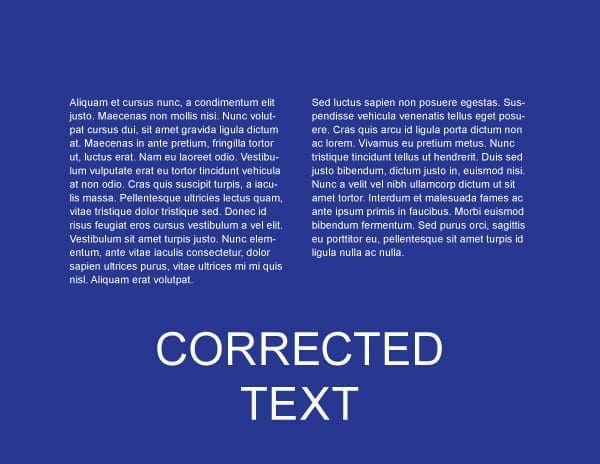
Example 5: This example shows what the text would looks like after fixing widows, orphans, rivers, and rags and adding hyphenation.
Conclusion:
In this blog we defined widows, orphans, rivers, and rags, we also went over some differences and similarities among these terms. Although they several different ways to minimize or avoid these issues in creative design, I came across three ways which I thought were pretty consistent throughout my research on these issues. First, it is best to rewrite portions of the text so your copy can fit the way you intended it to fit. Second, utilize the H&J setting within the design program you are using. Last by not least, adding kerning and tracking values to text maybe the most common practice when dealing with these issues.
When designing a project for digital or print, there are a couple of important aspects in design which must be taken into consideration. These important aspects to remember in design are namely kerning and tracking, known to most people simply as letter spacing. So what do these terms mean? Do they really make such a big difference in design? And how do we tell them apart?
We will start by defining these two design terms. Kerning by definition simply means to adjust the spacing between a letter pairing. Throughout history, characters of the alphabet were never designed with any type of letter spacing in mind; therefore, some letter combinations would appear awkward without applying any type of spacing to them. Presently, a designer can accomplish this process through the use of various page layout programs such as, Adobe Photoshop, Adobe Illustrator, and Quark Express . In most page layout programs, a designer can choose to apply two types of kerning options, namely auto kerning or manual kerning.
The difference between auto and manual kerning
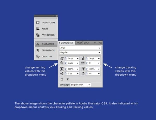
Example of a character box in a typical page layout program
Auto Kerning
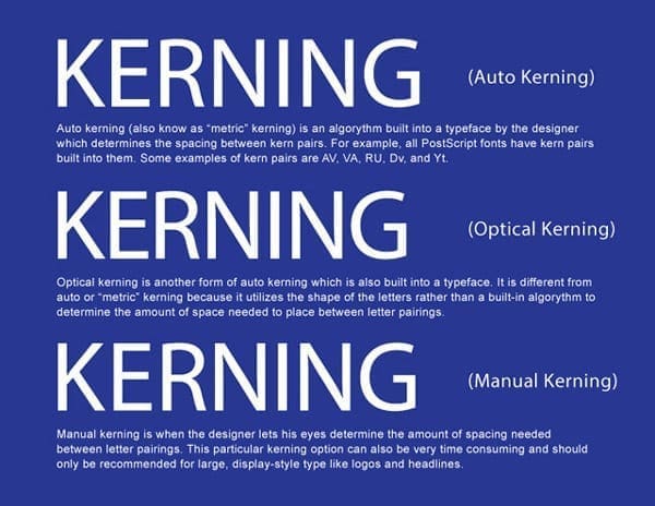
Automatic kerning refers to the kerning applied automatically by a program, as opposed to no kerning at all or the kerning applied manually by the user. There are two types of automatic kerning, namely metric and optical.
Metric kerning utilizes the kerning tables that are built into the typeface. When you select metric kerning in your page layout program, you are using the spacing that was intended by the designer of the typeface. Metric kerning usually looks good, especially at small sizes. Cheap novelty fonts or free fonts often have little or no built-in kerning and will need to be optically or manually kerned.
Unlike metric kerning, optical kerning uses the shapes of letters to determine what spacing is adequate between a pair of letters rather than a kerning table that is built into the typeface. There is some level of control with optical kerning, but this option will not space letters as accurately in comparison to kerning them manually. However, optical kerning can be a great option when mixing and matching different fonts.
Manual Kerning
The final kerning option is manual kerning. This is considered by many to be the preferred option for most designers and typographers. When kerning type manually, the designer’s eye is what determines the letter spacing between letter parings. This process can be very time-consuming and should only be used to kern large, display-style type.
The difference between auto and manual kerning
Tracking
While kerning refers to adjusting the spacing between letter pairs, tracking refers to the overall letter spacing in a selection of letters. This can be a word, a sentence, a paragraph, or an entire document. When applying tracking values, the spacing throughout the text will be equal.
As a rule, designers should adjust the tracking to a body of text before applying any kerning value. If you kern your text first and then apply your tracking values, you will negate the kerning values that were previously applied.
Examples of tracking text with different values
What Designers Need to Keep in Mind
Now that we have discussed and defined the differences between kerning and tracking in design, the following are some things to remember when manipulating text’s kerning and tracking:
Always start with the difficult pairings, like capital/lowercase pairings, diagonal letters (like X, V, and Z) and round letters (like O, B, and D).
Adjust kerning values as a last step in your design, especially after you choose a font. Remember every font is different.
Try kerning your text upside down. Kerning text upside down can help to focus on letter pairings rather than the entire word..
The goal of kerning is for the type to appear optically correct. There is no secret formula to this process, and often times it just takes practice.