• Skip to primary navigation
  • Skip to main content
  • Skip to primary sidebar
  • Get A Quote
  • 610.743.5602
  • Schedule A Meeting
default-logo
Menu
  • About
    • Team
    • Careers
    • Work
  • HubSpot Agency
    • Marketing Hub
      • Setup & Strategy
        • Inbound Success Plan
        • Inbound Marketing Plans
      • Traffic Generation
      • Lead Conversion
      • Lead Nurturing
    • Sales Hub
      • CRM Implementation
      • Sales Enablement
      • Sales & Marketing Alignment
    • Content Hub
  • Digital Marketing
    • Inbound Marketing
      • Inbound Marketing Plans
    • Content Marketing
    • Email Marketing
    • SEO
    • Social Media Marketing
    • PPC Management
  • Digital Analytics
  • Web Design
    • Shopify Web Design
    • CMS Hub
    • Branding/Graphic Design
    • Our Work
    • Hosting & Maintenance
  • Blog
    • Small & Mid-Sized Business Resources
    • Client Referral Program

Archives for April 2015

Five Free Tools Every Web Designer Should Have

April 29, 2015 by Mark Mapp Leave a Comment

As a Web Designer, I am always looking for ways to save time and money. One of the best ways to accomplish this is by utilizing some of the free tools offered online. It is best to test these tools to make sure you’re finding exactly what you are looking for. Most of these tools were created by other Web Designers or Developers and for the most part should work fairly well. The more tools you can add to your design palette, the more time and money you can save.

Here are five of my favorite tools you can find online free of charge, to get your web design palette started:

1. Color Pickers

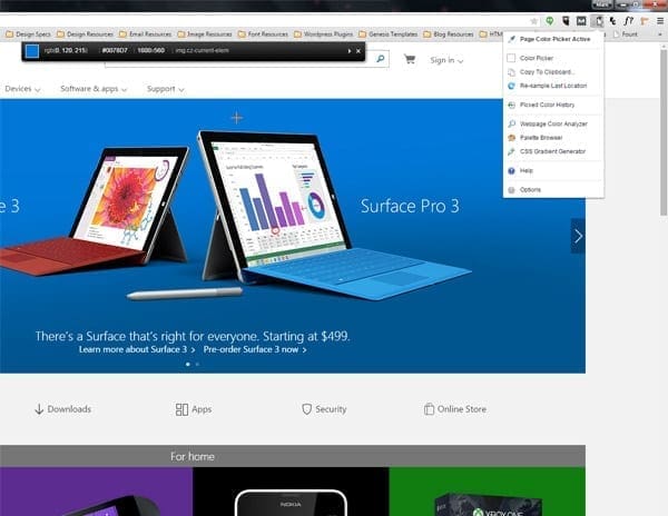
There are many free color pickers available on the web, but my favorite one to use is ColorZilla. With over 5 million downloads, it is considered to be one of the most popular browser extensions on the web; finally, this extension has been made available for Chrome. Some of my favorite features Colorzilla provides are an eyedropper, a page analyzer, a color history tab, a CSS generator, and a palette viewer with 7 pre-installed palettes. In addition to the features I’ve mentioned you may find other useful ones here that can help simplify your everyday design tasks.

Screen shot of colorzilla

2. Font Identifiers

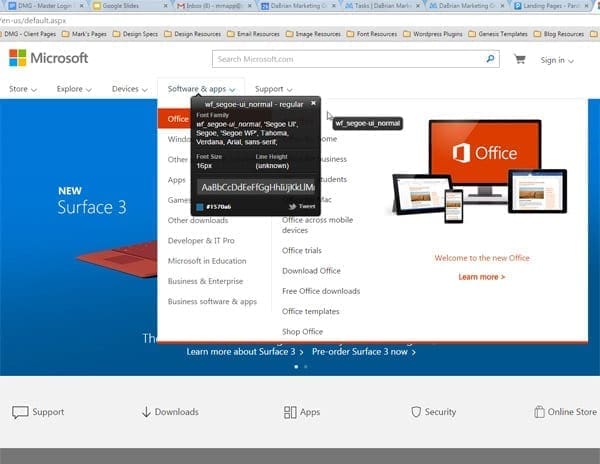
Another one of my favorites tools is the “What Font” extension. This extension gives you the ability to identify any font used within the the structure of a web site. This is probably the area I struggle most with clients. It is very seldom that a client is able to provide you with this information without going through hoops. “What Font” extension will help you to elimination that waiting period. All font identifiers for the most part offers the same features and benefits. For example, with “What Font you are able to reveal the font family (which even providing a visual), font size, line height, and hex color codes which you can then implement into any design program for use.

Screenshot of what font

3. On-Line/Digital Rulers

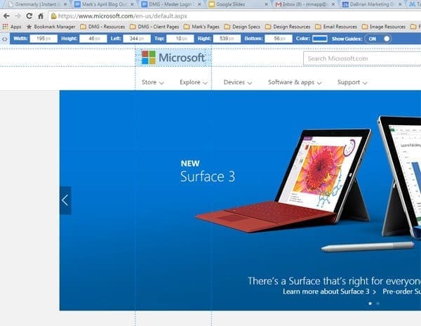
Changing your screen resolution can make things appear larger or smaller according to the setting chosen. The smaller the resolution specs are the larger the elements appear on the page. This doesn’t mean that the actual size of elements on the page physically changed. In fact, more often than not they stay the same. Using an online ruler such as “Page Ruler” would prove this fact. Anytime you are in need of on-screen measurements these digital rulers will absolutely come in handy. There are two unique features offered in the Page Ruler extension that other may not offer. First, there is the “Element Mode”, which allows you to outline elements on the page as you mouse over them (must be enabled first). Second, Page Ruler allows you to navigate through parents, children and sibling elements of any measured element.

Screenshot of page-ruler

4. Screen Capture Software

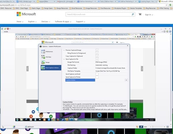
Screen capture software is probably the tool that I utilize the most on a daily basis. I use it for several everyday task such as proofing layout ideas to clients, posting approvals or changes to coworkers about specific tasks, or even using the screen capture to help created unique graphics or images to use in other projects. My screen capture software of choice is “Gadwin Printscreen”. I’ve been using this tool for quite some time now and highly recommend it’s usage. Some of Gadwin Printscreen’s unique features include the ability to export to 5 different file types, send captured images via email or directly to a printer source, as well as choosing a default output size for the captured image. It really comes in handy when creating posters of web pages we previously design to hang on our office walls. These posted are 18” x 24” in size so that should give you a pretty good idea the quality of the outputted files.

Screenshot of gadwin printscreen

5. Web Browsers

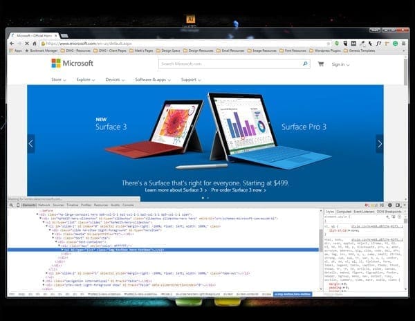
The most important tool utilized by a web designer would more than likely be the considered the web browser. Today, there are numerous web browsers available. Internet Explorer, Firefox, and Chrome are the browsers most commonly used by many; however, there are several others out there such as Opera, Maxthon, Sea Monkey, and Midori. I personal have up to 8 different browsers installed on my PC at any given time. Since each web browser renders web pages differently, it is recommended to test your designs in as many browsers as possible. Most browsers also include web page inspectors which allows designers to view code and make edits to see how elements may behave on a page.

Screenshot of chrome browser

Since there are so many free tools out there on the web for Web Designers to take advantage of, it is important that you fully test or maximize their capabilities. The more a tool can accomplish the better. If there are any other tools you would like to mention or add to this post please leave your comments below.

Filed Under: Web Design

4 Questions for Your Business Organic Search Audit

April 22, 2015 by Daniel Laws Leave a Comment

There’s not a business on the planet that doesn’t want more leads and sales.  In today’s marketing environment, it starts with search rankings or does it? SEO is about keyword relevancy and intent so SEO crosses over into other marketing tactics.

How does an SEO audit impact your business goals?

The purpose of a website or SEO audit is to evaluate the existing position of your website as it relates to search engine performance. Sometimes it’s not the keywords or rich snippets that are impacting SEO, it’s your website. The audit will provide you with information to prioritize your need to grow your business, improve your search engine results, and generate more leads. You can draw some parallels from being a GM in the NFL. You have to evaluate your team, staff, facilities, etc. The evaluation provides you with a plan and a course of action to achieve the ultimate prize of an NFL Championship.

seo audit

Do You have the Resources to Act on SEO Evaluation?

There are a number of SEO audit tools out there on the web. They range from free to paid solutions but never ask any questions about your resources (webmaster, programmers, tools, seo consultants, etc.) to fix the problems. Someone may have done some type of SEO work but what was or was not included in the SEO project.  The bottom line is if you don’t have the resources or know how to make any changes, what’s the point of the SEO evaluation? It’s the equivalent of a team having the number 1 pick in the NFL Draft without the money to pay, coaches to prepare, and facilities to train or the ability to keep him.

seo evaluation resources

Are you looking at SEO trending (#mobile)?

The SEO landscape continues to change for mobile, (Mobilegeddon) desktop and tablet. In addition, you need to take into consideration your specific business and the competitive landscape. In general, website audits software does not account for this. Again using the football analogy, the entire league is turning into a pass happy league, so the question is do you have a plan to account for the trending. If not, what’s the game plan for the future and the competitive landscape (talent, scheme, etc)?

seo trends expectations

Are you realistic with your SEO expectations?

I have clients or prospects call the office all the time with this statement that I want to be number one in the search engine results. It’s ok to have this expectation if you’re fairly well positioned within the search engine results but if your website is a structural or content nightmare, let’s get real! It’s like the equivalent of Raiders talking about winning the championship when they haven’t made it to the playoffs in almost a decade. So, please set realistic expectations and not dreams!

When you decide to run an SEO audit for your business I recommend settings goals and evaluating whether or not you’re going to be able to do anything with the information provided. Consider the resource that you may have to actually fix the problem/s. Take a look at your industry trends to prepare for your business future and the competitive landscape.  Be realistic with your expectations after your analysis and plan the next steps.

Filed Under: Search Engine Optimization (SEO)

Best Practices for Creating Testimonials

April 15, 2015 by Dabrian Marketing Group Leave a Comment

When creating a testimonial video there are some best practices that you should know and follow. These practices will help in structuring your videos correctly, gaining your target audience’s undivided attention, and providing a level of consistency throughout your projects. The ultimate goal of these best practices is to keep your testimonial videos simple, yet effective.

Knowing Your Audience

Having a target audience in mind before creating a testimonial video is very important.  Is the video trying to sell a product or service, a testimonial for a company, or is the video just for entertainment?  Knowing what audience that is being targeted will help the video stay focused. If the video loses focus of the target audience it will be off point.

Know the Right Length?

The appropriate length of the video will depend on the type of project. There are many different lengths that are suggested, but most lengths are a generalization(see allpromedia.com).  If the video is an advertisement, 15 to 30 seconds is the most effective length. If the video is a testimonial, 5 to 7 minutes is ideal. Most videos that are for any other project should be 2 to 4 minutes. Achieving the correct length of time will help the video be the most effective it can be to the audience.

Use Transitions in Moderation

Transitions are a great way to make hard cuts softer in the video.  When using a transition, make sure to use one that is appropriate for the video that is being worked on.  It is recommended that using the same transition will keep the video flowing steadily and will not be distracting.  Do not use too many transitions, as too many will be distracting and ruin the flow of the video.

Transitions from WeVideo.com

Separate Video and Audio for the Best Quality

When recording a video be sure that there is a separate audio recording device. If you do not have a proper recording device the quality of the audio that comes from the video recorder will not be the best quality.  Having a microphone that is closer to the speaker will produce clear and audible sounds for the listener.

Eliminating Background Noise

Recording audio separately from the video will help cut down on background noises and other ambient sounds.  Background noises that should be removed are other voices, sounds from outside sources, and the buzz from the microphone.  All of these sounds will be distracting and could be overpowering to the listener.

Conclusion

So with the rapidly dwindling attention of viewers, following these best practices will help keep those viewers engaged and help your videos achieve your goals.
These best practices tips will help keep videos focused and viewer interested.

Filed Under: Video Marketing

Mark your Calendars: Google’s New Algorithm is Coming

April 8, 2015 by Dabrian Marketing Group Leave a Comment

Google’s “Mobilegeddon” will begin on April 21st. This means that Google is no longer just recommending mobile friendly sites, they are requiring it. A study from Adobe found that 45% of businesses don’t have a mobile-optimized site or a mobile app. This means nearly half the businesses with an online presence will be penalized and see a significant drop in traffic. If your site is not mobile friendly, what are you waiting for?

Listed below are 5 mistakes to avoid while creating your mobile site in order for it to excel.

Not Considering Mobile First Design

According to Seoclarity, mobile search currently makes up about 30% of total traffic, regardless of the industry, and will only continue to grow. When designing your website, consider making your mobile site first. Create a simple, yet effective page with the user’s experience in mind. A study by MediaPost shows that 48% of mobile shoppers said that “ease of use” is their most important quality they look for in a mobile site. So just remember the old acronym K.I.S.S (Keep, it, simple, stupid).

After that, use your mobile site as a core basis of developing your desktop view. There is nothing you can put on a mobile site that can’t be loaded on a desktop. Progressively enhance your page with extra information and a more extensive navigation (as long as it’s relevant).

Not a Responsive Site

So you’re interested in mobile, but the thought of having two separate sites sounds difficult and time consuming. Well the good news is you don’t have to, nor should you. A responsive design, using the same site for both mobile and desktop, is the best option. In fact, Google actually recommends this approach. A responsive site is more efficient for Google to scan and review, making it more likely that your content will show in the search results. It also eliminates the possibility of being penalized for duplicate content as you most likely would for having two separate sites.

Consistent web design is also important because multiple device screening is becoming extremely prevalent. In fact, Google reports that 67% of online shoppers use multiple devices during their process. Users will look at products on mobile and revisit later on a desktop (or vice versa) hoping their history, preferences, and shopping cart is synced. The longer the conversion (sale or lead generation) process takes, the more likely the user will not complete it.

No Mobile Search Strategy

Since you’re using a responsive site, you can use the same search strategy, right? Not necessarily. Typically mobile users have different interest and intent than those on desktops. To develop theses strategies, use Google Webmaster’s tools and apply a mobile filter to your search query information. Compare the similarities and differences among mobile and desktop and begin to develop a list of keywords from that. Then do mobile competitive analysis using tools such as SEMrush, SearchMetrics, Sistrix or SimilarWeb, to develop a masters list. If your competitors do not have mobile sites, this is the perfect opportunity to get a leg up.

Not Assessing Mobile

Just because you have a mobile site does not mean it is mobile friendly. It is in an owners best interest to test the functionality of their site, among different devices and operating systems. Also they should check for any crawling issues or error reports (especially 404’s). Besides the technical aspect, ask yourself, “are SEO best practices still being followed?” Relevant and unique content, tags, titles, meta descriptions, site speed, etc should all be accounted for.

Evaluate the performance of your mobile page. This will show you the intent of these users. Which pages are receiving the most visits, have the longest view duration, and have the highest conversions? Make sure these pages are easy to get to by placing them in the navigation bar. Also asses which pages have a higher bounce rate on mobile. This could be an indicator of an error, or that the page is just not relevant to mobile users.

Still not sure where your stand? Google offers a free tool to test your sites mobile friendliness.

Not considering the impact on local search

According to Think With Google,  94% of Americans with smartphones search for local information on mobile. If that’s not enough to grab your attention, Google also polled mobile users searching for local businesses and discovered that half of them visited the business that day. This means your mobile strategy should be geared locally. To guarantee you are maximizing your reach and visibility, make sure your address, phone number, email, and any other business information is accurate and consistent. This information should not only be a resource, but provide as a simple and efficient channel for the consumer to further connect with your business as well. Consider adding a click-to-call button, syncing your location to Google maps, and making sure all email addresses are linked. This not only generates more traffic, but also will lead to more leads and sales.

Google’s “Mobilegeddon” on April 21st is the biggest update concerning mobile thus far,but it most likely is only the first of many more to come. If you are not mobile friendly by the time it is released, your visibility will certainly decrease and expect a substantial drop in traffic.

Do not wait for your site to be penalized, call DaBrian Marketing (610.743.5602) and create a mobile site now!

By: David McDowell

Filed Under: Mobile Marketing, Search Engine Optimization (SEO), Web Design

Primary Sidebar

Archives

Categories

Subscribe Now


CONTACT INFORMATION

DaBrian Marketing Group
3535 N. 5th Street HWY
Suite 2, #203
Reading, PA, 19605

  • 610.743.5602
  • Mon - Fri: 9AM - 5PM
Contact Us
Web Support

RESOURCES

  • Case Studies
  • White Papers
  • eBooks
  • Small Business Resources
  • Our Blog

MARKETING

  • Financial Services
  • Health & Wellness
  • Ecommerce & Retail
  • Business 2 Business
  • Business 2 Consumer

VISIT OUR LOCATION

  • Get Map & Directions

CONNECT WITH US

Facebook Instagram Linkedin Rss Twitter Youtube

Copyright © 2025 DaBrian Marketing Group  •  All Rights Reserved  •  Privacy Policy

Scroll Up