• Skip to primary navigation
  • Skip to main content
  • Skip to primary sidebar
  • Get A Quote
  • 610.743.5602
  • Schedule A Meeting
default-logo
Menu
  • About
    • Team
    • Careers
    • Work
  • HubSpot Agency
    • Marketing Hub
      • Setup & Strategy
        • Inbound Success Plan
        • Inbound Marketing Plans
      • Traffic Generation
      • Lead Conversion
      • Lead Nurturing
    • Sales Hub
      • CRM Implementation
      • Sales Enablement
      • Sales & Marketing Alignment
    • Content Hub
  • Digital Marketing
    • Inbound Marketing
      • Inbound Marketing Plans
    • Content Marketing
    • Email Marketing
    • SEO
    • Social Media Marketing
    • PPC Management
  • Digital Analytics
  • Web Design
    • Shopify Web Design
    • CMS Hub
    • Branding/Graphic Design
    • Our Work
    • Hosting & Maintenance
  • Blog
    • Small & Mid-Sized Business Resources
    • Client Referral Program

Web Design

Rackspace vs. GoDaddy Hosting Platforms

December 9, 2014 by Dabrian Marketing Group 2 Comments

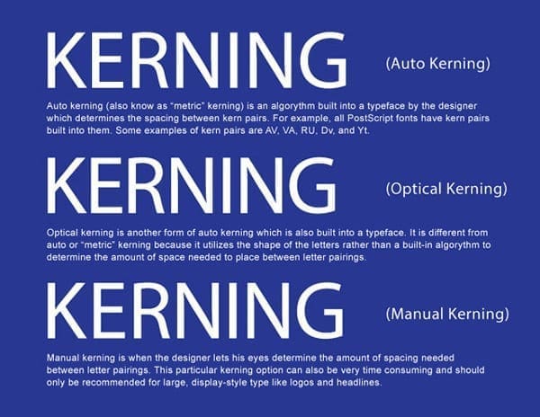
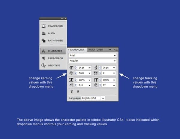
Rackspace eCommerce Platform

A new contender has joined the eCommerce competition. Rackspace is a UK-based web hosting company that boasts some premium services, but they have been known to be on the expensive side. Compare them to GoDaddy, the widely popular (and often less pricy) eCommerce hosting company, and it might seem like the decision between these two is easy. Let’s see how these two eCommerce platforms stack up against one another.

Rackspace eCommerce Hosting

Some advantages of Rackspace include…

  • They have nice diagnostic tools like page load speed checker and downtime cost calculator. Those alone can make a huge difference for webmasters when it comes to troubleshooting issues on an eCommerce site.
  • They have reliable hosting and rarely experience outages.
  • If your eCommerce site receives a sudden influx of traffic, Rackspace can easily manage the bandwidth.
  • Rackspace is well-known for their excellent security. We have yet to see them make a list of
    “hacked hosting companies.”
  • Rackspace offers multiple eCommerce software options, including the ever-popular Oracle and Magento.
  • In our team’s experience, Rackspace has had excellent customer and technical support.
  • Rackspace has 24-hour support, so there’s no need to worry if you ever have an issue.

The disadvantages…

The price. Their lowest eCommerce package is $300 a month.

Rackspace
Rackspace

GoDaddy Hosting

Some advantages are…

  • Pricing for GoDaddy is much less expensive than Rackspace–you can generally get hosting packages in the $5-$10 a month range.
  • In a span of 5 years, they have been reported to only of been down for 6 total hours. That’s quite impressive, even though they have received more media coverage than some smaller hosting companies.
  • There are several various add-ons you can implement on your eCommerce site (though most of them require you to purchase access to them). The add-ons differ from Rackspace; Godaddy’s add-ons are more along the lines of email, SSL, domains, etc.
  • They have 24/7 customer support.

The disadvantages…

  • Even though they have round-the-clock support, we’ve noticed that we often get transferred through several departments before we get to someone who can help solve our issue(s).

Because they’re so popular, they’re usually targeted for malicious attacks. So even though they claim to have excellent security, they’re not completely protected from hackers.

GoDaddy
GoDaddy

If you are a smaller eCommerce company that does not max out its bandwidth and uses little space on your server, then GoDaddy may be your best bet. If you have a larger or resource-intensive website and choose GoDaddy, you may find yourself dealing with customer service a lot. To save yourself that time and aggravation, you may wish to check out Rackspace and determine if the higher cost is the most effective business decision.

Have a question about these two eCommerce platforms? Leave us a comment below!

Filed Under: Marketing Strategy, Web Design

An Introduction to WordPress Frameworks

October 15, 2014 by Dabrian Marketing Group 1 Comment

What is a WordPress Framework?

A WordPress framework is similar to any normal theme in WordPress. The major difference between the two is that a framework requires a child theme to add custom styles. A custom style adds new code with the intent of changing the look and feel of the theme you choose. Basically, a WordPress framework takes care of the functionality and holds onto the basic code, and it requires a child theme for additional styling.

Wondering how to use a framework and a child theme? It’s as simple as uploading the files of your chosen framework into your themes  via FTP. Then you just have to upload your desired theme and set it as active. That’s all there is to it. The order of these steps is important. If your framework isn’t uploaded prior to your theme, the components may not work correctly.

Two examples of WordPress frameworks Genesis and Cherry.
Two popular WordPress frameworks, Genesis and Cherry

Advantages of WordPress Frameworks

  • WordPress frameworks speed up the web development process because you will already have the basic structure of the site. As a developer you just need to pick a theme on that framework and modify the look and feel based on your needs.
  • Frameworks experience faster load times when compared to normal WordPress themes. This is because it is free both of junk code and heavy graphics. Most framework themes must meet certain standards in order to be released for use.
  • Frameworks are frequently updated, and you will always receive the latest features. This is the advantage that initially sold me on frameworks. Theme frameworks rely on child themes, which means when you upgrade you will keep all of your custom changes. You will never have to change what you did a month ago because of an update!
  • If you choose to use a popular theme framework, it will have a huge community behind it which you can use as you develop your business online. Having a community behind you is always a huge plus.
  • There are many different kinds of frameworks available to fit your needs and degree of programming knowledge. You can use a free framework, or you can go with a paid option. There are frameworks with drag-and-drop interfaces as well as those that are strictly programmer-based (see below).
programmer-based wordpress frameworks
Interface of a programmer-based framework. This type is very different from more user-friendly frameworks
  • If you are constantly updating your website, then you likely understand the value of SEO. Most frameworks come with built-in options for SEO and/or are optimized for search engines.

As you might expect, nothing is perfect in the world of web technology. Below are a few of the disadvantages of using WordPress frameworks.

Disadvantages of WordPress Frameworks

  • As mentioned above, some of these frameworks do cost money. Two examples of the most popular paid frameworks are Genesis and Thesis. Unfortunately, most of the feature-packed frameworks are not free. Some of them cost a one-time or recurring fee. In some cases you’ll have to pay for additional upgrades as well. This reinforces the need to conduct research based on the functionality you’re looking for and deciding which option is best for your business.
  • As also mentioned above, working with frameworks has a bit of a learning curve. All frameworks are coded differently, and if it has a unique interface, it will take time to learn. After you allocate some time to learn the framework you picked, however, it will actually save a lot of time going forward.
  • Nothing is perfect, and frameworks are no exception. They might force you to overwrite core files in WordPress, and you need to be aware of this when you’re looking for a framework to use. Most of the time, you’ll receive a warning from the framework if it’s replacing WordPress files. We highly recommend making regular WordPress backups just in case.

Overall, the pros definitely outweigh the cons for WordPress frameworks. While we were hesitant at first to use frameworks, we now love using them. After getting used to using the framework, it nearly cut our development process in half.  As you get started in WordPress, hopefully you’ll give frameworks a try. In our experience, they can definitely make things more efficient (and save a few headaches as well). We’ll be covering more on frameworks in the future, so stay tuned!

Have a question about WordPress frameworks? Ask away in the comments below!

Filed Under: Web Design Tagged With: web design

Are You a Web Designer or a Web Developer?

October 2, 2014 by Mark Mapp 14 Comments

These two roles are often substituted for one another, however they both carry their own weight – and rightfully so. After all, they are the two main ingredients in any effective web design process. A web designer focuses on the aesthetics, or the “look and feel” of a website, while web developers concentrate primarily on the functionality, such as what happens when you click a button or submit a contact form. Although there are quite a few people out there who may be able to handle the tasks of both a web designer and a web developer, these two professions typically work together to bring web experiences into existence. This week, I’m going to cover some other characteristics that separate these two important professions.

Design and source code view of a webpage.
Here is an image example showcasing the design view of a website as well the source code view in Google Chrome, one of the most popular web browsers.
Web inspector view of a web page.
Web inspectors allow designers and developers to view the design and code of a website in one browser window. Typically used for troubleshooting purposes.

Let’s Start with Education

Web designers typically attain a 2-4 year degree in a visual arts or graphic design program. They often learn to use a variety of creative suites, as well as several WYSIWYG editors to help them develop the aesthetic look and feel of the websites they create. Although having HTML knowledge is also a major plus for web designers, it isn’t surprising if a majority of them do not have any knowledge of HTML outside of what Adobe Dreamweaver and some other basic web editors.

A web developer’s education, on the other hand, is mainly technical-based. They often attain some type of 2-4 year computer science or programming degree where they will learn programming languages such as HTML, HTML5, Java, JavaScript, CSS3, SQL, PHP, and C++. Having ample knowledge of these languages enables the developer to produce a properly-functioning website. Web developers or programmers may also dabble with Adobe Photoshop to help with simple tasks such as resizing images and color changes, but spend most of their time using various text editors to complete their tasks.

Web page layout in Adobe Photoshop.
Here’s a website template being visually created in Adobe Photoshop using a variety of graphics and layers. Absolutely no coding is required for these layouts.

Software, Tools, and Resources

The software and tools that designers and developers use on a daily basis also differ. A web designer’s software suite would include an image editor like Adobe Photoshop or Gimp, a vector-based program like Adobe Illustrator or Inkscape, and possibly a WYSIWYG web page editor like Adobe Dreamweaver or Kompozer. Other resources a web designer may use are color pickers, on-screen rulers, lorem ipsum text generators, and stock photography websites.

Unlike the web designer whose software collection consists mainly of creative suites, a web developer’s toolkit would most likely include a text editor such as Notepad++, an FTP client like Filezilla, as many internet browsers as possible for testing purposes, and different types of Web (Code) inspectors which are usually built into the browsers themselves. In addition, web developers also tend to use CMS (Content management Systems) platforms such as WordPress, Drupal, and Joomla to help streamline the implementation of content on a website.

Wysiwyg software view of a web page.
Adobe Dreamweaver is a very popular WYSIWYG (what you see is what you get) web design program which can also be used to edit HTML and CSS files.
Analyzing code using a text editor.
This image shows what typical HTML code would look like in a text editor; in this case, Sublime Text 2.

As part of the web design process

As mentioned above, web designers and web developers often work together on web design projects. Most initial conversations in the web design process have to do with the aesthetics, or the “look and feel” of a website. Clients will generally have an idea of what they want their website to look like and the audience they are targeting. A graphic designer would then use his creativity, the client’s design principles, and their collection of tools and resources to visually layout design concepts. Once a layout is approved, functionality becomes the focus. This is when the skill set of a web developer is required. Besides developing the website from scratch using one of several coding languages available, a web developer would also work on technical components like databases, online forms and applications (and the actions they require to be submitted), as well as client login portals. Even when the web design project is considered complete and uploaded to the Web, web developers can still spend countless hours troubleshooting issues that arise. Troubleshooting websites and web pages is a continuous process and generally web designers have little or nothing to do with this task.

In Conclusion

With the information provided, hopefully you’ve got a better understanding of what the differences between a web designer and a web developer are. The differences really are like night and day, and their definitions should not be substituted for each other. If you are an individual or a business looking to hire a web designer or a web developer you should know their strengths, but you should also know what their limitations are. This will help you to make the best decision possible in deciding the resources you need moving forward.

What do you think are the biggest differences between web designers and developers? Let us know in the comments!

Filed Under: Web Design Tagged With: web design, web development

Designing a Logo? Here Are 5 Basic Design Principles to Follow

June 4, 2014 by Mark Mapp Leave a Comment

Introduction

When starting a business it is very important to establish some sort of identity or visual presence. This is normally accomplished by the development or creation of a logo to represent your business. Your logo should speak to your audience with little or no explanation needed to justify its meaning. With that being said, there are 5 basic design principles that many designers follow that, more often than not, will ultimately determine the success of your new identity piece. In this blog we will go over these basic principles as well as provide some good examples of each.

1. Make it appropriate or relevant to your audience

Understanding your target audience and/or customers is probably the most important step in creating an effective or successful logo design. Not knowing or having this information may cause you to struggle with the development of your logo. It may even create a big disconnect between you and your target audience. By defining who your audience or customers are, you are then able to keep all the elements within the logo design relevant to them. Some examples of logos that clearly define who’s being targeted are the ones currently representing Gerber, Pantene Pro-V, and Rolex.

Relative logo design examples
Example 1: In the example above there are 3 logos shown that clearly define their target audience. As we all know Gerber markets towards new mothers, Pantene Pro-V markets towards women, while Rolex markets towards the rich and famous.

2. Most successful logos are “simple” in design

After you have defined your target audience, you can then move on to developing and designing your logo. This leads to our next principle, which is to keep the design or idea as simple as possible. It is best to apply the saying “less is more” to this principle. This phrase was actually first popularized by German architect Ludwig Mies van der Rohe, and I believe that this saying has more value or meaning in logo design than any other aspect of creative design. A logo that is too elaborately designed or made up of too many elements generally tends to create issues with things such as resizing, adding color, and most importantly readability. As a major rule, it is best to design the logo in black and white or grayscale before implementing colors. A well-designed logo in black and white usually translates well in color. Some logos that work well in black and white, as well as color are IBM, Nike, and Mercedes Benz.

Simple logo design examples
Example 2: It is a common practice to design a logo in black and white before implementing color. It is very possible that your logo may be successful enough where you do not have to add any color to make it relevant. That choice will be left up to you.

3. Your logo should be memorable

For a logo to be memorable, it should be visually pleasing and easy to remember. A good test to see if your logo has that memorable factor is by removing components or elements from the logo to see if it is still recognizable. Throughout history, many companies have eliminated parts or pieces of their identity without losing any relevancy. There are some key aspects to remember that can help make your logo a memorable one. First, stay away from concepts that mimic logos already in existence. Your logo design should be unique, yet relevant to the audience it’s trying to capture. Second, you should choose a font that best represents your business. Choosing a font can be considered the most crucial step in logo design. According to imjustcreative.com, fonts are the life and soul of the logo. Time spent choosing a font should not be underestimated. Make sure that you choose a font that delivers the right message because choosing the wrong font can be disastrous for you and your logo design. Third, stay away from design trends or social trends when designing a logo because as we know, trends do have a tendency to come and go. Follow them too closely and your logo could meet the same fate. In the examples below, I removed key elements or parts of logos to see if they are still recognizable.

Memorable logo design examples
Example 3: Here are 3 logos with key elements or major parts removed. See how quickly and accurately you can identify these brands.

4. Will your logo stand the test of time?

As time passes by, your logo or identity should remain relevant and appropriate to your audience with little or no changes at all. Simply put, the least amount of changes you make to your logo over time the better it is for you and your company. Logos that have that timeless factor or element to them tend to have little or no changes to their design over time, or the changes can be so miniscule that it is almost impossible to tell the difference between the previous and new design. According to brandprofiles.com, your logo should remain relevant 10-20 years down the road. Therefore, redesigning or rebranding your company’s identity or brand isn’t considered a good practice. Simply put, it is all about longevity. Some good examples of this would be the Google, Coca-Cola, and Reebok logos.

Timeless logo design examples
Example 4: In this example you can see that Reebok has changed or made slight alterations to their logo since 1895 (10 to be exact). Until the 2008-present version of the logo, they all closely resemble each other to some degree.

5. It must be versatile and flexible

Another key aspect of a successfully designed logo is its ability to be scaled at different sizes without losing quality or readability. Logos should also display well in one color or against different color backgrounds. They should also have the ability to be implemented across various media and within a variety of contexts. Creating a logo in vector format is the most common and recommended practice by designers as a whole. Vector files can be created in programs such as Adobe Illustrator and Inkscape and will give you the most versatility and flexibility when creating or implementing a logo for different media types.

Versatile/Flexible logo design examples
Example 5: This example shows an identity package with a variety of media. As you can see, the logo is implemented differently depending on the type of media it is on. Here you can see the variation of sizes and color.

Conclusion

Now that we have covered the 5 basic principles of logo design, it may be in your best interest to audit your company’s current logo, or a logo that you have been developing to see if the design reflects any or all of these principles. You may also want to critique some busy or complex logo designs to see what the designer could have done differently to make the logos more relevant or ideal to its audience. When looking at and critiquing these logos, keep in mind that some of them may still be considered good designs though they do not follow the 5 basic logo design principles.

Have a question or a tip I didn’t mention? Please add yours in the comments below!

Filed Under: Digital Branding, Web Design Tagged With: 5 basic principles, Logo Design, web design

Widows, Orphans, Rivers, and Rags

April 3, 2014 by Mark Mapp 1 Comment

Introduction:

In my last blog we discussed the importance of kerning and tracking in creative design. We explained their meanings and differences; in addition we gave visual examples of each.  Besides kerning and tracking there are other key factors to keep in mind when formatting text in creative design. The key factors I decided to focus on in this blog are: widows, orphans, rivers (also known as text rivers), and rags.  Although these issues are very common in print design, they can also be as problematic in a digital design space.

Definitions:

We will begin by defining these terms. First, widows are paragraph-closing lines which were pushed to the next page/column and left dangling and separated from the rest of the paragraph.  Second, orphans (which are often confused with widows) are paragraph-opening lines that appear by themselves itself at the bottom of a page/column. In addition, it can be a word, part of a word, or very short line that appears by itself at the end of a paragraph. Orphans can result in too much white space between paragraphs or at the bottom of a page. Third, rivers (or text rivers) are the white gaps (or white space) that can appear in columns of type (especially justified text), when there is too much space between words on consecutive lines of text. Rivers are particularly common in narrow columns of text, where the type size is relatively large. Last but not least, rags can be defined as the imbalanced alignment of text lines. Ragged is the opposite of flush. A text block may be formatted (or justified) to be evenly flush (align) right and unevenly aligned (ragged) on the left. Now that we have defined these terms let us now view visual examples of these terms so that they make more sense.

Widows, Orphans, Rivers and Rags - Reading, PA
Example 1: Widows are paragraph-closing lines which were pushed to the next page/column and left dangling and separated from the rest of the paragraph.
Orphans - Web design
Example 2: Orphans are opening lines to a paragraph lines that appear by themselves at the bottom of a page/column. It can also be a word, part of a word, or very short line that appears by itself at the end of a paragraph.
Rivers Web Design
Example 3: Rivers are the white gaps (or white space) that can appear in columns of type (especially justified text), when there is too much space between words on consecutive lines of text.
Rags - Web Design
Example 4: Rags can be defined as the imbalanced alignment of text lines. Ragged is the opposite of flush. A text block may be formatted (or justified) to be evenly flush (align) right and unevenly aligned (ragged) on the left.

How to avoid or fix these four issues:

Some techniques you may use to avoid or fix widows and orphans are by forcing an early page break, hence making the page shorter, adjusting the kerning and/or tracking to produce tighter or looser paragraphs, or even adjust the hyphenation of words within a paragraph. Rivers, or text rivers can be avoided or fixed by adjusting the hyphenation and justification settings, commonly called the “H&J” settings, which can be found in most high end creative design suites. Also note that H&J settings can vary from one program to the next. Like rivers, rags can also be minimized or fixed with the use of H&J settings. You may also want to avoid using justified type as much as humanly possible.

Corrected Text - Web Design
Example 5: This example shows what the text would looks like after fixing widows, orphans, rivers, and rags and adding hyphenation.

Conclusion:

In this blog we defined widows, orphans, rivers, and rags, we also went over some differences and similarities among these terms. Although they several different ways to minimize or avoid these issues in creative design, I came across three ways which I thought were pretty consistent throughout my research on these issues.  First, it is best to rewrite portions of the text so your copy can fit the way you intended it to fit.  Second, utilize the H&J setting within the design program you are using. Last by not least, adding kerning and tracking values to text maybe the most common practice when dealing with these issues.

Filed Under: Web Design Tagged With: design, orphans, rags, rivers, text formatting, widows

Importance of Kerning and Tracking

February 18, 2014 by Mark Mapp 6 Comments

Some Background

When designing a project for digital or print, there are a couple of important aspects in design which must be taken into consideration.  These important aspects to remember in design are namely kerning and tracking, known to most people simply as letter spacing. So what do these terms mean?  Do they really make such a big difference in design?  And how do we tell them apart?

We will start by defining these two design terms.  Kerning by definition simply means to adjust the spacing between a letter pairing.  Throughout history, characters of the alphabet were never designed with any type of letter spacing in mind; therefore, some letter combinations would appear awkward without applying any type of spacing to them.  Presently, a designer can accomplish this process through the use of various page layout programs such as, Adobe Photoshop, Adobe Illustrator, and Quark Express .  In most page layout programs, a designer can choose to apply two types of kerning options, namely auto kerning or manual kerning.

Auto Kerning / Manual Kerning
The difference between auto and manual kerning
Character Box - Web Design
Example of a character box in a typical page layout program

Auto Kerning

Automatic kerning refers to the kerning applied automatically by a program, as opposed to no kerning at all or the kerning applied manually by the user. There are two types of automatic kerning, namely metric and optical.

  1. Metric kerning utilizes the kerning tables that are built into the typeface. When you select metric kerning in your page layout program, you are using the spacing that was intended by the designer of the typeface. Metric kerning usually looks good, especially at small sizes. Cheap novelty fonts or free fonts often have little or no built-in kerning and will need to be optically or manually kerned.
  2. Unlike metric kerning, optical kerning uses the shapes of letters to determine what spacing is adequate between a pair of letters rather than a kerning table that is built into the typeface. There is some level of control with optical kerning, but this option will not space letters as accurately in comparison to kerning them manually. However, optical kerning can be a great option when mixing and matching different fonts.

Manual Kerning

The final kerning option is manual kerning. This is considered by many to be the preferred option for most designers and typographers. When kerning type manually, the designer’s eye is what determines the letter spacing between letter parings. This process can be very time-consuming and should only be used to kern large, display-style type.

Auto Kerning / Manual Kerning
The difference between auto and manual kerning

Tracking

While kerning refers to adjusting the spacing between letter pairs, tracking refers to the overall letter spacing in a selection of letters.  This can be a word, a sentence, a paragraph, or an entire document.  When applying tracking values, the spacing throughout the text will be equal.

As a rule, designers should adjust the tracking to a body of text before applying any kerning value.  If you kern your text first and then apply your tracking values, you will negate the kerning values that were previously applied.

Examples of Tracking Text
Examples of tracking text with different values

What Designers Need to Keep in Mind

Now that we have discussed and defined the differences between kerning and tracking in design, the following are some things to remember when manipulating text’s kerning and tracking:

  1. Always start with the difficult pairings, like capital/lowercase pairings, diagonal letters (like X, V, and Z) and round letters (like O, B, and D).
  2. Adjust kerning values as a last step in your design, especially after you choose a font. Remember every font is different.
  3. Try kerning your text upside down. Kerning text upside down can help to focus on letter pairings rather than the entire word..
  4. The goal of kerning is for the type to appear optically correct. There is no secret formula to this process, and often times it just takes practice.
  5. Here is a game to test your kerning your skills.
Do you have any kerning or tracking tip to add to this list? Let us know in the comments!

Filed Under: Web Design Tagged With: graphic design, kerning, tracking

  • « Go to Previous Page
  • Page 1
  • Interim pages omitted …
  • Page 7
  • Page 8
  • Page 9
  • Page 10
  • Go to Next Page »

Primary Sidebar

Archives

Categories

Subscribe Now


CONTACT INFORMATION

DaBrian Marketing Group
3535 N. 5th Street HWY
Suite 2, #203
Reading, PA, 19605

  • 610.743.5602
  • Mon - Fri: 9AM - 5PM
Contact Us
Web Support

RESOURCES

  • Case Studies
  • White Papers
  • eBooks
  • Small Business Resources
  • Our Blog

MARKETING

  • Financial Services
  • Health & Wellness
  • Ecommerce & Retail
  • Business 2 Business
  • Business 2 Consumer

VISIT OUR LOCATION

  • Get Map & Directions

CONNECT WITH US

Facebook Instagram Linkedin Rss Twitter Youtube

Copyright © 2025 DaBrian Marketing Group  •  All Rights Reserved  •  Privacy Policy

Scroll Up