Some Background
When designing a project for digital or print, there are a couple of important aspects in design which must be taken into consideration. These important aspects to remember in design are namely kerning and tracking, known to most people simply as letter spacing. So what do these terms mean? Do they really make such a big difference in design? And how do we tell them apart?
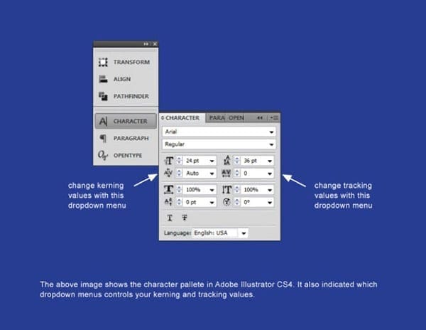
We will start by defining these two design terms. Kerning by definition simply means to adjust the spacing between a letter pairing. Throughout history, characters of the alphabet were never designed with any type of letter spacing in mind; therefore, some letter combinations would appear awkward without applying any type of spacing to them. Presently, a designer can accomplish this process through the use of various page layout programs such as, Adobe Photoshop, Adobe Illustrator, and Quark Express . In most page layout programs, a designer can choose to apply two types of kerning options, namely auto kerning or manual kerning.
Auto Kerning
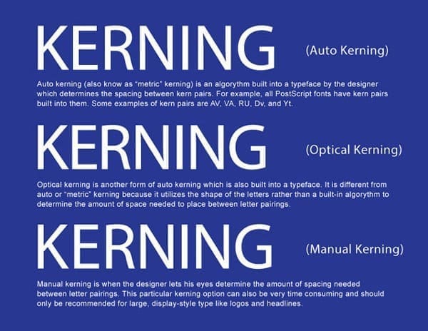
Automatic kerning refers to the kerning applied automatically by a program, as opposed to no kerning at all or the kerning applied manually by the user. There are two types of automatic kerning, namely metric and optical.
- Metric kerning utilizes the kerning tables that are built into the typeface. When you select metric kerning in your page layout program, you are using the spacing that was intended by the designer of the typeface. Metric kerning usually looks good, especially at small sizes. Cheap novelty fonts or free fonts often have little or no built-in kerning and will need to be optically or manually kerned.
- Unlike metric kerning, optical kerning uses the shapes of letters to determine what spacing is adequate between a pair of letters rather than a kerning table that is built into the typeface. There is some level of control with optical kerning, but this option will not space letters as accurately in comparison to kerning them manually. However, optical kerning can be a great option when mixing and matching different fonts.
Manual Kerning
The final kerning option is manual kerning. This is considered by many to be the preferred option for most designers and typographers. When kerning type manually, the designer’s eye is what determines the letter spacing between letter parings. This process can be very time-consuming and should only be used to kern large, display-style type.
Tracking
While kerning refers to adjusting the spacing between letter pairs, tracking refers to the overall letter spacing in a selection of letters. This can be a word, a sentence, a paragraph, or an entire document. When applying tracking values, the spacing throughout the text will be equal.
As a rule, designers should adjust the tracking to a body of text before applying any kerning value. If you kern your text first and then apply your tracking values, you will negate the kerning values that were previously applied.
What Designers Need to Keep in Mind
Now that we have discussed and defined the differences between kerning and tracking in design, the following are some things to remember when manipulating text’s kerning and tracking:
- Always start with the difficult pairings, like capital/lowercase pairings, diagonal letters (like X, V, and Z) and round letters (like O, B, and D).
- Adjust kerning values as a last step in your design, especially after you choose a font. Remember every font is different.
- Try kerning your text upside down. Kerning text upside down can help to focus on letter pairings rather than the entire word..
- The goal of kerning is for the type to appear optically correct. There is no secret formula to this process, and often times it just takes practice.
- Here is a game to test your kerning your skills.
This is a generally excellent tip especially to those new to the blogosphere. Basic however exact data… Thanks for sharing this one. An unquestionable requirement read article!
These are really enormous ideas in on the topic of blogging.
You have touched some pleasant things here.
Any way keep up writing. Way cool! Some very valid points!
I appreciate you writing this post and the rest of the website
is really good. I am sure this post has touched all the internet viewers, its really
really fastidious article on building up new website.
https://www.shaadimatchbook.com
Hey there! I just wanted to ask if you ever have any problems
with hackers? My last blog (wordpress) was hacked and I ended up losing several weeks of hard work due to no back up.
Do you have any solutions to prevent hackers?
I don’t believe we ever had that issue. That question would be better suited for our developer. when it comes to security I would lead you astray.
I think this is one of the most vital information for me. And i’m glad reading your article. But want to remark on few general things, The site style is perfect, the articles is really nice : D. Good job, cheers
Greatly appreciated the comments and glad the information was useful. If there is anything we can help you with please let us know.