It’s generally a good idea to start your web design project using best practices, especially if you haven’t accumulated any data to support a specific design change, or direction. Remember that you shouldn’t end your design solely implementing best practice solutions; however, you should use the data feedback, by use of analytics, to optimize and improve user experience. Here are five effective best practices that can help you get started.
1. Make Your Navigation and Visitors Location on the Site Highly Visible
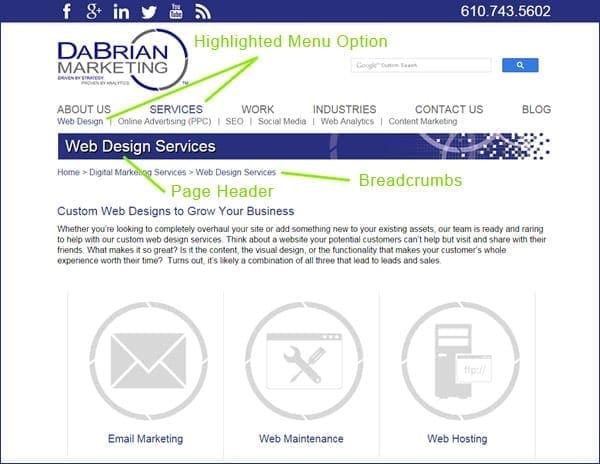
Users should know where they were, and where they are on your site. This can be accomplished using elements like breadcrumbs, page-headers, highlighted menu options, progress bars, thank you and confirmation pages. Not using these elements can cause an unhappy user experience when they try to navigate deeper into your website or try to navigate through a purchasing process. Always remember that creating a smooth and comfortable user experience is your ultimate goal when designing your B2B website.

2. Match Your Content to Real World Language by Eliminating Jargon
The language used on B2B websites should be familiar to the visitor rather than using industry specific terms or jargon. Using jargon, or language that is too technical to comprehend can create a disconnect with the visitor. To find out what words and phrases your website visitors are using it’s best to do a little keyword research. This will help you define how you go after potential customers or leads using language they are comfortable with.
3. Allow Total User Control and Freedom From Automated Processes
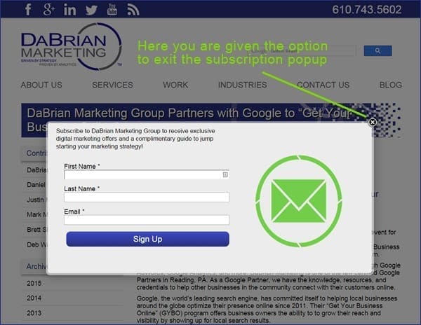
Simply put, eliminate anything that takes control out of the user’s hands. If not implemented correctly, elements such as popups, auto-play videos, and automatic carousels can cause lack of user control and freedom, hence creating a bad user experience. If the user doesn’t want to subscribe to a newsletter popup, or watch a demo video they should have a way of exiting or navigating away from that element without any complications.

4. Create Your B2B Website Using a Minimalistic Design Approach
For the past several years, taking a minimalist approach seems to be the most effective way to create a B2B website. In a study conducted by Google, it was scientifically proven that minimalist design are more appealing to buyers. In addition, an effective use of white space can clearly guide buyers to the important sections of information. Cluttered websites don’t effectively allow this to happen and that’s why it is best to focus on the important information visitors are looking for.
5. Offer Solutions and Help Documentation
If designed correctly, your website shouldn’t need much of this best practice solution. However, offering help solutions is a big plus. Help solutions such as live chat pop-ups, FAQ’s, pricing tables, and microcopy, which are little words or phrases that enhance the subscription or buying process that helps to reduce friction and get people taking action. Usually, if you submit a form without the required information being entered, you may receive a prompt in the form of microcopy letting you know that the information for that field is needed to submit the form request.
Conclusion
Whether you are creating a new website, redesigning, or just optimizing an existing one, utilizing best practices will offer a great peace of mind. Although the best practices mentioned aren’t actual principles or laws of web design, they provide a good starting point in most cases. Also, remember that these best practices are backed by data which support their effectiveness.
What other B2B website best practices do you recommend not mentioned in the blog? Please provide your comments below.

Hi, really this is very important for us given a piece of good information. First-class post!!. Outstanding collections. I am very happy to read this and recognize. Thank You