• Skip to primary navigation
  • Skip to main content
  • Skip to primary sidebar
  • Get A Quote
  • 610.743.5602
  • Schedule A Meeting
default-logo
Menu
  • About
    • Team
    • Careers
    • Work
  • HubSpot Agency
    • Marketing Hub
      • Setup & Strategy
        • Inbound Success Plan
        • Inbound Marketing Plans
      • Traffic Generation
      • Lead Conversion
      • Lead Nurturing
    • Sales Hub
      • CRM Implementation
      • Sales Enablement
      • Sales & Marketing Alignment
    • Content Hub
  • Digital Marketing
    • Inbound Marketing
      • Inbound Marketing Plans
    • Content Marketing
    • Email Marketing
    • SEO
    • Social Media Marketing
    • PPC Management
  • Digital Analytics
  • Web Design
    • Shopify Web Design
    • CMS Hub
    • Branding/Graphic Design
    • Our Work
    • Hosting & Maintenance
  • Blog
    • Small & Mid-Sized Business Resources
    • Client Referral Program

Mark Mapp

Five Logo File Types Every Business Should Keep on File

June 24, 2015 by Mark Mapp Leave a Comment

Business owners often advertise their brand in multiple facets and in the media space. This makes it crucial for them to understand the different logo file types and the way they are utilized in the media space they are implemented into. In this blog, I will be covering the five important logo file types all business owners should have at their disposal.
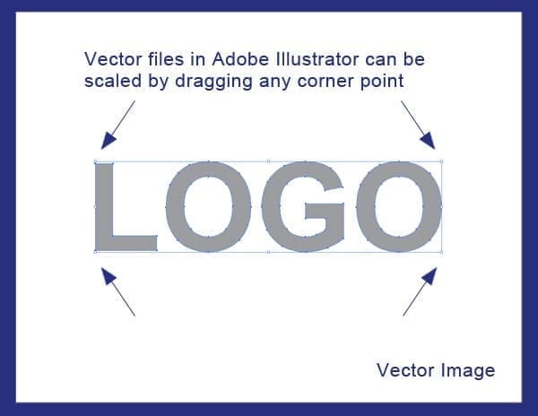
Vector Based File

Vector graphics are considered to be the most flexible image format for saving logo files. Vector based files allow you to easily add spot colors (Pantone colors), gradients, and textures to the artwork. However, what they are mostly known for is having the ability to be reduced or increased in size without losing any quality. Common file extensions associated with vector files are .AI, .SVG, .EPS, and .DRW. If there is one file type I would recommend a business owner use to preserve their logo, vector files would be it.

vector-export

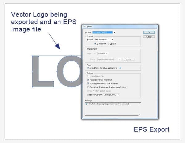
EPS (Encapsulated PostScript) File

​Another versatile and effective file type for preserving logos is an .EPS file. An .EPS file can contain any combination of text, graphics and images and is often used when exchanging logo vector graphics that are only to be read but not edited by the recipient. Files sent to a professional printer, for example, are usually sent in this format. Unlike vector files, .EPS files have very little editability when it comes to changing colors, adding gradients, or simply changing text. However, they are similar to vector files because they are programmed in PostScript (PS), which is the language used to create vector based graphics, allowing them flexibility in the scaling department. An .EPS file is made up of two types of data; there is the preview data that allows the file to be viewed in most page layout programs, and it also contains high resolution data used by high quality printing devices.

eps-export

JPEG (Joint Photographic Experts Group) File

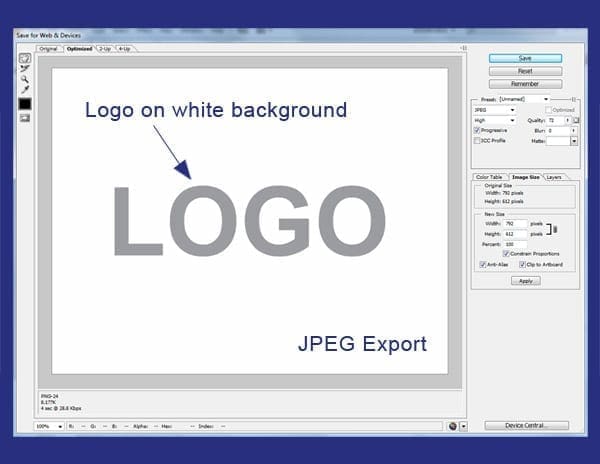
JPEG is a compressed image file format (or lossy compression format). JPEG files allow you to compress an image while trying to preserve as much of its’ quality as possible and are not limited to the amount of color it contains. Although some image quality is lost during compression, JPEG images can still appear to be colorful and high in resolution. I would make a guess and say that over 80% of the images seen on the World Wide Web are JPEG files in nature. If you have to showcase your logo on the web in an advertisement, for example, more than likely this would be your image file of choice. The big negative on JPEG images is that they do not preserve transparency data unlike all the other files mentioned in this blog.

jpeg-export

PNG (Portable Network Graphics) File

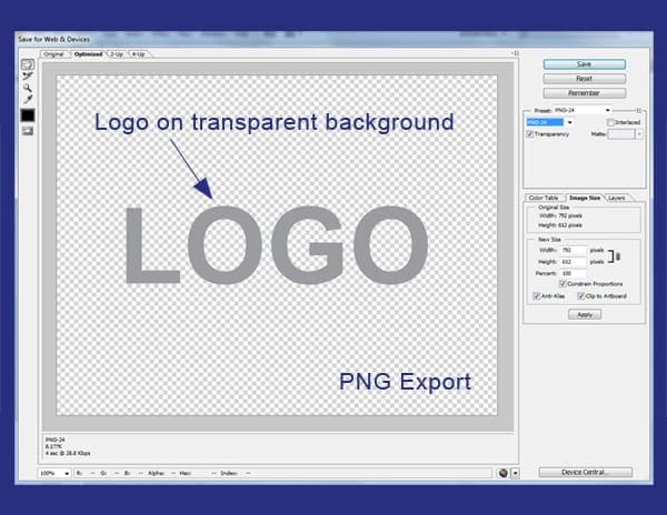
​Just like JPEG files, a PNG file is a raster (or bitmap) image file format which supports lossless data compression. It also supports millions of colors similar to it’s counterpart,  however it does not support non-RGB color spaces such as CMYK which doesn’t make it ideal for high quality printing if any printing at all. It’s a  clear advantage over JPEG files is the ability to preserve transparency data which is how logos on most websites are implemented.
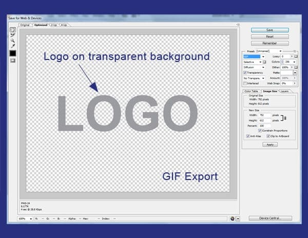
png-export

GIF

Last, we have the GIF file. A GIF image by nature is an 8-bit color file, which means they are limited to a palette of 256 colors. Having this limited color palette makes GIF files ideal for small images with solid areas of color. GIF files are also an effective means of saving grayscale images since they are based on an 8-bit color palette. With its limited color palette, GIFS offers the smallest image compression available, but that comes with the sacrifice of poor image quality. GIF image files are currently being replaced by PNG image files around the web and most digital spaces since they offer higher resolution images.

gif export

Conclusion

As a business owner, it is important that you prepare your logo in a variety of image file types. The ones I’ve listed are just a few, but these file types are the ones I feel are the most important. Having these files at your disposal gives you the flexibility to place your logo on any type of print or digital advertising campaigns. Having them readily available can also speed up your creative or design process, as well as, give your designer a peace of mind not having to recreate or redesign any logo assets. If you have any other file type in mind you would like to mention, please leave it in the comments below.

Filed Under: Web Design Tagged With: Logo Design, logo types

Five Free Tools Every Web Designer Should Have

April 29, 2015 by Mark Mapp Leave a Comment

As a Web Designer, I am always looking for ways to save time and money. One of the best ways to accomplish this is by utilizing some of the free tools offered online. It is best to test these tools to make sure you’re finding exactly what you are looking for. Most of these tools were created by other Web Designers or Developers and for the most part should work fairly well. The more tools you can add to your design palette, the more time and money you can save.

Here are five of my favorite tools you can find online free of charge, to get your web design palette started:

1. Color Pickers

There are many free color pickers available on the web, but my favorite one to use is ColorZilla. With over 5 million downloads, it is considered to be one of the most popular browser extensions on the web; finally, this extension has been made available for Chrome. Some of my favorite features Colorzilla provides are an eyedropper, a page analyzer, a color history tab, a CSS generator, and a palette viewer with 7 pre-installed palettes. In addition to the features I’ve mentioned you may find other useful ones here that can help simplify your everyday design tasks.

Screen shot of colorzilla

2. Font Identifiers

Another one of my favorites tools is the “What Font” extension. This extension gives you the ability to identify any font used within the the structure of a web site. This is probably the area I struggle most with clients. It is very seldom that a client is able to provide you with this information without going through hoops. “What Font” extension will help you to elimination that waiting period. All font identifiers for the most part offers the same features and benefits. For example, with “What Font you are able to reveal the font family (which even providing a visual), font size, line height, and hex color codes which you can then implement into any design program for use.

Screenshot of what font

3. On-Line/Digital Rulers

Changing your screen resolution can make things appear larger or smaller according to the setting chosen. The smaller the resolution specs are the larger the elements appear on the page. This doesn’t mean that the actual size of elements on the page physically changed. In fact, more often than not they stay the same. Using an online ruler such as “Page Ruler” would prove this fact. Anytime you are in need of on-screen measurements these digital rulers will absolutely come in handy. There are two unique features offered in the Page Ruler extension that other may not offer. First, there is the “Element Mode”, which allows you to outline elements on the page as you mouse over them (must be enabled first). Second, Page Ruler allows you to navigate through parents, children and sibling elements of any measured element.

Screenshot of page-ruler

4. Screen Capture Software

Screen capture software is probably the tool that I utilize the most on a daily basis. I use it for several everyday task such as proofing layout ideas to clients, posting approvals or changes to coworkers about specific tasks, or even using the screen capture to help created unique graphics or images to use in other projects. My screen capture software of choice is “Gadwin Printscreen”. I’ve been using this tool for quite some time now and highly recommend it’s usage. Some of Gadwin Printscreen’s unique features include the ability to export to 5 different file types, send captured images via email or directly to a printer source, as well as choosing a default output size for the captured image. It really comes in handy when creating posters of web pages we previously design to hang on our office walls. These posted are 18” x 24” in size so that should give you a pretty good idea the quality of the outputted files.

Screenshot of gadwin printscreen

5. Web Browsers

The most important tool utilized by a web designer would more than likely be the considered the web browser. Today, there are numerous web browsers available. Internet Explorer, Firefox, and Chrome are the browsers most commonly used by many; however, there are several others out there such as Opera, Maxthon, Sea Monkey, and Midori. I personal have up to 8 different browsers installed on my PC at any given time. Since each web browser renders web pages differently, it is recommended to test your designs in as many browsers as possible. Most browsers also include web page inspectors which allows designers to view code and make edits to see how elements may behave on a page.

Screenshot of chrome browser

Since there are so many free tools out there on the web for Web Designers to take advantage of, it is important that you fully test or maximize their capabilities. The more a tool can accomplish the better. If there are any other tools you would like to mention or add to this post please leave your comments below.

Filed Under: Web Design

Five New Web Design Trends for 2015

March 18, 2015 by Mark Mapp 1 Comment

Introduction

It seems that with every new year that comes around, old trends are phased out while new and improved ones emerge. Whether it is the color or style of clothing we wear, the type of car we drive, or even the everyday technology we use, trends tend to come and go at a rapid pace.

This holds true in the field of web design. Although some trends from 2014 may roll over to 2015, many of them will be phased out while new and improved trends will take over where they left off.

Here are some trends that will make a mark in 2015:

Responsive Design

There are several ways to implement a mobile web design solution as explained in my January blog Design Solutions for the Mobile Web. Also, in that blog it was stated that responsive design was the best solution to present day web design and development. Building secondary mobile sites (i.e. m.yourwebsitename.com) and depending on device detection is becoming a thing of the past. In 2015, mobile, tablet, and desktop layouts are being integrated seamlessly with the use of responsive design; resulting in a better user experience. This method also helps with optimizing your website by reducing subdomains and duplicate content.

Mobile Desktop Navigation

To navigate web pages on mobile devices, web designers and developers often implement mobile menu structures which function in several different ways. Mobile menus can collapse, expand, pop up or even flyout from the sides of the device’s screen. In 2015, these menu structures will be utilized in desktop layouts as well. Some websites like Adobe, MyEmma, and YouTube have already implemented this type of navigation. It’s only a matter of time before this become common practice.

Image and Video Backgrounds (Hero Images)

Most companies are content with letting words do the talking on their web pages. If this is your train of thought you are missing a big opportunity to grab your visitor’s attention. In 2015, designers and developers are now using hero images and video backgrounds instead of image sliders to accomplish this goal. These have been proven to be more effective than text heavy websites. Usually, accompanying Hero Images and video backgrounds are a couple lines of text and a call-to-action (CTA) button. Two very good examples of this would be the Tatamagouche Brewing Co. and Hammerhead websites.

Flat Design / Material Design

If you have been browsing the web lately (about for the past 2-3 years to be exact), you would have noticed a common trend in how websites are being designed. Everything appears to be flat, simple shapes with colors that pop. Presently, flat design, (as it is called), seems to be the technique of choice when creating websites (ex. https://www.getdonedone.com/). Google has even expanded on this concept by adding subtle gradients and slight movement or animation to create a new direction known as material design. A great example of material design would be Playground, Inc.’s website.  Flat design in general offers a clean, fast, and clutter-free layout that allows visitors to interact with content focused on gaining their attention without being distracted.

Micro Interactions (Forms, Popups)

Another web design trend that seems to be taking off as of late is the implementation of micro interactions. In web design micro interactions are modules – usually in the form of popups, that revolve around a single process. The process can be anything from subscribing to a blog or an email distribution, downloading content, watching a video clip, and so on. There are numerous ways to trigger mico interactions on a website; however, from personally viewing multiple websites over the past year or so, the most common way to trigger these interactions is by viewing a page for a certain amount of time; when that time elapses a micro interaction would usually appear.  This practice is very popular with blog posts. Ultimately, micro interactions should improve user engagement and increase customer loyalty if implemented correctly.

Conclusion

It is important to note that some of these new trends may not increase visits to your website; however, they may keep visitors engaged enough to positively impact conversion rates.

What other web design trends from 2014 will rollover or have an impact in 2015?

What other new trends do you expect to see in 2015 that are not listed above? You may add or list any other trends you foresee in the comments below!

Filed Under: Web Design

Design Solutions for the Mobile Web

January 28, 2015 by Mark Mapp Leave a Comment

The introduction of mobile devices, such as smart phones and tablets, has given people the ability to browse the web and complete additional task on the go. In January, 2014, mobile devices accounted for 55% of the internet usage in the United States with mobile apps making up 47% of the internet traffic while 8% came from mobile browsers. This was the first time in history mobile app usage eclipsed desktop usage (45%). This continual growth in mobile device usage also created several issues in the web design and web development workspace. Designers and developers now have to compensate for how web pages are being viewed on these devices as well as choose the best solution to implement.

This week, we’re going to walk you through the three most common design solutions for the mobile web.

Mobile Websites

The initial way of handling the mobile web experience was by creating an entirely separate website just for mobile. A good example of this is ESPN’s website. If you type http://espn.go.com/ into your browser window in a desktop setting you will be taken directly to their “desktop” version of their site. However, if you type that same URL into your smart phone or tablet’s browser you will notice that it will redirect you to their mobile version of the site and the URL will reflect m.espn.go.com/wireless/index instead.

This direction was effective, but it still created several issues. Mobile websites often have completely separate content and a bit less functionality in comparison to their desktop counterparts.

See other advantages and disadvantages of mobile websites here.

Websites designed for mobile devices.

Mobile Apps

Another solution for catering to the mobile web is developing a mobile app. This is not to be confused with a mobile website. Unlike mobile websites, mobile apps work independently of a browser and they don’t depend on an internet connection for general usage. Mobile apps are popular for linear processes, or processes that have a starting and an ending point. They also have the ability to utilize mobile device hardware such as credit card readers, cameras, and GPS locators.

A good example of this would be bank apps like Wells Fargo, or Bank of America that would allow you to scan your check with the use of your mobile phone or tablet which would then allow you to make a deposit into your bank account. You can browse and download other mobile apps from the Google Play Store from your mobile devices as well. The main disadvantage of developing a mobile app is that you have to create code for three platforms (namely Apple, Android, and Blackberry). The code is not universal and cannot be implemented across platforms.

See other advantages and disadvantages of mobile apps here.

Responsive Design

Responsive design is currently the best solution for mobile web development (See Google’s Mobile Guide). It is considered the best solution because it is one website, one URL, and one set of HTML code which allows the website’s content to be displayed on wide variety of mobile devices at multiple resolutions. Some good examples of responsive design are the Microsoft, Adobe, and BlueSky Interactive websites.

Responsive design can be a bit more costly to develop than your standard desktop website, but the low maintenance advantage of creating content for only one URL vs. multiple URLs saves time and money in the long run. In addition, having one URL is better suited for SEO related purposes.

Websites utilizing responsive design techniques.

Conclusion

Although all three solutions are proven ways of designing for the mobile web, in 2014 responsive design is the solution of choice. From our experience, responsive design is the simplest solution to the mobile design problem and has been the most effective for our web design projects.

Now that you are familiar with three design solutions, you are now able to make a better decision on which one is best for you and your company.

Which mobile design solution would you choose? Let us know in the comments below!

Filed Under: Marketing Strategy, Mobile Marketing, Web Design Tagged With: mobile app, responsive web design, web design

Are You a Web Designer or a Web Developer?

October 2, 2014 by Mark Mapp 14 Comments

These two roles are often substituted for one another, however they both carry their own weight – and rightfully so. After all, they are the two main ingredients in any effective web design process. A web designer focuses on the aesthetics, or the “look and feel” of a website, while web developers concentrate primarily on the functionality, such as what happens when you click a button or submit a contact form. Although there are quite a few people out there who may be able to handle the tasks of both a web designer and a web developer, these two professions typically work together to bring web experiences into existence. This week, I’m going to cover some other characteristics that separate these two important professions.

Design and source code view of a webpage.
Here is an image example showcasing the design view of a website as well the source code view in Google Chrome, one of the most popular web browsers.
Web inspector view of a web page.
Web inspectors allow designers and developers to view the design and code of a website in one browser window. Typically used for troubleshooting purposes.

Let’s Start with Education

Web designers typically attain a 2-4 year degree in a visual arts or graphic design program. They often learn to use a variety of creative suites, as well as several WYSIWYG editors to help them develop the aesthetic look and feel of the websites they create. Although having HTML knowledge is also a major plus for web designers, it isn’t surprising if a majority of them do not have any knowledge of HTML outside of what Adobe Dreamweaver and some other basic web editors.

A web developer’s education, on the other hand, is mainly technical-based. They often attain some type of 2-4 year computer science or programming degree where they will learn programming languages such as HTML, HTML5, Java, JavaScript, CSS3, SQL, PHP, and C++. Having ample knowledge of these languages enables the developer to produce a properly-functioning website. Web developers or programmers may also dabble with Adobe Photoshop to help with simple tasks such as resizing images and color changes, but spend most of their time using various text editors to complete their tasks.

Web page layout in Adobe Photoshop.
Here’s a website template being visually created in Adobe Photoshop using a variety of graphics and layers. Absolutely no coding is required for these layouts.

Software, Tools, and Resources

The software and tools that designers and developers use on a daily basis also differ. A web designer’s software suite would include an image editor like Adobe Photoshop or Gimp, a vector-based program like Adobe Illustrator or Inkscape, and possibly a WYSIWYG web page editor like Adobe Dreamweaver or Kompozer. Other resources a web designer may use are color pickers, on-screen rulers, lorem ipsum text generators, and stock photography websites.

Unlike the web designer whose software collection consists mainly of creative suites, a web developer’s toolkit would most likely include a text editor such as Notepad++, an FTP client like Filezilla, as many internet browsers as possible for testing purposes, and different types of Web (Code) inspectors which are usually built into the browsers themselves. In addition, web developers also tend to use CMS (Content management Systems) platforms such as WordPress, Drupal, and Joomla to help streamline the implementation of content on a website.

Wysiwyg software view of a web page.
Adobe Dreamweaver is a very popular WYSIWYG (what you see is what you get) web design program which can also be used to edit HTML and CSS files.
Analyzing code using a text editor.
This image shows what typical HTML code would look like in a text editor; in this case, Sublime Text 2.

As part of the web design process

As mentioned above, web designers and web developers often work together on web design projects. Most initial conversations in the web design process have to do with the aesthetics, or the “look and feel” of a website. Clients will generally have an idea of what they want their website to look like and the audience they are targeting. A graphic designer would then use his creativity, the client’s design principles, and their collection of tools and resources to visually layout design concepts. Once a layout is approved, functionality becomes the focus. This is when the skill set of a web developer is required. Besides developing the website from scratch using one of several coding languages available, a web developer would also work on technical components like databases, online forms and applications (and the actions they require to be submitted), as well as client login portals. Even when the web design project is considered complete and uploaded to the Web, web developers can still spend countless hours troubleshooting issues that arise. Troubleshooting websites and web pages is a continuous process and generally web designers have little or nothing to do with this task.

In Conclusion

With the information provided, hopefully you’ve got a better understanding of what the differences between a web designer and a web developer are. The differences really are like night and day, and their definitions should not be substituted for each other. If you are an individual or a business looking to hire a web designer or a web developer you should know their strengths, but you should also know what their limitations are. This will help you to make the best decision possible in deciding the resources you need moving forward.

What do you think are the biggest differences between web designers and developers? Let us know in the comments!

Filed Under: Web Design Tagged With: web design, web development

7 Design Elements for Email Marketing Campaigns

August 28, 2014 by Mark Mapp 4 Comments

Check out the 7 design elements every email marketing campaign should have for maximum compatibility, compliance, and success.

7 Design Elements Every Email Marketing Campaign Should Have
Infographic provided by DaBrian Marketing group, LLC.

Filed Under: Email Marketing, Marketing Strategy Tagged With: email, email campaigns, email design, email marketing

  • « Go to Previous Page
  • Page 1
  • Page 2
  • Page 3
  • Go to Next Page »

Primary Sidebar

Archives

Categories

Subscribe Now


CONTACT INFORMATION

DaBrian Marketing Group
3535 N. 5th Street HWY
Suite 2, #203
Reading, PA, 19605

  • 610.743.5602
  • Mon - Fri: 9AM - 5PM
Contact Us
Web Support

RESOURCES

  • Case Studies
  • White Papers
  • eBooks
  • Small Business Resources
  • Our Blog

MARKETING

  • Financial Services
  • Health & Wellness
  • Ecommerce & Retail
  • Business 2 Business
  • Business 2 Consumer

VISIT OUR LOCATION

  • Get Map & Directions

CONNECT WITH US

Facebook Instagram Linkedin Rss Twitter Youtube

Copyright © 2025 DaBrian Marketing Group  •  All Rights Reserved  •  Privacy Policy

Scroll Up