• Skip to primary navigation
  • Skip to main content
  • Skip to primary sidebar
  • Get A Quote
  • 610.743.5602
  • Schedule A Meeting
default-logo
Menu
  • About
    • Team
    • Careers
    • Work
  • HubSpot Agency
    • Marketing Hub
      • Setup & Strategy
        • Inbound Success Plan
        • Inbound Marketing Plans
      • Traffic Generation
      • Lead Conversion
      • Lead Nurturing
    • Sales Hub
      • CRM Implementation
      • Sales Enablement
      • Sales & Marketing Alignment
    • Content Hub
  • Digital Marketing
    • Inbound Marketing
      • Inbound Marketing Plans
    • Content Marketing
    • Email Marketing
    • SEO
    • Social Media Marketing
    • PPC Management
  • Digital Analytics
  • Web Design
    • Shopify Web Design
    • CMS Hub
    • Branding/Graphic Design
    • Our Work
    • Hosting & Maintenance
  • Blog
    • Small & Mid-Sized Business Resources
    • Client Referral Program

How Mobile Friendly Design Impacts Your Website

November 4, 2015 by Dabrian Marketing Group Leave a Comment

Why Should Your Site Be Mobile Friendly?

It is no secret that mobile usage has grown in recent years. Over 20% of Google searches are done on mobile devices, and 25% of internet users conduct their online search on only mobile devices. If your site isn’t mobile, do you think it will still show up in the search results? Google updated their search algorithm back in April. Mobile users that use Google, with Google being the most popular search engine, will only see mobile friendly sites. If your site is not mobile, you will not appear in theses results. To read more about the Google algorithm change, check out our blog on it.

Why Mobile Design Matters

So what does all that mean for your business? If your site is not mobile-friendly, you’re completely missing at least 1/4th of potential customers. According to Think with Google, 94% of Americans with smartphones search for local information on mobile. Meaning you’re missing even more potential customers as well as your current customers are having a bad user experience by not being able to find you.

Users will look at products on mobile devices and revisit later on their desktop hoping their shopping cart is synced. The longer it takes for them to check out the more likely they will not complete the sale. In a study by MediaPost, 48% of shoppers that use their phone said that “ease of use” is the most important quality they look for on a mobile site.

bad mobile
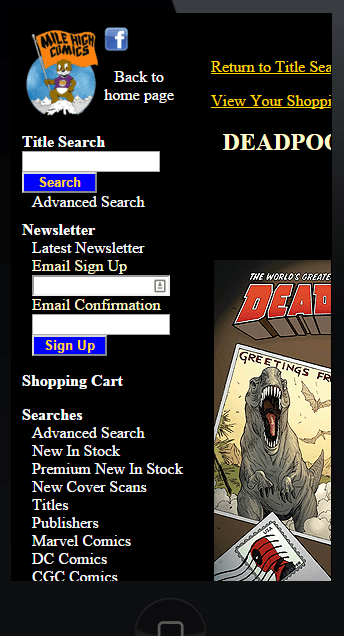
Horizontal scrolling, mismatch of colors, forms too small. What not to do.
mobile friendly
Only need to scroll down. Menu stays at the top as you scroll. This is all good.

What To Consider When Designing For Mobile

You want to go mobile friendly now but not sure what to consider. For starters, any buttons and links should be big enough for anyone’s thumb to click and not have issues. Meaning, it needs to be fairly big. Your “Contact Us” form is the same way as the user needs to interact with it. If it is too small, when they click on one thing they will get a different option making them frustrated and have them potentially leave your site.

If a user is on their mobile phone, chances are they are hunting for something specific and your site can only be 1 column. Get rid of excess and unneeded info / elements. For example, if you have a sidebar on every page with info like a form for them to fill out, blog options, register options, it’s best practice to get rid of them for mobile. You don’t need to shorten your content at all, you’re just making all the useful information easier to find.

Got questions about mobile first design? Ask away in the comments below!

Filed Under: Mobile Marketing, Search Engine Optimization (SEO), Web Design Tagged With: mobile, Mobile marketing, mobile optimization, mobile website

Reader Interactions

Leave a Reply Cancel reply

Your email address will not be published. Required fields are marked *

Primary Sidebar

Archives

Categories

Subscribe Now


CONTACT INFORMATION

DaBrian Marketing Group
3535 N. 5th Street HWY
Suite 2, #203
Reading, PA, 19605

  • 610.743.5602
  • Mon - Fri: 9AM - 5PM
Contact Us
Web Support

RESOURCES

  • Case Studies
  • White Papers
  • eBooks
  • Small Business Resources
  • Our Blog

MARKETING

  • Financial Services
  • Health & Wellness
  • Ecommerce & Retail
  • Business 2 Business
  • Business 2 Consumer

VISIT OUR LOCATION

  • Get Map & Directions

CONNECT WITH US

Facebook Instagram Linkedin Rss Twitter Youtube

Copyright © 2025 DaBrian Marketing Group  •  All Rights Reserved  •  Privacy Policy

Scroll Up