The introduction of mobile devices, such as smart phones and tablets, has given people the ability to browse the web and complete additional task on the go. In January, 2014, mobile devices accounted for 55% of the internet usage in the United States with mobile apps making up 47% of the internet traffic while 8% came from mobile browsers. This was the first time in history mobile app usage eclipsed desktop usage (45%). This continual growth in mobile device usage also created several issues in the web design and web development workspace. Designers and developers now have to compensate for how web pages are being viewed on these devices as well as choose the best solution to implement.
This week, we’re going to walk you through the three most common design solutions for the mobile web.
Mobile Websites
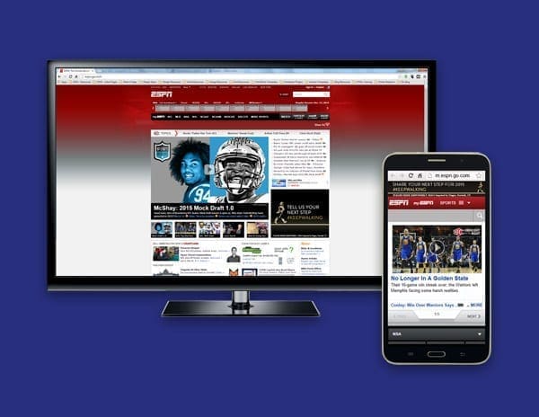
The initial way of handling the mobile web experience was by creating an entirely separate website just for mobile. A good example of this is ESPN’s website. If you type http://espn.go.com/ into your browser window in a desktop setting you will be taken directly to their “desktop” version of their site. However, if you type that same URL into your smart phone or tablet’s browser you will notice that it will redirect you to their mobile version of the site and the URL will reflect m.espn.go.com/wireless/index instead.
This direction was effective, but it still created several issues. Mobile websites often have completely separate content and a bit less functionality in comparison to their desktop counterparts.
See other advantages and disadvantages of mobile websites here.

Mobile Apps
Another solution for catering to the mobile web is developing a mobile app. This is not to be confused with a mobile website. Unlike mobile websites, mobile apps work independently of a browser and they don’t depend on an internet connection for general usage. Mobile apps are popular for linear processes, or processes that have a starting and an ending point. They also have the ability to utilize mobile device hardware such as credit card readers, cameras, and GPS locators.
A good example of this would be bank apps like Wells Fargo, or Bank of America that would allow you to scan your check with the use of your mobile phone or tablet which would then allow you to make a deposit into your bank account. You can browse and download other mobile apps from the Google Play Store from your mobile devices as well. The main disadvantage of developing a mobile app is that you have to create code for three platforms (namely Apple, Android, and Blackberry). The code is not universal and cannot be implemented across platforms.
See other advantages and disadvantages of mobile apps here.
Responsive Design
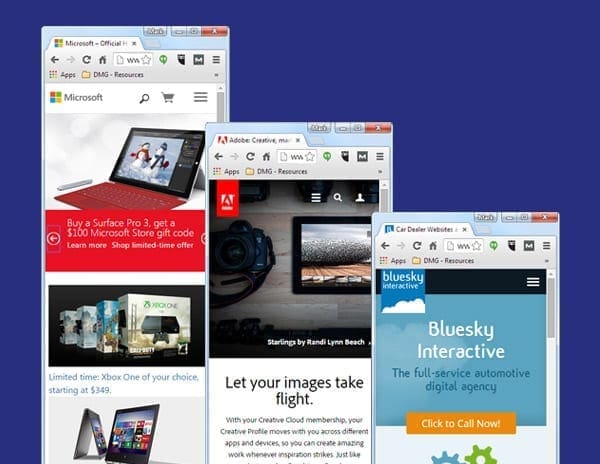
Responsive design is currently the best solution for mobile web development (See Google’s Mobile Guide). It is considered the best solution because it is one website, one URL, and one set of HTML code which allows the website’s content to be displayed on wide variety of mobile devices at multiple resolutions. Some good examples of responsive design are the Microsoft, Adobe, and BlueSky Interactive websites.
Responsive design can be a bit more costly to develop than your standard desktop website, but the low maintenance advantage of creating content for only one URL vs. multiple URLs saves time and money in the long run. In addition, having one URL is better suited for SEO related purposes.

Conclusion
Although all three solutions are proven ways of designing for the mobile web, in 2014 responsive design is the solution of choice. From our experience, responsive design is the simplest solution to the mobile design problem and has been the most effective for our web design projects.
Now that you are familiar with three design solutions, you are now able to make a better decision on which one is best for you and your company.

Leave a Reply