Websites have advanced a lot in just a few short years. In the ’90s, businesses simply aimed to set up online presences, resulting in an Internet full of electronic brochures. Since then, marketers have improved both the functionality and aesthetics of their websites. As a result, they’ve delivered a better experience to customers – and better outcomes for business owners.
The corollary for marketers is that with advances come heightened consumer expectations. Potential buyers increasingly need more from websites than basic transactions and facts about their favorite brands. They want to shop, learn, and play on their own terms, in a fun, user-friendly, and convenient format. Oh, and one more thing: they want all of that from their mobile devices, and they want it right now.
What Does This Mean For You?
It means that if your business hasn’t retooled its website in a while, you’re probably sending the wrong message to potential customers. And by sending the wrong message, we mean you’re losing customers to a competitor. Someone who is more fun, more user-friendly, more convenient, more mobile-responsive, and more “right now”. Luckily for you, we’re willing to take the time to outline a few ideas to fix your painfully outdated website:
1. Clean Up Your Site
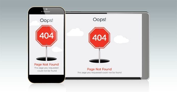
If you’re like most of our new clients, you can probably find everything you need on your own website. And if you’re like most of our new clients, your potential customers probably can’t find a thing. That’s because when you build up a website over time, you begin to lose the intended structure. Your page organization fails to highlight newly released product lines . Links lead to 404 errors. Posts get housed under random categories. For the business owner, it’s just part of a growing business. For maximizing your website traffic, it’s a mess.

The problem is that your site might make sense to you and your team (after all, you made the mess) but your audience is probably lost. So have a fresh set of eyes look over your website. Within 5 seconds of landing, can she tell exactly what your company does? Can she find the blog? Subscribe to the blog? Give her a product description to “purchase” – how long does it take her to find, view, and watch a product video? How many broken links and outdated bits of information did she encounter in her journey? If just imagining this scenario is painful, consider a (free) website audit to discover simple ways to clean up your site.
2. Speed Up Page Load times
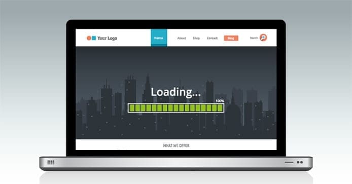
Customers no longer tolerate websites with slow load times. You can test the load times of pages and identify the bottlenecks with a number of online tools. You need these tools because your website is a lot slower than you think it is. You’re probably reading this blog on a desktop computer at work (i.e. you’ve got a fast, stable Internet connection). But how would it render on a spotty 3G connection? That’s where you might be losing the people who have better things to do than wait for your site to load.

Resist adding bandwidth-hogging (and annoying) features like videos or music that auto-load. Pick and choose design elements that highlight product features and engage readers – without slowing down your site. That amazing copy you wrote can only sell your product or service if the page renders. And if you have a hero video, 13 images and myriad design elements on the home page, readers never get that far. The best thing you can do is keep your landing page(s) simple. If a reader finds that landing pages take too long to load, that reader is probably going to hit the back button and shop with a competitor, instead.
3. Make It Mobile Friendly
How does your site look on a smartphone screen? Here’s one better: how does your site look on an iPhone X compared to an iPhone 6? If you don’t know the answer to those questions, you’re taking a big risk with your website. Customers increasingly rely on mobile devices for browsing. Many of our clients now get over 60% of their traffic from mobile channels. That means that whether browsing, shopping, or scheduling, your customers are probably doing it from their phones.
A mobile-friendly website is crucial to convert these users. Either have your site professionally redesigned for mobile or use one of the many responsive templates out there for WordPress, SquareSpace, or Weebly. Our design and marketing teams can review your bounce rates in Google Analytics (because you DO have Google Analytics code on your site, right?) to tell you what pages to focus on. Next, consider your contact us, make an appointment, and other lead generation forms. We haven’t even seen them yet but I bet they are too long, too free-form, and too hard to complete on a small screen.

Your best bet is to work with a digital agency that adheres to a mobile-first philosophy. The old practice of designing a website for desktop and then tweaking it for the mobile experience, later, is no longer good enough. Ask your current design team for their thoughts on accelerated mobile pages (AMPs) for your site. (If their answer at any point includes a blank stare, contact webdesign@dabrianmarketing.com).
Accelerated mobile pages are part of an open source initiative that allows developers to create web pages that load quickly on mobile browsers. If your website has a lot of different stories, products, and articles combined with high (or volatile) website traffic, AMP functionality could greatly improve your performance on mobile devices.
4. Refresh Your CMS
If you’re still relying on your website designer to update content on your site, you’re already behind the competition. Your marketing team should be able to add information to your site through an easy-to-use content management system (CMS), like WordPress. You should have multiple portions of your site updated regularly with current news, upcoming events, and recent blog posts to ensure that new traffic becomes repeat traffic.
Get more value from your CMS by implementing a process to review and update leading plug-ins. Plugs-ins are bits of software that can be uploaded to expand the functionality of your site. If you can imagine a way to extend and enhance your site, someone else probably has, too. And there is probably a plug-in to accomplish it.
Finally, grant multiple people the ability to post custom content. You can assign some to create content and others to review and approve it before it goes live. You can also outsource work to contractors, giving them limited rights to partitioned areas of your site. It takes a little bit of time and effort to get the most from your CMS, but in the end, the timeliness of content and ease of updates ensure a better experience for prospects, customers, and marketers alike.
Wrapping It Up
The user experience needs to be the forefront of your thought process when updating your website. It needs to be a friendly, smooth-sailing, information-packed adventure that leads prospects toward a conversion. Having an updated site can make all the difference between “I don’t have time for this” and “I’m ready to checkout”.
Once you’ve refreshed your site, set a few dates to review it each year. Keep an eye on other websites and note the things they’re doing that you’d like to see on your own site. Pay attention to the way other companies interact with their customers through their websites, and emulate the best practices that might work for your business. Sooner or later, the competition may even start to emulate you.
Using the information provided here will give you insight and a starting point to fix your outdated website. But if you need a more comprehensive plan to update your business’s website, reach out to our team to discuss our free site audit process.
In the meantime, we love a good laugh, so feel free to share your frustrations with outdated websites. Tell us about it in the comments below!

Leave a Reply