• Skip to primary navigation
  • Skip to main content
  • Skip to primary sidebar
  • Get A Quote
  • 610.743.5602
  • Schedule A Meeting
default-logo
Menu
  • About
    • Team
    • Careers
    • Work
    • Who Do We Serve
  • HubSpot Agency
    • Marketing Hub
      • Setup & Strategy
        • Inbound Success Plan
        • Inbound Marketing Plans
      • Traffic Generation
      • Lead Conversion
      • Lead Nurturing
    • Sales Hub
      • CRM Implementation
      • Sales Enablement
      • Sales & Marketing Alignment
    • Content Hub
  • Digital Marketing
    • Inbound Marketing
      • Inbound Marketing Plans
    • Content Marketing
    • Email Marketing
    • SEO
    • Social Media Marketing
    • PPC Management
  • Digital Analytics
  • Web Design
    • Shopify Web Design
    • CMS Hub
    • Branding/Graphic Design
    • Our Work
    • Hosting & Maintenance
  • Blog
    • Small & Mid-Sized Business Resources
    • Client Referral Program

Dabrian Marketing Group

Online vs Software Video Editing Platforms

May 13, 2015 by Dabrian Marketing Group Leave a Comment

In Online vs Software editing platforms there a many choices.  Whether you’re using YouTube Video Editor or Adobe Premier Elements, there are positives and negatives to both online and software editing platforms.  There are many programs for both platforms that can be used to edit videos.  Each will have special features that the others will not have, but which platform is right for you?

Online Video Platform Review

Online Platforms Positives

There are many online editing programs that can be utilized such as YouTube Video Editor, WeVideo.com, and Kaltura. Each will be set up in a similar fashion with a preview window, media area, and timeline for editing. What makes online platforms a good choice is that they have free accounts.  They have faster integrations with iCloud, Google Drive, and other file storage platforms.  The platform is always being updated and there is no cost attached, just make sure that your computer is able to handle any big changes.  Community and Online support are easily accessible and helpful with any questions that you may have and feedback that you may want to make.  As long as you are using one of the major operating systems (Windows, OSX, or Linux) you will be able to easily find online platforms that will work.

Online Editing Platforms

Online Platforms Negatives

With all the positives that there are with online platforms, there are also many negatives.  Some of the platforms will only work with certain operating programs (i.e. Windows, OSX, and Linux).  This would also make the platform obsolete when a new operating system is released. Another negative is that updates could make the platform incompatible with your computer.  With online platforms, there are free accounts which is a positive, but those free accounts will be limited in features. Paid accounts have a cost to use the platform that could rise over time, but would unlock more if not all the features of the platform.  If at some point the company would close and shut down the servers that are used for the platform, all of the files would be lost and there would be no way to recover or make changes in the future, unless the files were moved to a new platform with an accessible file type.

Software Video Program Review

Software Program Positives

There are many different software programs that can be utilized from Adobe Premiere, Pinnacle Studio 16 Ultimate, Final Cut Pro, and many others.  All of the programs will have a one time cost.  Each will have similar features and all the features will be accessible right from the beginning.  These programs will have updates that can be downloaded and will give a notification from the start up of the program at no extra cost.  The community and support help is just as accessible and helpful as the online programs.  Also, there are a number of programs that will work with the many different operating systems.
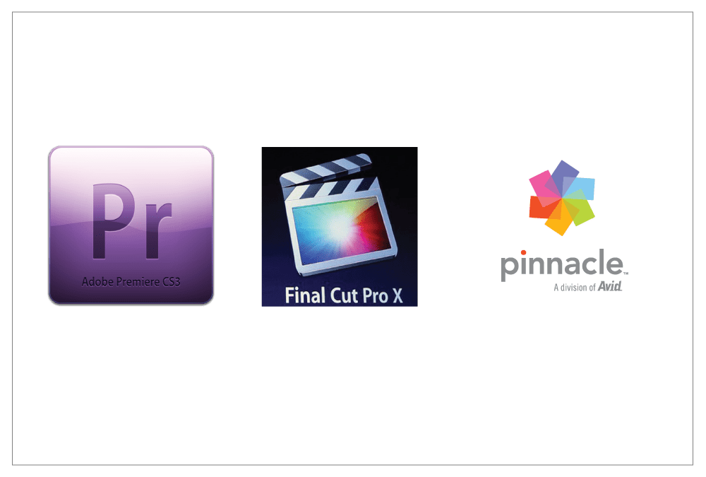
Software Editing Programs

Software Program Negatives

There are also many negatives that come with using a software program.  Like online platforms, software programs are made for only certain operating systems.  This makes it harder to find the best program for your computer. The cost of both the software program and the cost of support for that specific software program after a certain period of time could be considered a negative because of the price that is associated with both. There are many options to pick from and that could be confusing if you are not confident in what they are looking for in a program.

Conclusion

There are many positives and negatives that come with both online and software editing platforms.  There should be system requirements on the website or software box that you can read over.  Then when you have found the program that works with your computer, see if there is a free trial that you can use.  Online platforms should allow for a trial period and software should have a free trial or demo that you can download.  Most are 30-day trials, which should give you enough time get a good grip on the program.  When deciding on a program to use, it is always a good idea to try out 2 or 3 free trials or free demo programs in each. Also read forums and the frequently asked questions pages for more information that other users have shared. Let us know what video editing online platforms and software programs you have tried out, and what you have like and/or disliked about them.

So take your time and make sure to research which program or platform will work the best for you and your project.

Filed Under: Video Marketing

Why Landing Page Testing Solutions Are Needed

May 6, 2015 by Dabrian Marketing Group Leave a Comment

You never get a second chance to make a good first impression. This is especially true when it comes to website landing pages. These pages should be search engine friendly so you can draw visitors there first. You also want to catch visitors’ attention, provide some basic information, engage them and motivate prospects or customers to take action.

This is where landing page testing solutions are used. These tools allow you to build and run “A/B” tests or multivariate versions of a landing page to answer questions such as whether you should have a navigation bar, will visitors click on a video, what color is most appealing, or would testimonials support your cause. Here are some available online platforms which help design and test landing pages to fit your business needs:

Unbounce focuses only on landing pages, with customization features and A/B testing functionality. They provide over eighty templates geared towards maximizing conversions, whether a sign-up, form submission or sale. You can capture leads on your landing page and send them directly to Salesforce, MailChimp, Constant Contact or AWeber. It’s also easy to add KISSmetrics, Google Analytics, and other conversion tools like surveys or a live chat. Different plans are available, from $49/month to $199/month, with a 30-day free trial.

Optimizely provides one optimization platform for websites and mobile apps. It offers an intuitive, easy-to-use landing page editor with a strong focus on A/B and multivariate testing. Highlights include a reporting dashboard with a testing focus, cross-browser testing and integration with common analytics tools. Benefits include increased interactions, engagement, and conversions (leads and sales.) Different pricing plans are available from $17 to $359/month. A 30-day free trial starter program is also available.

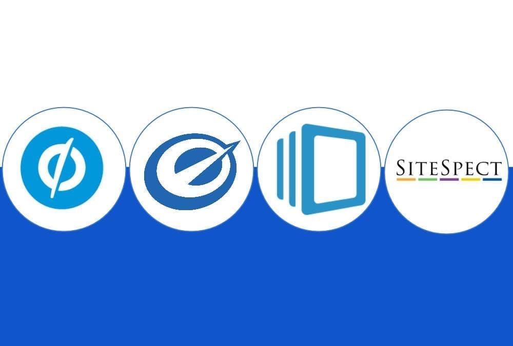
From Left to Right, the company logos are Unbounce, Optimizely, Instapage, and SiteSpect.

Instapage

Designed to quickly build and customize A/B testing landing pages, Instapage focuses on turning visitors into leads and customers. Over seventy templates are available for uses such as click-through, lead generation, and “coming soon” pages. It also has the capability to learn based on visitors who come to the landing page, and will serve up the best possible landing page to help increase your conversion rate. Users can view real-time data to determine the winner of split tests, while tracking conversion types including thank you pages, button/link clicks, and shopping cart checkouts. Instapage integrates with a variety of marketing platforms such as Google Analytics, MailChimp, Constant Contact, AWeber, Facebook, Google+, and Twitter. Build your first page free, then upgrade to plans from $29 to $179/month.

SiteSpect

A little more technical in implementation, SiteSpect is designed to allow a broader range of testing options for every aspect of your site. Advanced behavioral targeting is available to create deep and engaging experiences. Users can test content, functionality and features across various websites, mobile sites, and apps, in order to uncover new optimization opportunities. Pricing is dependent on the solution chosen and the user’s ongoing website needs. While pricing can get expensive, if it helps solve your business needs and increase conversions, then it might be worth the investment.

DaBrian Marketing Group understands the importance of having a tested and proven lead generation and sales process. Contact us today to make a great first impression.

Filed Under: A/B Testing, Google Analytics, Multivariate Testing, Paid Search (PPC)

Best Practices for Creating Testimonials

April 15, 2015 by Dabrian Marketing Group Leave a Comment

When creating a testimonial video there are some best practices that you should know and follow. These practices will help in structuring your videos correctly, gaining your target audience’s undivided attention, and providing a level of consistency throughout your projects. The ultimate goal of these best practices is to keep your testimonial videos simple, yet effective.

Knowing Your Audience

Having a target audience in mind before creating a testimonial video is very important.  Is the video trying to sell a product or service, a testimonial for a company, or is the video just for entertainment?  Knowing what audience that is being targeted will help the video stay focused. If the video loses focus of the target audience it will be off point.

Know the Right Length?

The appropriate length of the video will depend on the type of project. There are many different lengths that are suggested, but most lengths are a generalization(see allpromedia.com).  If the video is an advertisement, 15 to 30 seconds is the most effective length. If the video is a testimonial, 5 to 7 minutes is ideal. Most videos that are for any other project should be 2 to 4 minutes. Achieving the correct length of time will help the video be the most effective it can be to the audience.

Use Transitions in Moderation

Transitions are a great way to make hard cuts softer in the video.  When using a transition, make sure to use one that is appropriate for the video that is being worked on.  It is recommended that using the same transition will keep the video flowing steadily and will not be distracting.  Do not use too many transitions, as too many will be distracting and ruin the flow of the video.

Transitions from WeVideo.com

Separate Video and Audio for the Best Quality

When recording a video be sure that there is a separate audio recording device. If you do not have a proper recording device the quality of the audio that comes from the video recorder will not be the best quality.  Having a microphone that is closer to the speaker will produce clear and audible sounds for the listener.

Eliminating Background Noise

Recording audio separately from the video will help cut down on background noises and other ambient sounds.  Background noises that should be removed are other voices, sounds from outside sources, and the buzz from the microphone.  All of these sounds will be distracting and could be overpowering to the listener.

Conclusion

So with the rapidly dwindling attention of viewers, following these best practices will help keep those viewers engaged and help your videos achieve your goals.
These best practices tips will help keep videos focused and viewer interested.

Filed Under: Video Marketing

Mark your Calendars: Google’s New Algorithm is Coming

April 8, 2015 by Dabrian Marketing Group Leave a Comment

Google’s “Mobilegeddon” will begin on April 21st. This means that Google is no longer just recommending mobile friendly sites, they are requiring it. A study from Adobe found that 45% of businesses don’t have a mobile-optimized site or a mobile app. This means nearly half the businesses with an online presence will be penalized and see a significant drop in traffic. If your site is not mobile friendly, what are you waiting for?

Listed below are 5 mistakes to avoid while creating your mobile site in order for it to excel.

Not Considering Mobile First Design

According to Seoclarity, mobile search currently makes up about 30% of total traffic, regardless of the industry, and will only continue to grow. When designing your website, consider making your mobile site first. Create a simple, yet effective page with the user’s experience in mind. A study by MediaPost shows that 48% of mobile shoppers said that “ease of use” is their most important quality they look for in a mobile site. So just remember the old acronym K.I.S.S (Keep, it, simple, stupid).

After that, use your mobile site as a core basis of developing your desktop view. There is nothing you can put on a mobile site that can’t be loaded on a desktop. Progressively enhance your page with extra information and a more extensive navigation (as long as it’s relevant).

Not a Responsive Site

So you’re interested in mobile, but the thought of having two separate sites sounds difficult and time consuming. Well the good news is you don’t have to, nor should you. A responsive design, using the same site for both mobile and desktop, is the best option. In fact, Google actually recommends this approach. A responsive site is more efficient for Google to scan and review, making it more likely that your content will show in the search results. It also eliminates the possibility of being penalized for duplicate content as you most likely would for having two separate sites.

Consistent web design is also important because multiple device screening is becoming extremely prevalent. In fact, Google reports that 67% of online shoppers use multiple devices during their process. Users will look at products on mobile and revisit later on a desktop (or vice versa) hoping their history, preferences, and shopping cart is synced. The longer the conversion (sale or lead generation) process takes, the more likely the user will not complete it.

No Mobile Search Strategy

Since you’re using a responsive site, you can use the same search strategy, right? Not necessarily. Typically mobile users have different interest and intent than those on desktops. To develop theses strategies, use Google Webmaster’s tools and apply a mobile filter to your search query information. Compare the similarities and differences among mobile and desktop and begin to develop a list of keywords from that. Then do mobile competitive analysis using tools such as SEMrush, SearchMetrics, Sistrix or SimilarWeb, to develop a masters list. If your competitors do not have mobile sites, this is the perfect opportunity to get a leg up.

Not Assessing Mobile

Just because you have a mobile site does not mean it is mobile friendly. It is in an owners best interest to test the functionality of their site, among different devices and operating systems. Also they should check for any crawling issues or error reports (especially 404’s). Besides the technical aspect, ask yourself, “are SEO best practices still being followed?” Relevant and unique content, tags, titles, meta descriptions, site speed, etc should all be accounted for.

Evaluate the performance of your mobile page. This will show you the intent of these users. Which pages are receiving the most visits, have the longest view duration, and have the highest conversions? Make sure these pages are easy to get to by placing them in the navigation bar. Also asses which pages have a higher bounce rate on mobile. This could be an indicator of an error, or that the page is just not relevant to mobile users.

Still not sure where your stand? Google offers a free tool to test your sites mobile friendliness.

Not considering the impact on local search

According to Think With Google,  94% of Americans with smartphones search for local information on mobile. If that’s not enough to grab your attention, Google also polled mobile users searching for local businesses and discovered that half of them visited the business that day. This means your mobile strategy should be geared locally. To guarantee you are maximizing your reach and visibility, make sure your address, phone number, email, and any other business information is accurate and consistent. This information should not only be a resource, but provide as a simple and efficient channel for the consumer to further connect with your business as well. Consider adding a click-to-call button, syncing your location to Google maps, and making sure all email addresses are linked. This not only generates more traffic, but also will lead to more leads and sales.

Google’s “Mobilegeddon” on April 21st is the biggest update concerning mobile thus far,but it most likely is only the first of many more to come. If you are not mobile friendly by the time it is released, your visibility will certainly decrease and expect a substantial drop in traffic.

Do not wait for your site to be penalized, call DaBrian Marketing (610.743.5602) and create a mobile site now!

By: David McDowell

Filed Under: Mobile Marketing, Search Engine Optimization (SEO), Web Design

Internal Office Communication Impacts Business Success

March 25, 2015 by Dabrian Marketing Group Leave a Comment

Introduction to Internal Communication

Whether you’re chatting by the office cooler, or discussing the newest client contracts; communication is key to keeping your business afloat. Balancing office antics and effective management can seem unrealistic, but minor changes could lead to immeasurable benefits.

By building a healthy relationship with your superiors and subordinates it will encourage and enhance communication. Working as a team and ensuring no work slips through the cracks will work in everyone’s favor. An effective manager understands the benefits of connecting with your coworkers to grow their business. We should leave our doors and our minds open to stay informed.

Promote an Open Door Policy

Speaking freely while in the office doesn’t always call for a big meeting with Human Resources. Communicating with our coworkers can play a crucial role in keeping work flowing smoothly. Creating a rapport is the easiest way to stir up serious conversations. A simple “How was your weekend?” on a dreaded Monday, could usher in a series of rewarding changes. When your coworker’s weekend didn’t go as planned, playing the role of confidant can boost esteem that generates productivity. Using a Project Management Platform to communicate with your team allows employees holding different roles to participate in all projects. Beginning conversations with light banter can ease the stress when troubleshooting and problem solving. Lending your time can create efficiency in the inner workings of your company.

Collaborate Effectively

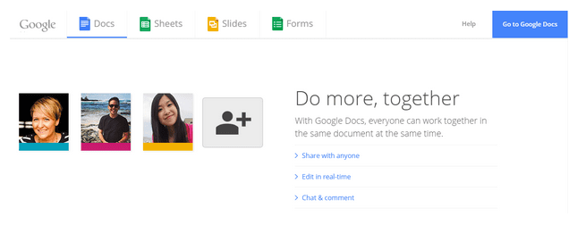
While gaining the trust of your coworkers, you can become an essential part of your company. Holding brainstorming discussions to prepare for the next big meeting, can become a necessary step. Speaking up or chiming in can leave you at the top of the minds of your coworkers and bosses! One small idea can snowball into the launch of the next big thing. Collaborating with open communication can be a common practice that keeps your company one step ahead. Google Docs is one of the most user friendly collaboration tools in the market allowing numerous people to view,edit, or comment on any document. The environment in which your company grows is correlated to its success. But what happens after the planning and brainstorming? You’ve got an objective, the next step is to act upon it efficiently.

Use Technology as a Tool and Not a Crutch

Technology has become a cog in the machine of businesses around the globe. Taking notes during meetings can be done digitally to reduce waste and streamline next steps. Note taking on a tablet or even with the latest Smart Pen can become your next favorite habit. Recapping, or sharing notes, makes it easier for everyone to assure they’re on the same page. Using apps such as Google Keep Notes can provide a handy reminder that can also allow your team to communicate with notes. Scheduling meetings digitally with the use of the Checker Plus for Google Calendar Chrome extension provides an easy forward thinking method of making sure you’re on track.

Triumph Together!

Now is this time to guarantee your company isn’t tearing down its own walls. Use your relationships with your coworkers to stimulate connections, join hands for your business, and assure a blossoming environment. So, the next time you’re leaning by the cooler, remember your words translate to effective management communication.
We’d love to hear your success story below!

Filed Under: Marketing Strategy

Technical Considerations for Going Mobile Design

March 11, 2015 by Dabrian Marketing Group Leave a Comment

What method should you use when starting your mobile design?

There are a lot of variables you need to consider when making your site mobile friendly. To start, there are three different ways you can do it. Only 1 of the 3 ways is considered best practice, and the other 2 are being phased out. Ideally you want to shoot for responsive design which with media queries work. Then no matter the size of your screen, your website’s look and feel will always be as at the width you want it.

Before we get into the 3 most common ways to design for mobile, I should mention the absolute most ideal way to do it. If you are doing a complete re-design then you should design for mobile first. I know it’s a bit different from how we developers have been doing it for decades, But going from the simplicity of mobile to complex is much easier. If you are not doing a re-design and already have a website you want to go to mobile, then you are going to choose between one of the 3 methods below. Keep in mind that there are other ways to go about it, I only mention the most common.

The 3 most common ways are as follows: media queries (referred to as responsive), mobile version of site (you would have 2 sites basically – one for desktop, and one for mobile), and making it fit exact sizes (making it fit 320, 450, 700, 900, 1024. If someone has a screen size of 400, they would see the 450 size. Basically, the design jumps as if you moved the browser).

Helpful Tools For Mobile Design

There are dozens of software packages and sites you can use to help. I am going to keep it simple and only mention 2 specific ones. The first is to help with Internet Explorer since you’ll usually encounter the most issues,  as with previous versions of the browser. The next one can help with every browser, but it only gives you a screenshot of what you select. Still very helpful for checking multiple versions of chrome in one go.

  • Netrenderer
  • Browser shots
  • Responsivepx

The last one allows you to view websites in different sizes without having to resize your browser. You can also browse the site using this, which is helpful for usability. If you use Google Chrome then you can use this next bit. If not then I highly recommend downloading Chrome. It is actually a built in feature that I use all the time.

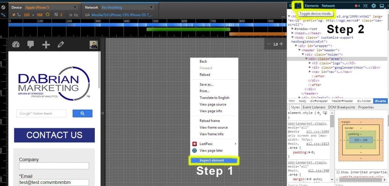
Chrome phone icon.
Shows the chrome inspect element, and where the phone icon is located.

All you need to do is right click on a site, and select “inspect”. Then another bar will pop out showing you the code of where you right clicked, and below that will be the CSS properties associated with it. It is handy for anyone programming. I have used Chrome for years and never noticed this until recently.

At the top of the inspect window there are buttons to change what you are seeing. Those are cool to use also. You can change the position of the inspect window from there. It can either be bottom, right side or a completely different window. On that top bar between the magnifying glass and the “Elements” tab, there is a phone icon. Click on it. Instantly you can browse in any size and go to specific device sizes. You can also see the recommended screen sizes to hit when going for mobile design.

Mobile Design Cross Browser Issues

Here is where all of the trouble is. You need to pick which devices you want to design for, and for which browser versions. The more versions and devices you support the better. Choose wisely – supporting every browser version under the sun for all devices simply isn’t possible.  A good standard would be the webs top 5 browsers that cover 95% of the user market: Google Chrome, Internet Explorer, Firefox, Safari, and Opera. You can download them and use them for testing, or use the tool above to see screenshots in those browsers. I recommend both so that if you want, you can use the site on that browser instead of only seeing a screenshot.

Browser version wise, it is recommended that you go back at least as far as 3 versions. For Chrome, Firefox, Safari, and Opera those typically can go even farther back, maybe as far as 10 versions or more because they usually show roughly the same. For Internet Explorer, you will need to pick what specific version you want to design for.For each version you go back, it will become harder and harder to design for. So your mileage my vary with Internet Explorer versions.

Programing wise, inside your CSS you can use 3 properties to target those browsers. First is “ -webkit- “ – this targets Chrome and Safari. The next is “ -moz- “ – which targets Firefox. Lastly, there is “ -o- ” – and that targets Opera. To target Internet Explorer, you need to do some research depending on the version you’re designing for –  that pre-fix might be different.

Browser support pre-fix.
Thinking about going mobile and have questions? Ask away in the comments below!

Filed Under: Mobile Marketing

  • « Go to Previous Page
  • Page 1
  • Interim pages omitted …
  • Page 24
  • Page 25
  • Page 26
  • Page 27
  • Page 28
  • Interim pages omitted …
  • Page 48
  • Go to Next Page »

Primary Sidebar

Archives

Categories

Subscribe Now


CONTACT INFORMATION

DaBrian Marketing Group
3535 N. 5th Street HWY
Suite 2, #203
Reading, PA, 19605

  • 610.743.5602
  • Mon - Fri: 9AM - 5PM
Contact Us
Web Support

RESOURCES

  • Case Studies
  • White Papers
  • eBooks
  • Small Business Resources
  • Our Blog

MARKETING

  • Financial Services
  • Health & Wellness
  • Ecommerce & Retail
  • Business 2 Business
  • Business 2 Consumer

VISIT OUR LOCATION

  • Get Map & Directions

CONNECT WITH US

Facebook Instagram Linkedin Rss Twitter Youtube

Copyright © 2026 DaBrian Marketing Group  •  All Rights Reserved  •  Privacy Policy •  Terms & Conditions

Scroll Up