Introduction:
In my last blog we discussed the importance of kerning and tracking in creative design. We explained their meanings and differences; in addition we gave visual examples of each. Besides kerning and tracking there are other key factors to keep in mind when formatting text in creative design. The key factors I decided to focus on in this blog are: widows, orphans, rivers (also known as text rivers), and rags. Although these issues are very common in print design, they can also be as problematic in a digital design space.
Definitions:
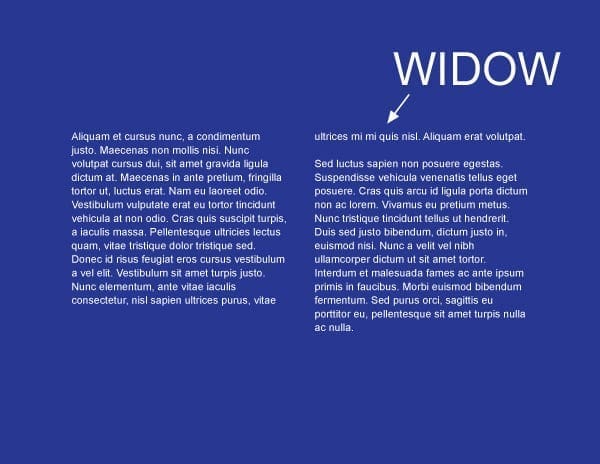
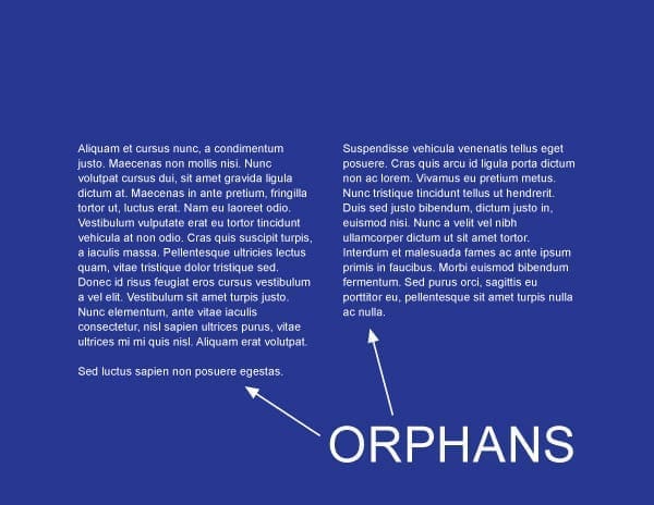
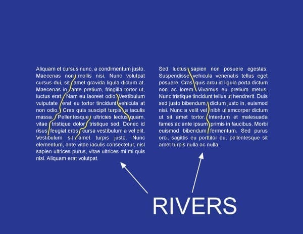
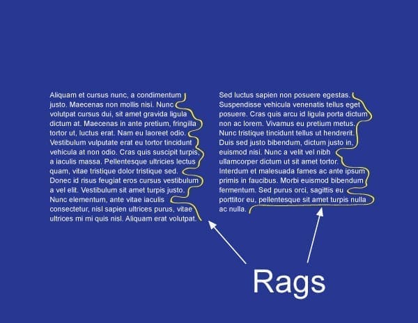
We will begin by defining these terms. First, widows are paragraph-closing lines which were pushed to the next page/column and left dangling and separated from the rest of the paragraph. Second, orphans (which are often confused with widows) are paragraph-opening lines that appear by themselves itself at the bottom of a page/column. In addition, it can be a word, part of a word, or very short line that appears by itself at the end of a paragraph. Orphans can result in too much white space between paragraphs or at the bottom of a page. Third, rivers (or text rivers) are the white gaps (or white space) that can appear in columns of type (especially justified text), when there is too much space between words on consecutive lines of text. Rivers are particularly common in narrow columns of text, where the type size is relatively large. Last but not least, rags can be defined as the imbalanced alignment of text lines. Ragged is the opposite of flush. A text block may be formatted (or justified) to be evenly flush (align) right and unevenly aligned (ragged) on the left. Now that we have defined these terms let us now view visual examples of these terms so that they make more sense.
How to avoid or fix these four issues:
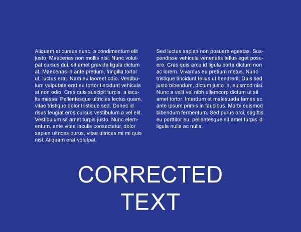
Some techniques you may use to avoid or fix widows and orphans are by forcing an early page break, hence making the page shorter, adjusting the kerning and/or tracking to produce tighter or looser paragraphs, or even adjust the hyphenation of words within a paragraph. Rivers, or text rivers can be avoided or fixed by adjusting the hyphenation and justification settings, commonly called the “H&J” settings, which can be found in most high end creative design suites. Also note that H&J settings can vary from one program to the next. Like rivers, rags can also be minimized or fixed with the use of H&J settings. You may also want to avoid using justified type as much as humanly possible.
Conclusion:
In this blog we defined widows, orphans, rivers, and rags, we also went over some differences and similarities among these terms. Although they several different ways to minimize or avoid these issues in creative design, I came across three ways which I thought were pretty consistent throughout my research on these issues. First, it is best to rewrite portions of the text so your copy can fit the way you intended it to fit. Second, utilize the H&J setting within the design program you are using. Last by not least, adding kerning and tracking values to text maybe the most common practice when dealing with these issues.

Also it is a wise practice to reread text before putting it on one’s blog in order to avoid typo’s and/or spelling mistakes. Awkward.
Otherwise, this is good and useful information, clearly explained.