Here at DaBrian Marketing Group, we are always staying up-to-date with the latest web design and development news. We incorporate what we learn into our process and share it with the world. In past blogs, we have discussed best practices for website design and for better user experience (UX) for the respective year. Our Creative Director, Mark Mapp, wrote both 5 B2B Web Design Trends to Consider in 2016 and Five New Web Design Trends for 2015. Now it’s time to reflect on the trends of 2017 and what the year has brought to us, along with what has survived over the years.
Surviving Web Design Trends
Some web design trends we have seen in the past are still going strong today and will most likely continue to do so in the foreseen future. Unique fonts, for example, continue to expand across the web. We’re no longer looking at the standard Arial or Helvetica fonts on every website. As Google Fonts continues to bulk up their library, our options online do as well.

Another trend that continues to sticks around is the Card Design style layout. As we continue to head towards a mobile world, I predict this will become even more popular since it creates an easily stackable layout for mobile devices.
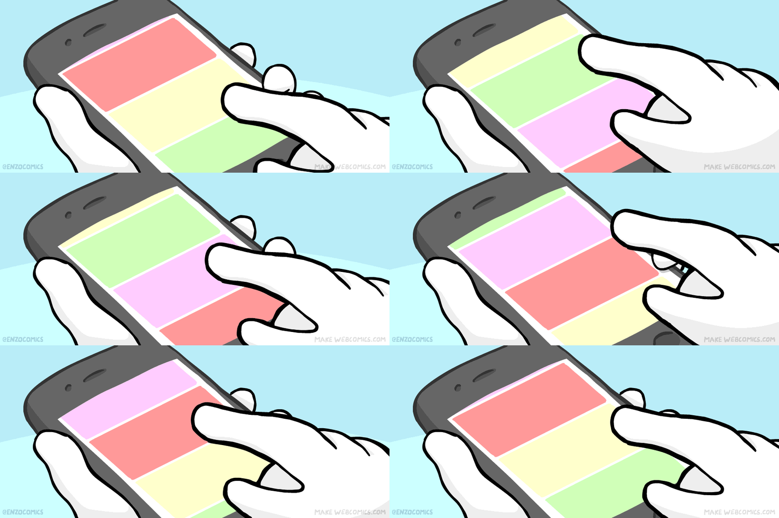
One last surviving trend is the one, long scrolling page. This ties right into the mobile-first approach, saving users load time and in turn data when navigating your website.
Upcoming Web Design Trends
With mobile devices taking over as the go-to device to access the internet, all of our web design practices are gearing toward that future. Because of this, the practice of Minimalism is becoming a more relevant trend. Too often sites of the past had crowded, text-filled areas. This presented the user with too much information at once. As things go mobile, we need to reevaluate how we present information. We need to use symbols, images, and keywords to get our message across as clearly and efficiently as possible.

Since one-page websites are taking a front seat in our design process, so are scrolling anchor points. While scrolling saves a user’s load time, you still want them to navigate to the information as quickly as possible. This is where anchors come in. Anchors give you click points that will take users directly to the relevant content on the page they’re looking for instead of scrolling through it all to find what you want.
A surprising twist this year is that imagery is making a comeback in design instead of the illustrations and vectors we’ve seen these past few years. Large, high-quality images are being used; not to convey a specific message but to support the overall focal point or story being told. Keep in mind that whenever possible you want to have original photos to make your website stand out from the crowd. Otherwise, your site may end up looking like everyone else’s in your industry from using the same stock photography.

Looking Forward
In everything that you read about web design trends these days, the overall message is very clear. Design with mobile in mind first by keeping everything simple and as clean you can. Avoid the clutter and cut down the content. These tips can apply to all web design projects.

This was super helpful thanks for sharing these tips! Refreshing and informative while staying entertaining, thanks
Nice checklist! Thanks to you that you have made me so clear with this. This really a great read that I have ever come across. I am happy to visit your website. It is highly attractive and simple to understand. Thanks a lot for this great knowledge for improving website traffic.
This blog related to the webdesign trands. Some website architecture patterns we have found in the past are as yet going solid today and will undoubtedly keep on doing as such in the anticipated future.
nice post
see more
Thank you, Ann!
Yes, I agree with you that using long scrolling page can make the user stay longer on the website. Also making use of the large content area is the best because the user gets clear idea of what that indicates and can become easy for him to navigate.
Thank you for the feedback, Rajesh!