Why So Optical?
The ever-changing realm of social media develops new processes, norms, and expectations on a seemingly daily basis. So much so, in fact, that the only way to keep tabs on how the industry is changing is to get the information straight from the source behind the changes: the platforms themselves and the marketers who use them.
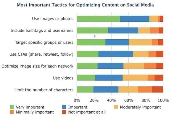
That’s why our friends at Software Advice, a social CRM research company, have released the preliminary results of their Social Media Content Optimization Survey – a survey of organizations’ content optimization processes on social media – specifically, what tactics are most effective.
According to the results – and not surprisingly to us – using photos and visuals in social media posts is the number one way to optimize engagement – with nearly 85% of respondents labeling visual content as “very important” or “important”. Social media marketing is all about grabbing attention (and ideally maintaining it) so as social media continues to integrate more closely with our brands’ visibility, the content we share needs to reflect that visibility in more than black and white.

Why We Should Follow Suit
The effective implementation of visual content into your social media strategy can prove beneficial to more than just how many “likes” you’re receiving. More importantly, visual content gives your brand a personality capable of building meaningful relationships that go beyond the electronic equivalent of an awkward hug – the Tweet “favorite.”
How Platforms Are Responding
Recently, Twitter’s transition to making images in line with text so that users no longer have to click a separate link to view an image has streamlined the user experience. More notably, it’s brought visual content to the forefront of Twitter campaigns.
Facebook has traditionally been the industry precedent for visual content, and continued without exception with the integration of larger images on link posts. If you share a URL on Facebook, a preview of the article with an image now over twice as large as in early 2013 will appear – which has been increasing engagement across the board.
We all know that the casual social media user is resistant to change. One could’ve thought the Mayan Apocalypse was more than a rumor when Facebook made its 2013 layout and chat functionality change. So, when a platform decides that change is worth the blowback, marketers best revise their strategy accordingly. The computer age and the visual movement are now one in the same.

Leave a Reply