Introduction
When starting a business it is very important to establish some sort of identity or visual presence. This is normally accomplished by the development or creation of a logo to represent your business. Your logo should speak to your audience with little or no explanation needed to justify its meaning. With that being said, there are 5 basic design principles that many designers follow that, more often than not, will ultimately determine the success of your new identity piece. In this blog we will go over these basic principles as well as provide some good examples of each.
1. Make it appropriate or relevant to your audience
Understanding your target audience and/or customers is probably the most important step in creating an effective or successful logo design. Not knowing or having this information may cause you to struggle with the development of your logo. It may even create a big disconnect between you and your target audience. By defining who your audience or customers are, you are then able to keep all the elements within the logo design relevant to them. Some examples of logos that clearly define who’s being targeted are the ones currently representing Gerber, Pantene Pro-V, and Rolex.

2. Most successful logos are “simple” in design
After you have defined your target audience, you can then move on to developing and designing your logo. This leads to our next principle, which is to keep the design or idea as simple as possible. It is best to apply the saying “less is more” to this principle. This phrase was actually first popularized by German architect Ludwig Mies van der Rohe, and I believe that this saying has more value or meaning in logo design than any other aspect of creative design. A logo that is too elaborately designed or made up of too many elements generally tends to create issues with things such as resizing, adding color, and most importantly readability. As a major rule, it is best to design the logo in black and white or grayscale before implementing colors. A well-designed logo in black and white usually translates well in color. Some logos that work well in black and white, as well as color are IBM, Nike, and Mercedes Benz.

3. Your logo should be memorable
For a logo to be memorable, it should be visually pleasing and easy to remember. A good test to see if your logo has that memorable factor is by removing components or elements from the logo to see if it is still recognizable. Throughout history, many companies have eliminated parts or pieces of their identity without losing any relevancy. There are some key aspects to remember that can help make your logo a memorable one. First, stay away from concepts that mimic logos already in existence. Your logo design should be unique, yet relevant to the audience it’s trying to capture. Second, you should choose a font that best represents your business. Choosing a font can be considered the most crucial step in logo design. According to imjustcreative.com, fonts are the life and soul of the logo. Time spent choosing a font should not be underestimated. Make sure that you choose a font that delivers the right message because choosing the wrong font can be disastrous for you and your logo design. Third, stay away from design trends or social trends when designing a logo because as we know, trends do have a tendency to come and go. Follow them too closely and your logo could meet the same fate. In the examples below, I removed key elements or parts of logos to see if they are still recognizable.

4. Will your logo stand the test of time?
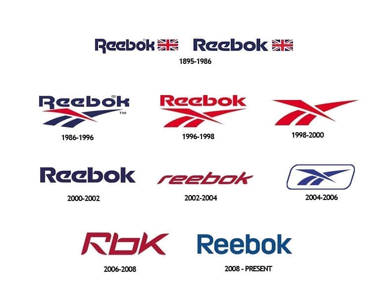
As time passes by, your logo or identity should remain relevant and appropriate to your audience with little or no changes at all. Simply put, the least amount of changes you make to your logo over time the better it is for you and your company. Logos that have that timeless factor or element to them tend to have little or no changes to their design over time, or the changes can be so miniscule that it is almost impossible to tell the difference between the previous and new design. According to brandprofiles.com, your logo should remain relevant 10-20 years down the road. Therefore, redesigning or rebranding your company’s identity or brand isn’t considered a good practice. Simply put, it is all about longevity. Some good examples of this would be the Google, Coca-Cola, and Reebok logos.

5. It must be versatile and flexible
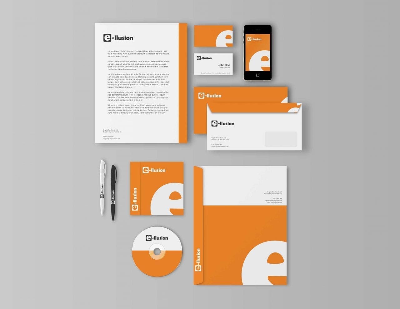
Another key aspect of a successfully designed logo is its ability to be scaled at different sizes without losing quality or readability. Logos should also display well in one color or against different color backgrounds. They should also have the ability to be implemented across various media and within a variety of contexts. Creating a logo in vector format is the most common and recommended practice by designers as a whole. Vector files can be created in programs such as Adobe Illustrator and Inkscape and will give you the most versatility and flexibility when creating or implementing a logo for different media types.

Conclusion
Now that we have covered the 5 basic principles of logo design, it may be in your best interest to audit your company’s current logo, or a logo that you have been developing to see if the design reflects any or all of these principles. You may also want to critique some busy or complex logo designs to see what the designer could have done differently to make the logos more relevant or ideal to its audience. When looking at and critiquing these logos, keep in mind that some of them may still be considered good designs though they do not follow the 5 basic logo design principles.
Have a question or a tip I didn’t mention? Please add yours in the comments below!

Leave a Reply