What method should you use when starting your mobile design?
There are a lot of variables you need to consider when making your site mobile friendly. To start, there are three different ways you can do it. Only 1 of the 3 ways is considered best practice, and the other 2 are being phased out. Ideally you want to shoot for responsive design which with media queries work. Then no matter the size of your screen, your website’s look and feel will always be as at the width you want it.
Before we get into the 3 most common ways to design for mobile, I should mention the absolute most ideal way to do it. If you are doing a complete re-design then you should design for mobile first. I know it’s a bit different from how we developers have been doing it for decades, But going from the simplicity of mobile to complex is much easier. If you are not doing a re-design and already have a website you want to go to mobile, then you are going to choose between one of the 3 methods below. Keep in mind that there are other ways to go about it, I only mention the most common.
The 3 most common ways are as follows: media queries (referred to as responsive), mobile version of site (you would have 2 sites basically – one for desktop, and one for mobile), and making it fit exact sizes (making it fit 320, 450, 700, 900, 1024. If someone has a screen size of 400, they would see the 450 size. Basically, the design jumps as if you moved the browser).
Helpful Tools For Mobile Design
There are dozens of software packages and sites you can use to help. I am going to keep it simple and only mention 2 specific ones. The first is to help with Internet Explorer since you’ll usually encounter the most issues, as with previous versions of the browser. The next one can help with every browser, but it only gives you a screenshot of what you select. Still very helpful for checking multiple versions of chrome in one go.
The last one allows you to view websites in different sizes without having to resize your browser. You can also browse the site using this, which is helpful for usability. If you use Google Chrome then you can use this next bit. If not then I highly recommend downloading Chrome. It is actually a built in feature that I use all the time.

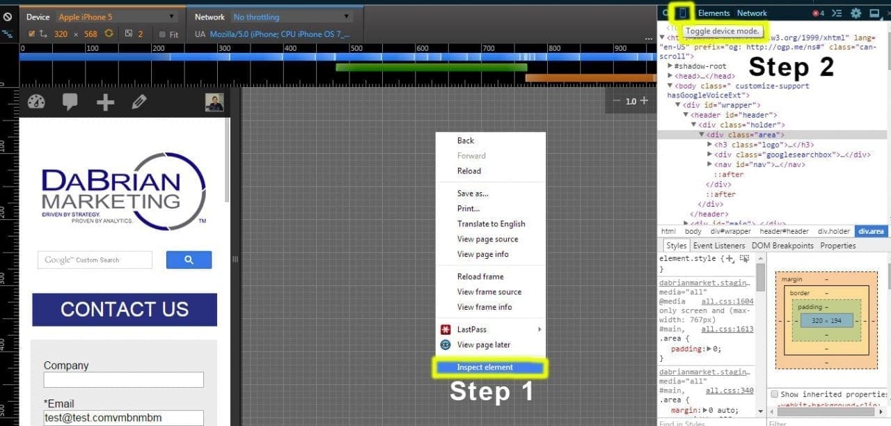
All you need to do is right click on a site, and select “inspect”. Then another bar will pop out showing you the code of where you right clicked, and below that will be the CSS properties associated with it. It is handy for anyone programming. I have used Chrome for years and never noticed this until recently.
At the top of the inspect window there are buttons to change what you are seeing. Those are cool to use also. You can change the position of the inspect window from there. It can either be bottom, right side or a completely different window. On that top bar between the magnifying glass and the “Elements” tab, there is a phone icon. Click on it. Instantly you can browse in any size and go to specific device sizes. You can also see the recommended screen sizes to hit when going for mobile design.
Mobile Design Cross Browser Issues
Here is where all of the trouble is. You need to pick which devices you want to design for, and for which browser versions. The more versions and devices you support the better. Choose wisely – supporting every browser version under the sun for all devices simply isn’t possible. A good standard would be the webs top 5 browsers that cover 95% of the user market: Google Chrome, Internet Explorer, Firefox, Safari, and Opera. You can download them and use them for testing, or use the tool above to see screenshots in those browsers. I recommend both so that if you want, you can use the site on that browser instead of only seeing a screenshot.
Browser version wise, it is recommended that you go back at least as far as 3 versions. For Chrome, Firefox, Safari, and Opera those typically can go even farther back, maybe as far as 10 versions or more because they usually show roughly the same. For Internet Explorer, you will need to pick what specific version you want to design for.For each version you go back, it will become harder and harder to design for. So your mileage my vary with Internet Explorer versions.
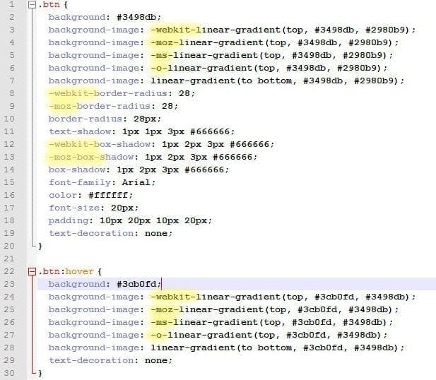
Programing wise, inside your CSS you can use 3 properties to target those browsers. First is “ -webkit- “ – this targets Chrome and Safari. The next is “ -moz- “ – which targets Firefox. Lastly, there is “ -o- ” – and that targets Opera. To target Internet Explorer, you need to do some research depending on the version you’re designing for – that pre-fix might be different.


Leave a Reply